Yousign – Improve product adoption

CASE STUDY

Yousign – Improving Forms feature’s adoption


Project summary: improving the adoption of the Forms’ feature

Methods: internal interviews, data analysis, user survey, new mockups, usability tests

Tools: Figma, Notion, Typeform

Role: Lead designer, I actively contributed to the research phase and delivered all design mockups and specifications

Platform: web – mobile + desktop (Responsive platform)

Team: worked with product managers, product marketing managers, and developers

Context

Yousign is a SaaS offering an e-signature solution. As described in this 👉 case study, I actively contributed to the « Workflows » launch: an automation solution generating documents to sign.   

This major feature aims to speed up the content preparation of recurring documents to sign.


How it works?

The Workflow creator inserts variables (blank areas) in the source document. From these variables, a form is automatically created. Each variable is linked to a form question. To make data collection smoother, it is possible to rephrase each variable into questions. Finally, the Workflow creation ends by adding signature fields (define who will have to sign the document).

The magic happens when the form is submitted. A document including collected form data is automatically generated and sent for signature to final recipients. Thanks to variables, data are properly inserted within the document.


Why continue working on this product?

The product’s version 1 did not perform as expected. However, our ambition was to this project a success. That’s why since the product launch, we have run major initiatives to improve our performance:

  • a new product naming to reflect better what this product is all about (Workflows are now named « Forms »)
  • a new pricing model,
  • a new marketing positioning,
  • offering a Forms trial on the most affordable Yousign plans,
  • offering Forms in self-serve,
  • new product features.

On top of these initiatives, we also wanted to identify what were the Forms adoption blockers. This is what I will be detailing here.


The problem we are trying to solve

Forms are not used that much by existing customers: not so many documents are generated via our automation product.


Why is it a problem?

With Forms sold in self-serve, it is crucial to understand the product’s paint points as it can lead to losing sales.


Who are we designing for?

  • HR officers,
  • Legal officers.


Constraint

The main constraint was the organization. We had to sync with 2 other squads to ensure design changes we might do, fit existing product flows as well as upcoming ones.


What were the expected impacts?

  • on users: save time, fewer errors, more compliance,
  • on Yousign: MRR increase.

Research

To discover why Forms did not meet the expected adoption, we defined a discovery plan including these initiatives:

  • internal testing sessions
  • user funnels analysis
  • user survey
  • user tests


Internal testing sessions

Format: Workshop

Attendees: product designers, product managers, and product marketing managers

Length: 50 minutes

Used tool: Miro

Analyzed design: 👉 View flows


Workshop part 1 – feedback sharing
Using virtual Post-it, attendees have been asked to share their feedback on the 2 main flows of the product:

  • The creation flow (showcasing various steps to create a Form)
  • The execution (showcasing how to use an existing Form)

Workshop part 2 – synthesize

For this second part, attendees had to organize their feedback within this canvas:

  • « What works well »
  • « What is not understood / clear »
  • « Ideas » (improving existing screens or adding new features)


However, before filling out the canvas, we tried to put our attendees in our user target shoes:

  • Legal officers,
  • HR officers.

To do so, we created groups of 2 and assigned them a document type related to their persona:

  • a fake consent attestation document (legal officer target)
  • a fake promise to hire document (HR officer target)

Results

Overall, we did not notice any major differences between « legal officers » and « HR officers » groups (maybe the limit of playing a role vs. being a « real user »).


đŸ€© « What works well »:

  • Form creation – Document upload: The illustration highlighting the double brackets
  • Form creation – Document upload: The document drag and drop
  • Form creation – History statuses of the signature request (from collecting data to generating the document to sign)
  • Form execution – Data integration within the document to sign
  • Form execution – Customizing the wording email invitation (to sign the document)


Â đŸ˜”â€đŸ’« « What is not understood / clear »

  • Form creation – Document upload: The information density is too high (too many key ideas to process at the same time)
  • Form creation – Document to sign preparation: Signer types are not clear (« Always the same person » vs « Someone requiring data collection »)
  • Form creation – Form customization: changing field types is quite « hidden »
  • Form creation – Form customization: it could go further
  • Form creation – Form settings: « names » are a bit confusing (Workflow name vs. Signature request name)
  • Form execution – Form submitted: it feels strange to have a cta inviting a user to submit a form right after submitting one
  • Form execution – Email notification (Form submitted): the wording could be improved


💡 « Ideas » (improving existing screens or adding new features)

  • Form creation – Document to sign preparation: make signer types clearer by adding a tooltip with signer examples
  • From creation – Document to sign preparation: create a visual distinction between signer types (« always the same person » vs « someone requiring data collection »)
  • Form creation – Form customization: for short answer field types, clearly indicate how many characters can be input.
  • Form execution – Forms list: surface better the link to copy the form


User survey

Context

During Q4 2022, we found out that the adoption of Forms was pretty low, which resulted in a low conversion rate (<7%).

We wanted to better understand the main pains met by the trial users of Forms. It would help us to come up with a refined solution and ultimately, increase the adoption rate of Forms.


Targeted users

All active users who don’t have the Forms feature in their plan, having started a Forms trial in 2023, finished it but didn’t subscribe to a Forms add-on.

Survey questions

I tried Forms (formerly Workflows) because…

  • I often collect data to generate documents
  • I send recurring documents for signature
    I want to automate my document generation I was curious about this new feature
  • Other

I didn’t subscribe to Forms (ex-Workflows) because…

  • Not enough time to try it
  • Too complicated to use
  • Lack of features
    Not what I expected
  • Too expensive
  • I didn’t understand what it does
  • Other

What features were you looking for?

Only displayed if the user selects “Lack of features” in the previous question


What solution were you expecting?

Only displayed if the user selects “Not what I expected” in the previous question

Were you shown a demo of Forms (ex-Workflows) by the Yousign team?

  • Yes
  • No

Do you have any other relevant feedback to help us improve Forms (ex- Workflows)?


Learnings

We only got a few answers from this survey. However, it gave us some keys to understand pain points.

They tried Forms because…

  • 66% (4 out of 6) wanted to automate their document generation
  • 33% (2 out of 6) send recurring documents for signature
  • 16% (1 out of 6) were curious about this new feature


They didn’t subscribe because…

  • 50% (3 out of 6) didn’t have enough time to test it 16% (1 out of 6): the price is too high
  • 16% (1 out of 6) said the price is too high

Verbatim: « No comment, everything’s good. I love the new Yousign version but there are more paid features on top of price plans which is a pity. »

  • 16% (1 out of 6) felt the feature is too complicated to use

Verbatim: « Guys, there are too many bugs, it takes too long to create, and there is no way to go back ( to the document upload page). As soon as we start a document, we are struggling to get a preview of what the final document will look like. Thus, I have to reopen the Word document, upload it again on the platform, and re-add fields.  I’ll be willing to pay for this feature but for now, the experience is really bad. As soon as we have version 2, I am paying for it. »

  • 16% (1 out of 6) don’t have a need for Forms immediately

Verbatim: « It was useful but I don’t have other documents to produce in a batch like this at the moment. »


Other feedback

Honestly, I thought that this would be the default editor for all documents.


Were they shown a demo of Forms?

  • 66% (4 out of 6) answered « No »
  • 33% (2 out of 6) answered « Yes »


User funnel analysis

Context

To better identify the most painful steps in the form creation flow, the product manager analyzed the funnel from the time the user started creating a form for the first time until he/she activated it. The idea is to identify the steps that are the most dropped by the users and to focus on the most problematic pains to improve the adoption.

Notes:

  • results based on users having started creating a form in the last 30 days (several hundred users in total) until the activation of this form,
  • users with a Yousign account have been excluded,
  • only a single entry per user was counted,
  • the time window for a user to complete the funnel was 7 days,
  • only looked at the first time the path was loaded by the user.


Key learnings

Less than 23% of the users creating their first form manage to activate it (vs. 71% of users creating their first SR that manage to send it).

  • Only 31% of the users have started the funnel and passed this step (vs 88-95% for the other steps and vs. 89% for the SR creation flow)
  • The average time to pass this step is more than 7 hours (vs. less than 1 hour for the other steps)

Hypotheses

  • The users don’t know what to do when landing on the upload page
  • It’s too much work for the user to create a document to discover the feature
  • The users don’t see that they can use our sample document to test the feature
  • The sample document doesn’t match their use case enough to protect themselves
  • By quitting the Yousign app and opening their text editor to prepare the doc, they are sucked by their daily work and forgot to keep testing Forms

We lost 12% of the users on this step

Hypotheses

  • The users don’t know what to do when landing on the document preparation step
  • The users are confused to see the signature request creation flow when they were preparing a form in the first place

The users (that manage to go through the whole flow) spend on average 11 hours to create a form when we claim they only need 15 minutes to do it.

Each step takes between 25 minutes to 7 hours to execute.


Hypotheses

  • The steps are too complicated to execute
  • The users don’t create their form with one stroke

Design

To verify the main pain points identified during the research phase we also ran user tests.


User test round 1

  • Duration: 30 minutes
  • Method: remote moderated via Google Meet
  • Protocol: user test ran on the production environment (a user account was created prior to the test session)
  • Objective: verify pains identified during the research phase
  • Testers panel: 12 users (there was 4 no-show)
  • Targets: french active App users who never tried creating a form
  • Tested hypotheses:
    • As a user, I don’t understand what Forms are
    • As a user, I don’t know how to create a form
    • As a user, I don’t know how to use a form
  • Design version tested:  👉 View flows

✹ Test highlights:

  • 50% (estimate) have a decent understanding of what Forms are at first sight (right after watching the video presentation)
  • 100% of users have not been able to create a Form on their own
  • Most pains are in the creation phase. The main blocker is the upload document step
  • There is hope in the dark, as around 45% clearly expressed they see the added value brought by Forms
  • There is an Aha moment when users see data properly integrated into the document
  • The Form execution part did not generate too much pain, probably because they were already quite confused by the form creation experience. They did not really know what was the purpose of filling out a form

Before jumping into the creation process, we asked users to tell us what they understood of Forms after reading/watching the content on the landing page.

The results are pretty average.


Key results:

Most users understood some key benefits vers the whole concept. Here are some keywords heard during the test:

  • Automation
  • Downloading templates on Yousign
  • Form templates
  • Create standardized documents

Hypotheses:

  • The video pace was too fast and maybe too abstract, making it hard for users to understand the whole concept.
  • Users struggled to picture themself using Forms as the showcased example did not match their use cases (we showcased a binding offer in the video)

Key results:

100% of users felt lost or blocked at least one time during the creation process. The upload document step is the best example of that:

  • 5 o 9 did not know what we were expecting from them at this step
  • 8 of 9 did not understand how to add variables

At large, 3 of 9 users clearly expressed they did not understand the connection between the form and the document. Various pains uncovered along the creation process make us think most users actually feel the same.

Hypotheses:

  • we are not providing enough context along the way. We are not stating enough that the creation process is about building a reusable template.
  • we are probably too text-heavy. We noticed several times people don’t read many instructions.
  • we are not explaining enough the connection between the form and the document. Users don’t understand how data is inserted within the document.
  • we are confusing them by showcasing pages that look like forms. They think they have to fill out the form themselves.

Key results:

  • 2 out of 9 users clearly expressed they did not understand what they had to do since they had created their template.
  • 2 out of 9 also clearly expressed that they don’t know what to do after completing their form.

Hypotheses:

For both key results, our guess is more than 2 users struggled with the form execution at large. They were so confused by the creation phase most of them probably clicked a bit mechanically on interface elements without really understanding what they were doing.

However, some feedback makes us think there is hope to change this perception.

Key results:

  • 2 out of 9 liked the review phase where data were injected into the document. It seems to be the Aha moment of the experience
  • 4 out of 9 perceived the added value even if they sometimes felt lost while testing forms

User test – Round 2

The first round of user tests helped us understand the pain points related to the form discovery. The main learning was that users felt lost along the form creation. They did not know have to do especially once they arrived on the upload page.

For time reasons, we did not have time to make all the design edits we wanted.

Focused on the creation flow, here were the design changes made:

  • Start the creation process with a page highlighting actions to build a form
  • Breakdown the docx preparation phase into multiple steps
  • Delete the step where the user needs to define questions
  • New form customization page
  • Breakdown the settings page into 2 parts (document settings vs. form settings)


User test details:

  • Duration: 30 minutes
  • Method: remote moderated via Google Meet
  • Protocol: test ran on Figma prototype
  • Objective: verify pains identified during the research phase
  • Testers panel: 12 users (there was 4 no-show)
  • Targets: french active App users who never tried creating a form
  • Hypotheses to test:
    • The user understands how forms work
    • The user understands how to mark variables
    • The user understands he/she needs to save/export the document in docx format on its computer
    • The user understands the concept of placeholder signer
    • The user understands what is the purpose of the form customization step
    • The user understands how to edit variables and turn them into questions
    • The user understands the difference between “Public” and “Private” forms?
    • The user understands how to use the newly created for
  • Tested prototype:  👉 View prototype (in đŸ‡«đŸ‡· french)

✹ Test highlights:

  • 6 out of 8 hypotheses have been successfully verified
  • 2 out of 3 users understood what Forms value proposition is (we are already working on an animated gif on the intro/activation page to make it more explicit)
  • 100% of users have been able to create a form
  • 100% of users understood how to prepare the document. This
  • includes marking variables and uploading the document (it was the main
  • pain of the previous user test)
  • 2 out of 3 users did not understand the concept of placeholder signers (there is already an ongoing initiative from the app core squad to improve this point)
  • 100% of users did not understand how to use their newly created form (the upcoming intercom onboarding should solve this pain point)

Hypotheses testing results

2 of 3 users understood how forms work.


Recommendation:

Create an animated gif to explain better what the form value proposition

3 out of 3 users understood how to mark variables


Recommendation:

Keep the design as is

3 of 3 users understood the document needed to be saved in docx format


Recommendation

Keep the design as is

3 out of 3 users did not understand the concept of placeholder signer


Recommendation

Another Yousign squad will be in charge of tackling this pain

3 out of 3 users understood the purpose of the form customization step


Recommendation

Keep the design as is

3 out of 3 users understood how to edit variables and turn them into questions


Recommendation

Keep the design as is

2 out of 3 users understood the difference between “Public” and “Private” forms


Recommendation

Associate a form preview to each state to surface UI differences

3 of 3 users did not understand how to use the newly created form


Recommendation

The intercom onboarding should solve this issue as it will engage users to start sharing their form

Results

From a design standpoint, edits made after running user tests helped us pass most of our hypotheses. Before sharing what the final flows looked like, here is how we tackled some of the main pains identified during our research phase.


Explain better how forms work

From user research, we know that the Form value proposition was not necessarily clearly understood. When users clicked on the Forms section, they landed on a text plus video page explaining the Form concept. This approach did not work well as the video was too abstract and fast-paced. Here is what it looked like:

After running a benchmark, a few approaches stood up. The one we decided to follow was to create an animated gif that would reflect the connection between the form and the document to sign. From there I collaborated with a motion designer and a PMM to come up with an animation conveying clearly our value proposition. Here is what the animation looks like:

Explain better how to prepare the document prior to uploading it on Yousign

Thanks to our form creation funnel analysis and our user test, we knew we lost a large portion of our users while they were preparing their documents (prior to uploading on Yousign). Our hypotheses explaining these results were:

  • we not providing enough context along the way. We are not stating enough that the creation process is about building a reusable template.
  • we are probably too text-heavy. We noticed several times people don’t read many instructions.
  • we are not explaining enough the connection between the form and the document. Users don’t understand how data is inserted within the document.

Here is for context what the original design looked like:

To move the needles, I teamed up with the design directors and came up with a step-by-step approach where expected actions from the user are broken down into multiple screens:

  1. Overview of the form creation process
  2. How to insert variables within the document
  3. Explain in which format the document needs to be saved

Make the form customization clearer

One of the elements that made users feel lost while creating a form where the form customization part. In the original flow the form customization part where users can turn variables into questions as well as change answer field types (short answer, long answer, email, was broken down into different steps (screens). As a reminder here is what it looked like:

From user tests, we learned that people did not understand the back-and-forth related to the form customization. Here is how the form customization was broken down:

  1. Screen 1 – Form custom customization part 1 – Turn variables into questions
  2. Screen 2 – Document to sign preparation – Add signature fields over the document
  3. Screen 3 – Form custom customization part 2 – Edit form answer field types as well as various settings.

For context, read this 👉 case study to understand why we designed the flow this way.

This back-and-forth feeling created confusion in the user’s mind. On top of that, on screen 3, users also felt confused and thought they had to fill out the form themselves. They did not understand at this point they were simply building the form which would be filled out, later on, by form respondents.

With these insights in mind, I decided to:

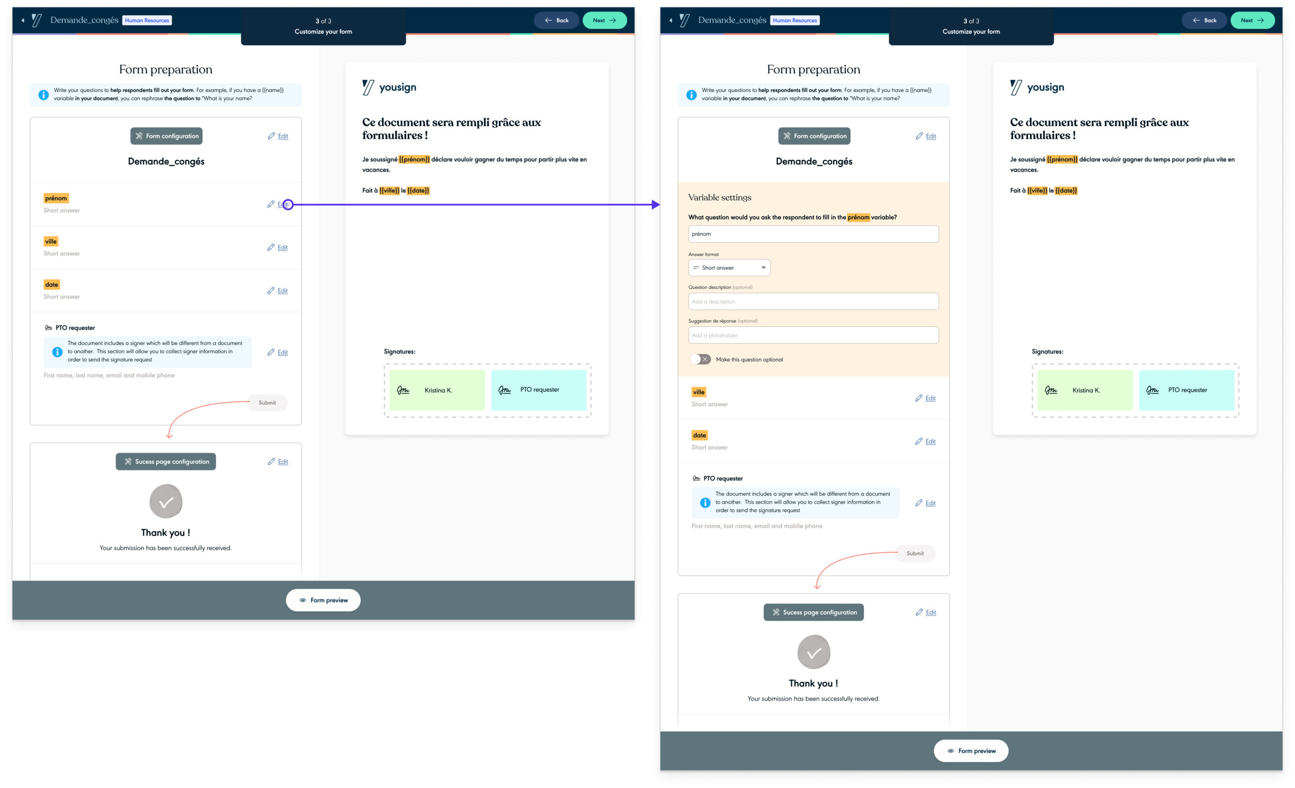
  • merge into one step, form customization elements
  • remove upfront form fields to avoid misleading users
  • improve wording instructions to make clear that at this step, users are building a form template

Here is what the new form customization step looked like:

Improve settings information architecture

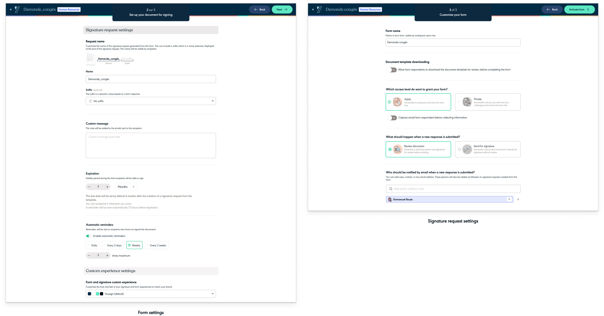
Another design element we changed after collecting user feedback was to clarify settings. In the original design, settings related to the form as well as the one from the signature request were regrouped into a single page. It created a pretty busy page and contributed to confusing users on the purpose of what they were building. Here is for context what was the original design:

Following our new approach to breaking down information to make form creation easier to process, I split form settings and signature request settings into 2 distinctive steps:

Enrich the Forms product with a new key feature

While we working on improving adoption, the design of a major new Forms feature had already been completed. This feature named « Multi-respondents » allows Form creators to define multiple people to collect document data. For a single document, creators will be able to define which information will be collected by whom. For context, this approach led us to generate a unique Form per contributor (individual in charge of collecting data).

Even if this initiative was not about increasing Forms adoption, I wanted to share what the new Form experience now looks like with this new feature.


Go beyond design initiatives

Following the objective to improve Forms adoption, I also collaborated with the marketing team to create an onboarding experience.

Focused on users who never tried Forms, the intent was to display an interactive walkthrough. The objective was to help them create their first form as well as experience the benefits of executing this feature. For time and resource reasons, we used our third-party messaging tool (Intercom) to build this onboarding experience. Triggered after clicking on specific CTAs, the onboarding experience looked like modals displayed over the content. On the design end, using this tool did not allow us to have full control of the modal rendering. This explains why Intercom modals don’t fit the Yousign brand. Here are some screens showcasing what it looks like:

Takeaways

Working on this project has been very rewarding even if it was sometimes challenging and intense. I have been involved in the project since day 1 when it was still an idea from the Yousign executive committee until making Forms a self-serve sold product.

This product launch was probably the most ambitious since the Yousign creation as it was our first intent to go beyond e-signature. Also, the product culture at Yousign remains recent, which probably led us to make some mistakes and did not allow us to meet our business objectives in the first place (to learn more about this project, 👉 read this case study). This experience led the company’s leadership to revise business expectations for Forms. From a standalone product that was supposed to help increase our ARR, it became a premium feature helping the company to still be relevant in front of our competitors.

From a design and product perspective, I have the feeling we made some prioritization mistakes as we started to work on a new complex feature (multi-respondent forms) while Forms adoption was meeting our expectations. This led us to make some rework on the Multi-respondent initiative as we uncovered, later on, strong pain points slowing down Forms adoption. The time lost on the rework prevented us, later on, from solving all Forms adoption issues as we had to focus on another company initiative. Another learning from this experience is to not disregard communication with other squads. Despite various rituals and slack channels we sometimes did not communicate enough which made us lose some time while implementing the design.

However, I think we have done our best to make this product a success. This non-exhaustive list of initiatives reflects the hard work we put into it, since the product launch:

  • adding new features (e.g.: multi-respondent forms),
  • redesigning the creation flow (improving Forms adoption),
  • implementing a new pricing model (from a standalone feature sold on top of pricing plans without no restrictions to an add-on with restrictions on the number of documents to sign generated),
  • selling this product in self-serve.

I don’t know if our efforts to make Forms adoption better paid off since I left Yousign but I am proud of what we did considering the numerous challenges have gone through.

Thanks for reading.