Yousign – Product launch

CASE STUDY

Yousign – launching an automation solution to generate documents to sign


Project summary: launching an automation solution to generate documents to sign

Methods: problem interviews, solution interviews, mockups, prototyping, usability tests

Tools: Figma, Notion, Typeform

Role: lead Designer, I actively contributed to the research phase and delivered all design mockups and specifications

Platform: web – mobile + desktop (Responsive platform)

Team: worked with product managers, product marketing managers, and developers

Context

Yousign is a SaaS offering an e-signature solution. So far the company was only focusing on the core business of this industry meaning:

  • on the signer requester end, adding signature fields on the document and send it to recipients for signature,
  • on the recipient end, signing the document.

As part of the company strategy to go beyond e-signature, Yousign decided to launch a new major feature named Workflows: an automation solution generating documents to sign.   

This feature aims to speed up the content preparation of recurring documents to sign.


How it works?

The Workflow creator inserts variable (blank area) in the source document. From these variables a form is automatically created. Each variables is linked to a form question. To make data collection smoother, it is possible to rephrase each variable into questions. Finally, the Workflow creation ends by adding signature fields (define who will have to sign the document).

The magic happens when the form is submitted. A document including collected form data is automatically generated and sent for signature to final recipients. Thanks to variables, data are properly inserted within the document.


Why did we decide to go that way?

  • provide more value to customers before the signature act,
  • differentiate our product from competitors,
  • accelerate MRR growth with a new product line.


Problem we are trying to solve

The document to be signed journey does not necessary start when the content has already been approved. Prior reaching this milestone, there is a long way to align multiple stakeholders on a document content.


Why is it problem?

Drafting a document to be signed comes with 2 main challenges:

  • It is time consuming as it takes a lot of back and forth between stakeholders to approve a document content,
  • data collection (to be integrated in the document to sign) is a source of errors, especially if there are multiple data entries.


Who are we designing for?

Companies with « basic » business use cases:

  • Legal NDAs, partnership agreements, etc.),
  • HR (employment agreement, HR policies).

We deliberately decided to leave aside the sales use cases


Constraints

1. Resources:

  • we acquired Canyon, a company which offered an automation solution to generate documents to sign. This meant collaborating with newly integrated employees (former co-founders of the company),
  • we were operating with limited resources (one of the co-founders was acting as Engineering manager and PM). We also temporary collaborated with few consultant developers,
  • a rudimentary design system. At that time me recently switched from Sketch to Figma. We had to recreate or adjust existing components.

2. Organisation: the whole product team switched to a squads model where product designers now work on specific part of the product. This also meant defining new work rituals to get the job done.   

3. Timeline: from the discovery to the delivery we launched a product in 6 months only. This forced us to make choices and define what would be our MMP (Minimum Marketable Product).


What was the expected impacts?

  • on users: save time, less errors, more compliance,
  • on Yousign: better upsell, win-rate, retention (stickiness).


Business objective

Contribute to reach company OKR by selling Workflows to X customers by the end of July 2022 (I cannot disclose the figure).

Research

To give Yousign all chances to succeed in this major project, we ran a discovery phase involving multiple teams from product, design, engineering, finance to marketing. I’ll be only focusing here on the initiative which helped me shaping the product design.


Problem / solution interviews

When I joined the project, most interviews had been already ran. I attended some as a note taker. It helped me to get into the automation topic.


Interview details:

  • Duration: 25 minutes,
  • Interview type: Remote moderated via Google Meet,
  • Objectives:
    • define customer segments,
    • understand user pain points,
    • rank most critical ones,
    • list out customer toolsets (competitive solutions),
    • get feedback on the existing Canyon solution (an automation solution to generate documents to sign),
    • evaluate the willingness to pay,
  • Targets: Yousign customers producing a high volume of signature requests (excluding for various reasons these personas: sales, real estate, digital agencies, small accounts, non Yousign customers),
  • Script: 👉 read the script

Problem / solution Interview learnings:

Results based after conducting 9 interviews (ou of 10 initially scheduled).

Problems

  • data collection came as number one problem for 5 interviewees,
  • other problems mentioned once each were: document filling, document approval/review, lack of connectivity between existing tools,
  • the problem with doc collection & doc filing is that they take time and are mind-numbing at scale,
  • legal and HR personas encounter the same set of problems, except for doc archiving & doc compliance (specific to legal) and multiple data entry (specific to HR),
  • automated doc creation is only relevant when there’s a high volume of standard documents coming from the company (employment contracts & offers, NDAs, DPAs, freelance agreements, work orders, letters). Data collection and approval/edition workflows are relevant for outbound and for inbound documents coming from third parties (supplier contracts, NDAs received from third parties, etc.),
  • another problem specific to the legal use case appeared: business people use outdated document versions or use the wrong doc templates (doc compliance),
  • it has been confirmed that legal and HR people are not tech savvy. All interviewees stated they were « not at ease » or « not at all at ease » with technology,
  • willingness to pay is best asked as a multiple of what a customer currently pays for eSignature (and not as a fixed amount per month). Some interviewees don’t know how much they are paying for Yousign,
  • The number of signed contracts is a very good indicator of the relevance for the doc workflows solution.


Solution

  • all interviewees understand the value of the doc workflows solution and what it aimed at achieving. They deem every step of the workflow as a essential (form filling, automated doc creation, doc review, doc/fields edition, doc approval/rejection, automated signature, contracts library). No step is deemed as a nice-to-have or a mere « gadget ». No interviewee had a « waw » effect on a particular feature. The workflow is considered logical and functional,
  • 3 interviewees insist that the document workflows solution must have other features. 1 interviewee wants the ability to inject employee data into HRMS (HR use case). 2 interviewees want the mass publication of contracts (HR and legal use cases),
  • All interviewees use Word (desktop version) as text editor. 7 interviewees are on the Microsoft Office suite of tools. 2 interviewees are on Google Workspace,
  • Enterprise companies and traditional SMBs are more likely to use Microsoft Office (whether the online 365 version or on their own local servers) while startups and modern SMBs are more likely to use Google Workspace,
  • Building your own text editor sounds like a good idea. You have more control over template building, doc versioning and inline collaboration. Yet it’s actually a bad idea because it’s virtually impossible not to break documents (layouts, fonts, inline changes, comments) when they’re exported in and out (whether .docx or PDF), it takes ages to setup, is difficult to adopt internally (i.e. it’s not intuitive) and third parties won’t use it to negotiate (see bad reviews for tools that have built their own text editor like Pandadoc, GetAccept, Ironclad).


Alternatives/competition

  • 6 interviewees have no alternative dedicated product: they all follow a manual process for doc workflows:
    • email/phone to collect data,
    • Word editor to input data into doc template (copy-pasting),
    • manual retrieving of signed document into document management system.
  • Examples of tool set used by our interviewees:
    • interviewee #1: a mix of Typeform / Google sheets / Google Doc / Payfit form,
    • interviewee #2: Notion (ticketing) / Leeway (contract library),
    • interviewee #3: French contracts library solution (only for vendor contracts and only as a contracts library).
  • certain HRMS offer document generation & signature workflows. Note: features are limited to in-app doc generation & signature (no approval workflow, no external data collection form).


Customer profile

Ideal customer profile for doc workflows solution for:

  • HR: company of 500 employees signing 10+ employment contracts each month,
  • legal: legal counsel signing 50+ standard contracts each month.


Willingness to pay

  • all interviewees, except one agreed to test the doc workflows solution. An interviewee even pressured for a quick follow-up call to create a proof of concept for a particular use case,
  • 7 interviewees are ready to pay for the solution:
    • highest: around 2X what they currently pay for Yousign,
    • lowest: between 1.2X and 1.5x of what they currently pay for Yousign.
  • 2 interviewees are not ready to pay for the solution,
  • we did not test out the solution to non Yousign customers. Yet current Canyon customers were living proof that companies are willing to buy Yousign and/or shift from their existing eSignature provider to Yousign at 3X and 20X the price they are currently paying.

Design

Nourished by these learnings, I then closely worked with the former Canyon founders to design a first iteration of the product. Initial specifications were based on:

  • the problem interviews learnings,
  • the knowledge of Canyon co-founders (research made before getting acquired by Yousign),
  • the market launch date (MMP approach).

To materialise this first iteration we decided to focus on the legal customer profile (one of the 2 profiles identified from our research phase). From there we imagined 2 scenarios, one focused on creating a Workflow, the other on executing the Workflow.

Workflow « creator » scenario:
You are working for Yousign as a legal counsel who frequently has to prepare Non Disclosure Agreements documents (NDA). From one NDA to another, the only changing elements are company information details (company name, company address, company representative name…). In addition to these information, each NDA must include the CEO signature and the counter signer signature. Finally, to make sure generated NDAs don’t include any data glitches, you want to review every document before sending them to their recipients. Your goal is to create a Workflow including the previously mentioned details.

Workflow « executor  » scenario:
You are working for Yousign as sales development representative. Before starting business relationships with other companies, you first need to make them sign a NDA. You are about to do business with another company. Before making it official, you need your future business partner to sign a NDA. You goal is to collect company details using the Workflow created by the Yousign legal counsel.

Here were the first design version we aligned on:

👉 Workflows – version 0.5

Challenges encountered

Building this first design iteration came up with various challenges. The main ones where concentred on the Workflow creation flow:

1. Find the right steps order

What came first? The chicken or the egg? That’s pretty much the question I asked myself when I started to think about the Workflow creation flow. In my case the question was to define what the user should see after uploading the source document:
Customizing the form, linked to the document or adding signature fields hover the document?

When I started to work on the creation flow I did not have a strong opinion regarding steps order. This is after doing design explorations I realized that starting with the form customisation could lead to create a less intuitive creation flow. To understand why, here is some context elements:

  • at Yousign, documents to sign are sent via email to recipients thanks to a signature field. A signature field includes signer contact information:
    • first name,
    • last name,
    • email,
    • mobile phone.
  • With Workflows, we were introducing the placeholder signer field. It allows the Workflow creator to add a signer without knowing its identity yet. To send the document to this type of recipient, the signer email as well as the other contact information are collected while the form respondent is filling out the form.


With these elements in mind, here is what the user flow would look like, if we decided to start with the form customization versus the document preparation:

Option 1: Starting with the form customization


Option 2: Starting with the document preparation


To me offering a clear form preview during the creation flow was essential to build an intuitive experience. Choosing option 1 over option 2 would create a non essential back and forth around the form customization. Post document upload, the user starts the form customization then go through the document preparation to finally get back again to the form customization. This is because it is impossible to get an accurate preview at the « Form customization – part 1 » step. At this point, we don’t know yet if the Workflow will include or not a placeholder signer. As a reminder if a placeholder signer is added to the document, signer information (first name, last name, email and mobile phone) will be collected via the form. To me, it would generate confusion as the user sees another time a step dedicated to the form.

For this reason, I decided to go with the option 2. Here is what the design looked like:

2. Balance the information break down between creation steps

Closely related to previous one, another challenge I had to deal with was to find the right information distribution between pages. By breaking down information too much, the risk was to create a pretty long creation flow. From a user stand point, it could create a feeling of complexity while our product philosophy is simplicity. At the same time, to reinforce UX consistency, I reused the same breadcrumbs pattern we have in the « regular » signature request creation flow.

While on the « regular » signature request creation flow one step equals one screen, on the Workflow creation flow, one step sometimes equals 2 screens. Identified as « Document » in the breadcrumbs, this phase included:

  • one step to add signer fields hover the document,
  • one step to review the form (aside the document).

I tried to display 4 items within the breadcrumbs but it felt very busy visually. Also I had to take into account other elements:

  • the internationalisation. Yousign is available in several languages. Most of the time other languages require more characters than english to express the same idea. In french for instance it would have been too tight,
  • the breadcrumbs can also display an optional element: the workspace name (for users who have created workspaces).

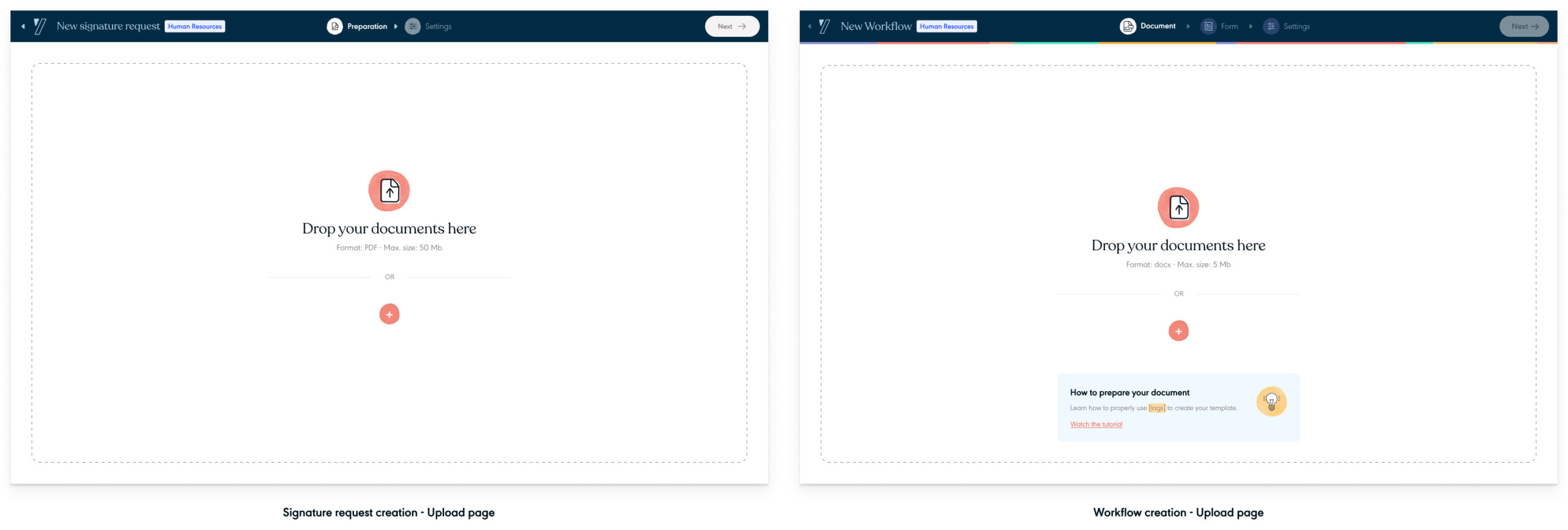
This is the compromise I made to preserve at a first glance, simplicity. Here is for comparison what the signature request and workflow breadcrumbs look like:


3. Define how far we go in the document preparation

Contrary to our core experience where the user uploads a document whose content is finalised (approved), a Workflow aims to build reusable document. This means creating within the document content, variables (blank areas), where data will be injected.

To make this happens, 2 main avenues stood out:

  • integrating within our app, a text editor,
  • outsource the text edition (via tools such as Microsoft Word or Google Docs).

For time and resources reasons we quickly chose to outsource the text edition. It had an important impact on the creation flow:

  • explaining to the user that adding variables to document must be done outside of the Yousign app. To create a variable, the user has to put word / expression between brackets: [variable name],
  • reusing as much as I can existing design patterns, I started the design work of this educational / upload document page.

Inspired by the upload page from our current signature request creation flow, I came up with this design:

Refining before testing

At this point of the design user journey, our goal was to start refining the Workflow v1 features set before running user tests.

To do so, we shared the flows to key internal stakeholders to collect feedback. We also contacted again customers we interviewed during our research phase and conducted solution interviews. While we walked them through the flows, our objective was to get their feedback and evaluate the initial features set we had in mind.

To keep things short I won’t disclose all edits we made prior running user tests. However, here are 2 key elements we changed:

1. The Workflow creation steps order

Even if the option 1 did not create this back and forth feeling around the form customization part, we decided to go with the option 2. Rationales were:

  • option 1 has been perceived less intuitive than option 2. To key stakeholders, the « expected » step after uploading the document was the form customisation,
  • breaking down the form customization in 2 steps allows to lighten the information density per page. Thus, it reduces the mental workload for the user.

2. The document upload page

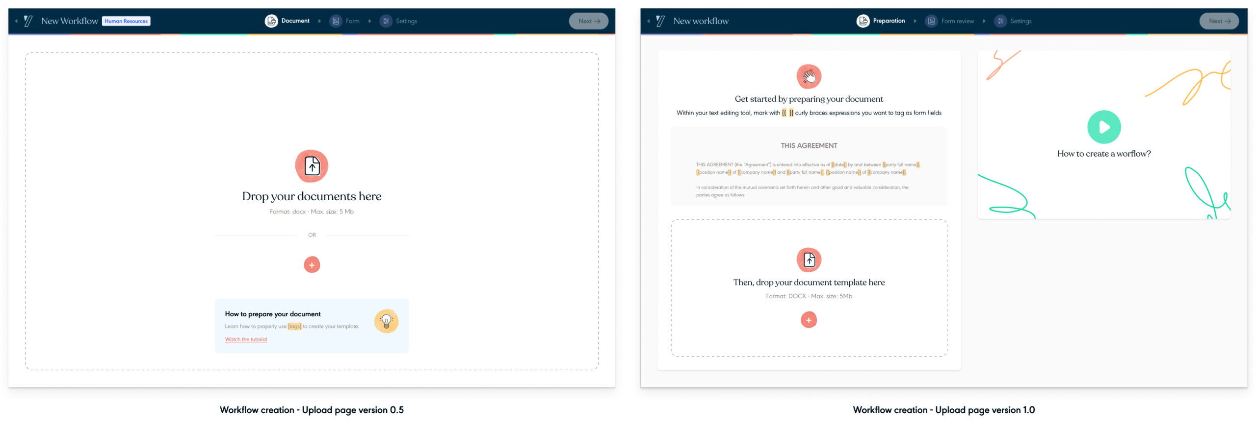
The upload page has been enriched with:

  • a video explaining how to add variables within a document,
  • a larger illustration surfacing a fake text including variables.

With these new elements, the objective was to make the document preparation crystal clear for users.

After applying these changes here was the design iteration we aligned on:

👉 Workflows – version 1.0


User tests

From the version 1.o, I then prepared user tests from drafting the script, contacting users to creating prototypes.


User test details:

  • Duration: 60 minutes
  • Method: remote moderated via Google Meet
  • Objective: identify user pain points (view hypotheses we wanted to verify during the user tests)
  • Testers panel: 11 users – 7 existing customers + 4 prospects (there was 1 no-show)
  • Targets:
    • french users,
    • current Yousign app customers with min. 100 FTEs (no API, no One plans),
    • prospects with min. 100 FTEs,
    • current Yousign app customers that signed up to the workflows product waiting list,
  • Tested scenarios:
    • Scenario 1 – create a NDA from an existing workflow – execution side,
    • Scenario 2 – review a NDA and send it for signature – execution side,
    • Scenario 3 – publish an updated document version and send it for signature – execution side,
    • Scenario 4 – create a workflow – creation side.
  • Script: 👉 Read the script

For context, we initially planned to only run one round of tests. Finally, after running 6 user tests, we observed recurring pain points and decided to implement design improvements to fix them. Thanks to those first user feedback we made a second design iteration of our flows and resumed our user tests.

User tests learnings – round 1

Here is the prototype used to round of tests:
👉 Round 1 prototype

All users understand they need to use imposed markers to tag words/expressions on the local desktop in the Word editor. Yet some users didn’t catch the nuance between using curly braces and square brackets.

Creation side – Sceneario #4


👉 3 out of 6 users understood they need to use square brackets [ ] versus curly braces { }. to tag words/expressions


Recommendation(s):

  • No initiative to engage at this point
  • This could change depending on UT2 results

All users understand why form answers are displayed within the notification email. For some of them, it was a “waw” effect.

Execution side – Scenario #2


👉 4 out of 6 users said they found really useful to get form answers within the notification email


Recommendation(s):
Keep design as is

Most users did not understand the form visibility options.

Creation side – Scenario #4

👉 4 out of 6 users did not understand the form visibility options. Workflows have two form visibility options. The form is either public (anyone with the link to it can access it) or « private » meaning only accessible for Yousign account owners. Users were instructed to make the form/workflow accessible to all employees at Acme. Since presumably only a few employees have a Yousign account, users must put the form as public. Yet most users struggled to understand that.

Recommendation(s):

  • improve the question wording,
  • explicit the 2 options wording,
  • specify in the instructions that only 3 employees at Acme have a Yousign account (on a total of 50 employees).

When a workflows has multiple document versions, users struggle to understand which version is going to be prepared for signature

Execution side – Scenario 3


👉 3 out of 6 users did not understand that the green area highlight refers to the document version to be prepared for signature. This is critical, as this could lead to sending the wrong document version for signature.


Recommendation(s):

  • remove the “tag” treatment for document name,
  • in the document version area, add a tag mentioning that this version is the one to be prepared for signature,
  • add an accent colour on the document title background to make it more visible (left part of the screen).

User tests learnings – round 2

Here is the prototype used to round of tests:
👉 round 2 prototype

Using square brackets to tag words/expressions is clear

Creation side – Scenario #4


👉 4 out of 5 users understood they need to use square brackets to tag words/expressions in order to prepare their document. As surprisingly as it sounds, this second batch of user tests ended up very positive results while we did not do any design edits.

Recommendation:
Keep design as is

All users understand the form visibility options (i.e. who can use a workflow).

Creation side – Scenario #4


👉 5 out of 5 users understood the form visibility options. In the first user tests round, most users struggled to understand that they had to set the form as “accessible to everyone” in order to make it accessible by all Acme employees even these who don’t have a Yousign account (see highlight 5 of UT round 1).

With this new design, we improved the wording (e.g. using “private” and “public” mentions). We improved the icons. This clearly paid off!


Recommendation:
Keep design as is

When a workflows has multiple document versions, most users understand which version is going to be prepared for signature

Execution side – Scenario #3


👉4 out of 5 users now clearly understood which document version is going to be prepared for signature when there are multiple uploaded versions.

In the first user tests round, most users were confused about which document version would eventually be sent for signature (see highlight n° 8 of UT round 1).

This second design iteration displays new information architecture and visual hierarchy, which paid off!


Recommendation:
Keep design as is

The creation flow creates a back and forth between the field mapping step and the form question customisation step

Creation side – Scenario #4


👉 2 out of 5 users did not seem to expect returning to a question customisation step after already mapped form field at the beginning of the flow. Some expected to land on the settings page. A tester even thought this was a “live” form popping out and wanted to fill it to test it out. Testers were however not surprised by the signer box questions. They understand where it came from. They understand how to use it and amend it.


Recommendations:

  • No immediate initiative to start as it is not a blockers and does not represent a significant group of users
  • However, it would be worth post v1 to explore a design solution combining in one screen the 2 steps.

User test synthesis

Here are the key learning after conducting these user tests:

  • we achieved our main objective: the design of the user journey just works,
  • all 22 hypotheses passed the test after round 2 of user testing (100% success rate). 4 medium-risk hypotheses didn’t pass the test after round 1 (81% success rate) and were successfully remediated for round 2.
  • users understood what the product does and what benefits they can get out of it. They wished to be kept informed about the release of the product. Testers kept high interest and energy during the tests.
  • we performed 11 user testing interviews on our objective of 10. Testers were happy to participate and enjoyed the experience of testing an innovative product.
  • the users tests were valuable because:
    • They helped us built a high confidence level about the usability of the design. We’re now reassured that we will ship a product that users will likely understand and be able to use.
    • We received lots of insights on how to improve the product in the future (17 users insights),
  • after round 2 of the tests, we captured a limited set of design edits (4 design edits).


Results

I made few extra edits after running the second round of user tests but nothing major blocking the Workflows launch. Here is the version we launched back in June 2022.

Business wise, we did not reach our goal which to have X Workflows customers by the end of Q2 2022 (again, I cannot disclose what was the figure). For the record, we reached this milestone late November 2022.

As a team we tried to understand the reasons explaining this result. Several emerged:

  • the product was not sold in self serve yet (Sales team had to make product demos to sell Workflows),
  • some must have features had not been implemented yet,
  • the new positioning, pricing and Workflows presentation had not been implemented yet.

Takeaways

While I really enjoyed been part of this exciting adventure, I feel frustrated by the initial business results. On top of the reasons I just shared, I have the feeling we touched the limit of the MMP approach. The initial product features set was probably too limited at launch making Workflows not relevant for some customer profiles. Also, not offering any self serve onboarding was probably a mistake as the product comes up with some concepts which can be complicated to understand.

A year later, other key reasons stood out. The 2 main ones were that the value proposition was not clearly understood. Also the document preparation aka adding variables, seemed to be a blocker: users did not seem to understand how to add variables within their documents. Even if it has never been a blocker while we conducted initial user test, several users clearly said they expected to be able to edit the document directly into Yousign.

Since then, we have ran several major initiatives to make the product richer and more intuitive to use. I’ll detail these in another case study.

Thanks for reading.