Elly

Case study: Room/roommate finder mobile application

CASE STUDY

Elly: Room/roommate finder mobile application


Context

With a moderate climate, an awesome panorama, and an economic dynamism, Vancouver is often mentioned among the best places to live in the world. Victim of its own success, the city has become the most expensive one to live in Canada. Because of an imbalance between the offer and the request, finding a place to live in at a decent price is challenging.

This is after looking for a shared accommodation I have decided to tackle this issue. From this search experience, I have kept in mind a couple of pain points I wanted to solve:

  • Time, it takes a lot of time to search for places matching my expectations
  • Communication, arrange a viewing was complicated because I had to sync my calendar with the one of ad poster
  • Trust, you never know if the persons you gonna live with are trustworthy

To come up with a solution to this problem, I teamed up with another UX/UI Designer. Considering we only got 3 weeks to present a concept, our objective was to build a MVP. Based on our assumptions, we thought the best way to demonstrate our product value was to design a mobile application.
Design process

We have followed a Human-Centered Design approach to make sure our design decisions would be supported by strong rationales.

Go beyond our hypothesis

To go further my own experience and understand what are room seeker expectations and frustrations, we have run a research phase. To start things off, we have defined our targeted users and research objectives. This is by doing this exercise we have realized we needed to focus not only on room seekers but also on landlords as they are the room providers.

To reach out our objectives, we have designed a survey for each target and sent it to our friends and acquaintance matching these profiles. Starting with room seekers, here is what we have learnt from the 19 respondents.

84% use Craiglist to look for a room
80% have mentioned that is time consuming
78% have mentioned there is a lot of scams
74% have requirements to feel comfortable to live with other people

Top criterions:
1. Budget and location
2. The person people they would have to live with
3. Amenities

Regarding the landlords, we did not have enough respondents to get meaningful insights.


Interviews

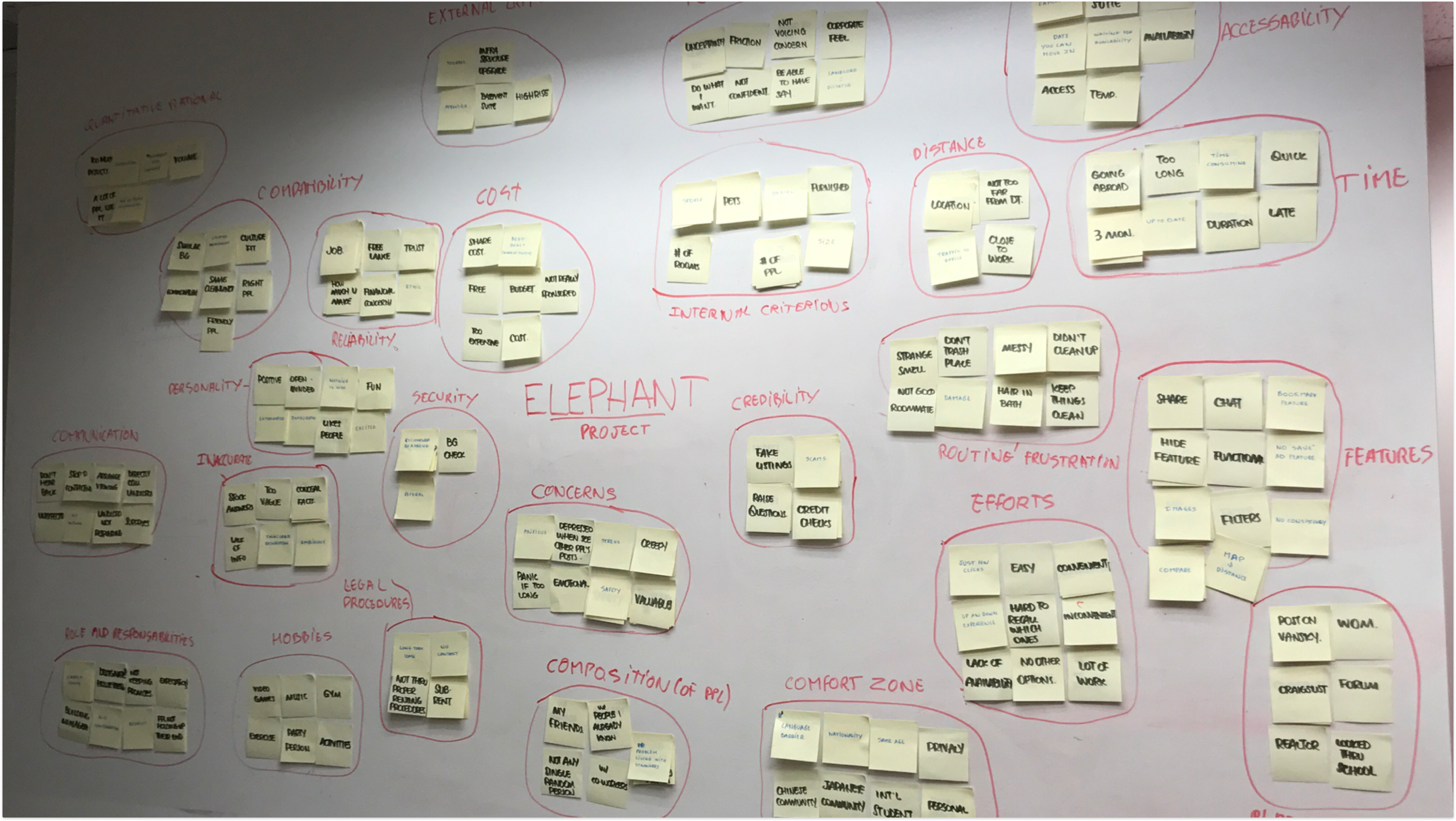
In addition to these quantitative data, we have also run 15 face to face interviews with room seekers and 4 with landlords to get qualitative data. By mixing these 2 types of data our goal was to create the most accurate user personas possible. To help us in this task, we have extracted key interviewees’ insights (room seekers and landlords) and built a unique affinity diagram.

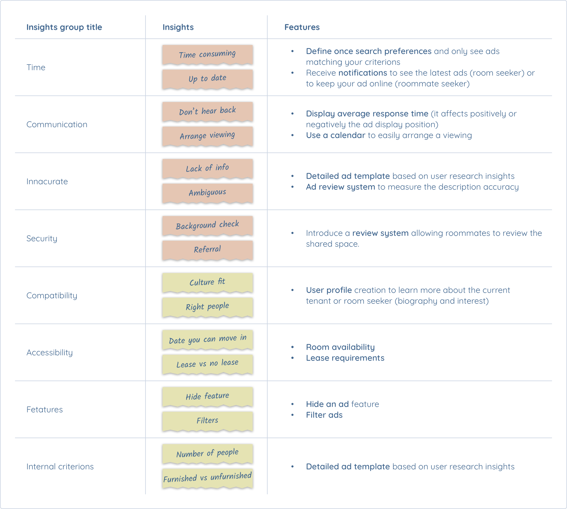
More than helping us to create our user personas, the affinity map gave us directions to build later on the MVP (see Features list section). Here is a condensed view of the insight groups we have focused our attention on.

Besides those findings, we have also made a meaningful discovery that was not translated on this mapping exercise.

Current roommates are most of the time the persons in charge to find new tenants when a room is vacant.

Contrary to what we thought, landlords are generally not involved at the beginning of the process to find their new tenants. More than time concern, the landlords delegate the candidates screening to current roommates to make sure they have matching personalities.

The second major discovery no reflected in the affinity map relates to language. As Vancouver is a melting pot of communities, some newcomers don’t feel enough at ease in English to express themselves as they would like to.

Language can be a barrier preventing people to feel comfortable communicating with others.


Personas

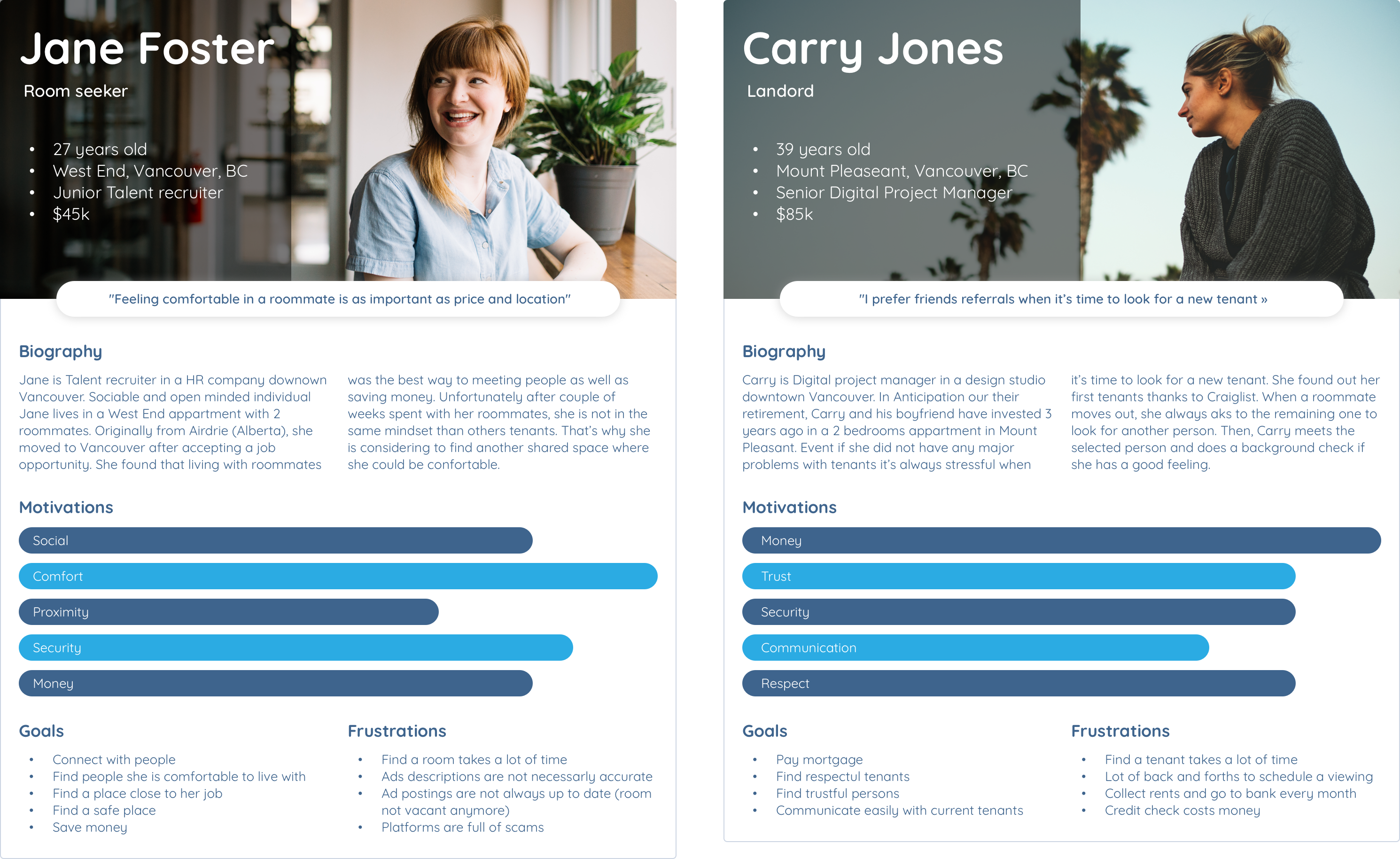
From the affinity diagram, we also have developed personas to guide our design decisions.

The competition

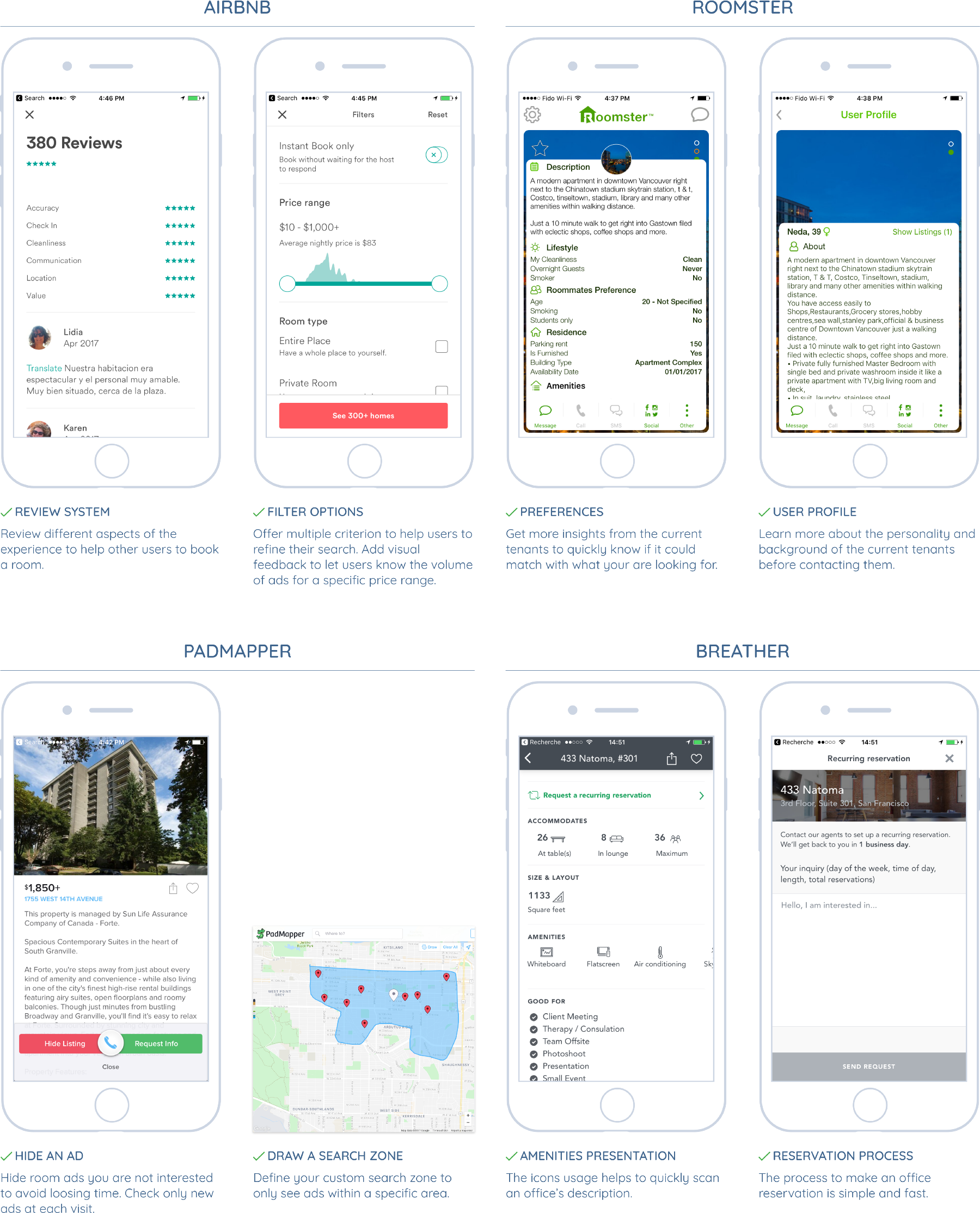
To compare how similar services approach the room and roommate search, we also have run a competition analysis. Thanks to the interviews and surveys we found out what services our targeted users used. Here is what we have learnt.

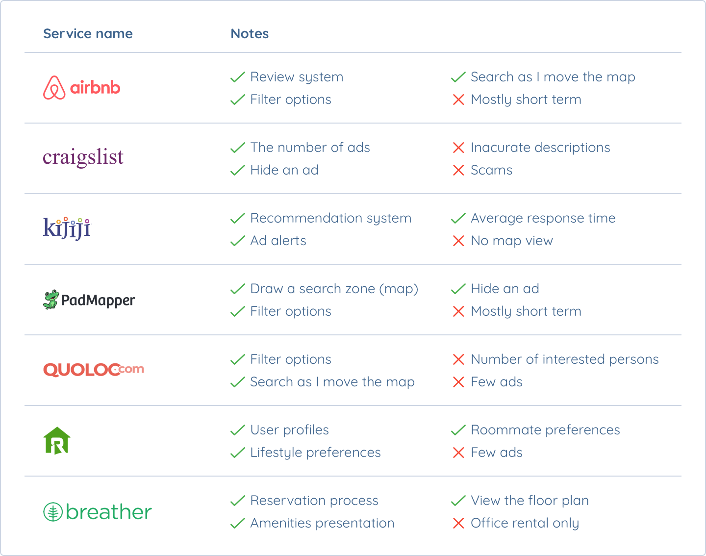
We have then Synthesized our findings into a table to get a quick overview of the competitor highlights.

Features list

After conducting this research, we had enough insights to move to the planning phase. These data helped us to define the scope of features we wanted to integrate for building our MVP. To do so we took the user insights we previously discovered and turned them into features.

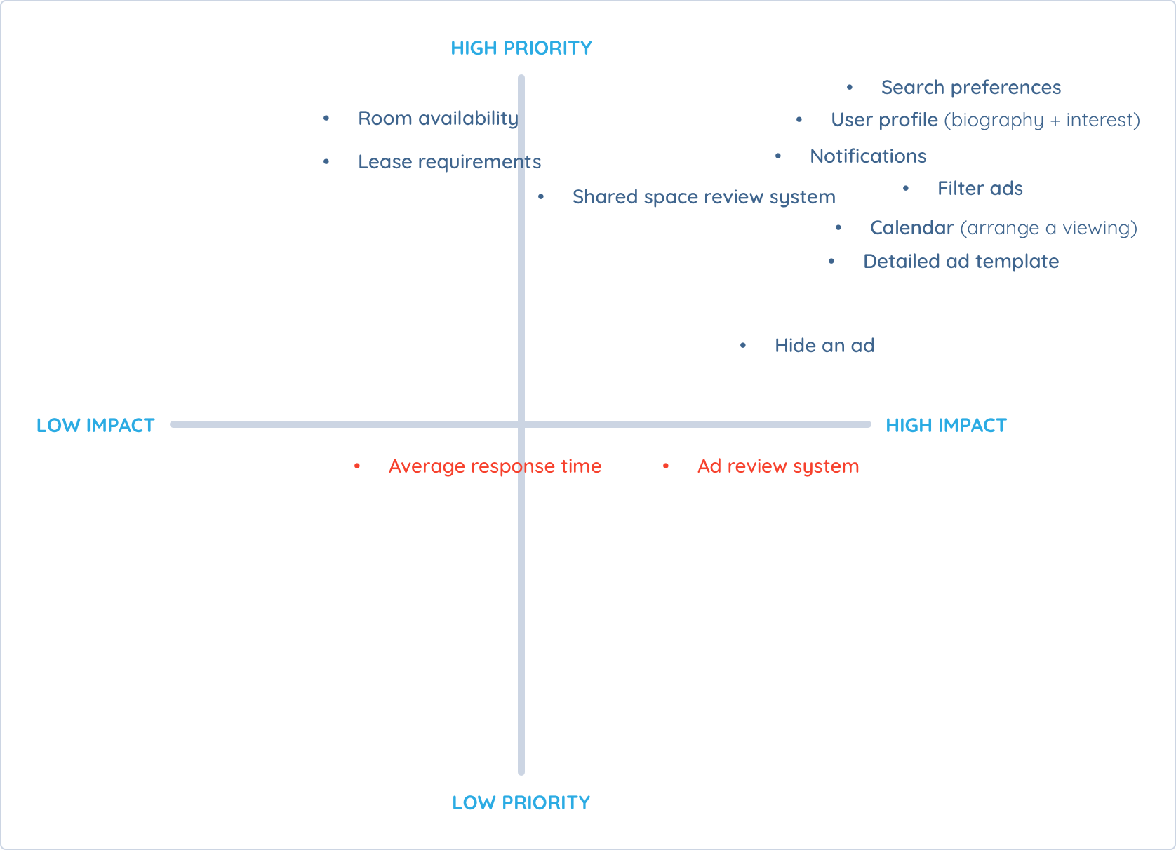
Then, to help us to prioritize what should be part or not of the MVP, we have looked at our interview transcriptions and surveys. We finally end up with this features list matrix.

Tasks flow

Prior to ideating solutions, we have also designed the core task flows of the MVP with our 2 targeted users in mind.

  • The room search flow, for the room seekers
  • The roommate search flow for the current tenants

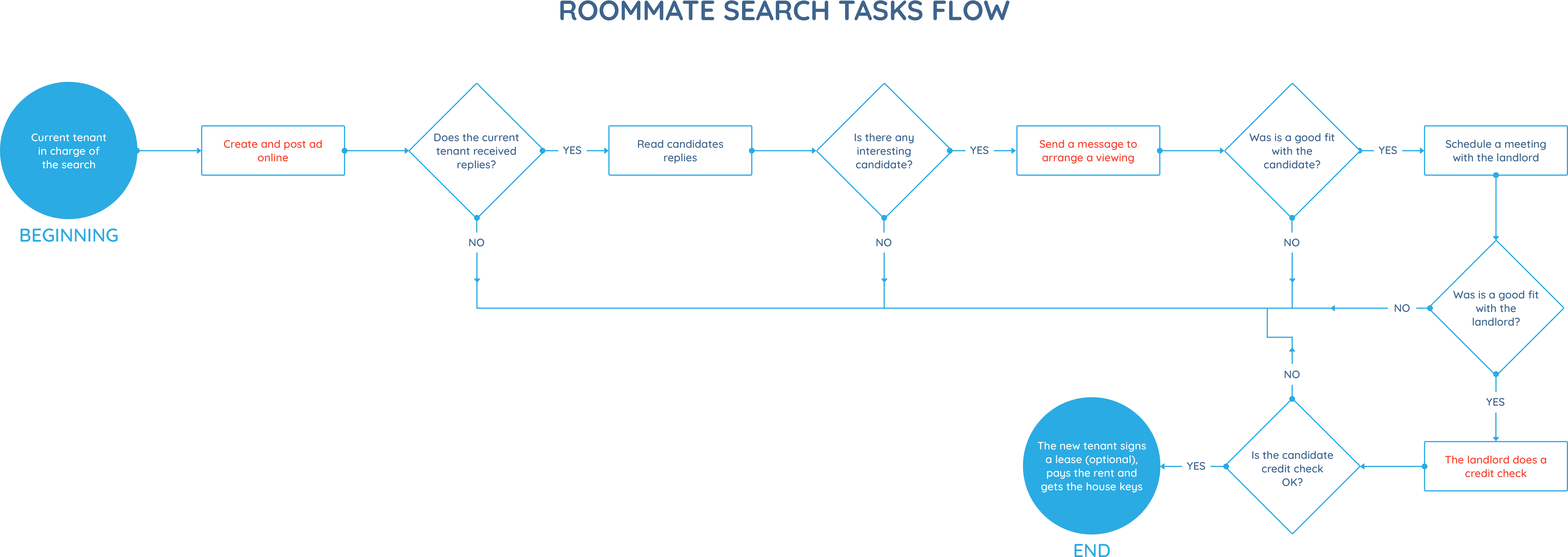
Our goal was to identify where in the search experience the pain points occurred. Based on our research discovery, we have mapped out the roommate search flow by starting with current tenants and not the landlords.

Brand identity

UI research

At this stage of the design process, we already had enough insights to start sketching ideas. However, we have decided to focus on the branding aspect of the application. The objective was to nourish our design process and come up with a more solid concept.

To start this branding thinking, we got back to our research phase to capture our interviewee’s emotions and thoughts. To do so, we asked them additional questions focused on their feelings. Contrary to UX research questions, we have asked the same ones to our two targeted users (room seekers and tenants). Indeed, these questions were relevant to both of them. Here are some questions we asked:

How do feel about using the ad rooms platforms?

What make you feel relax?

What trust mean to you?

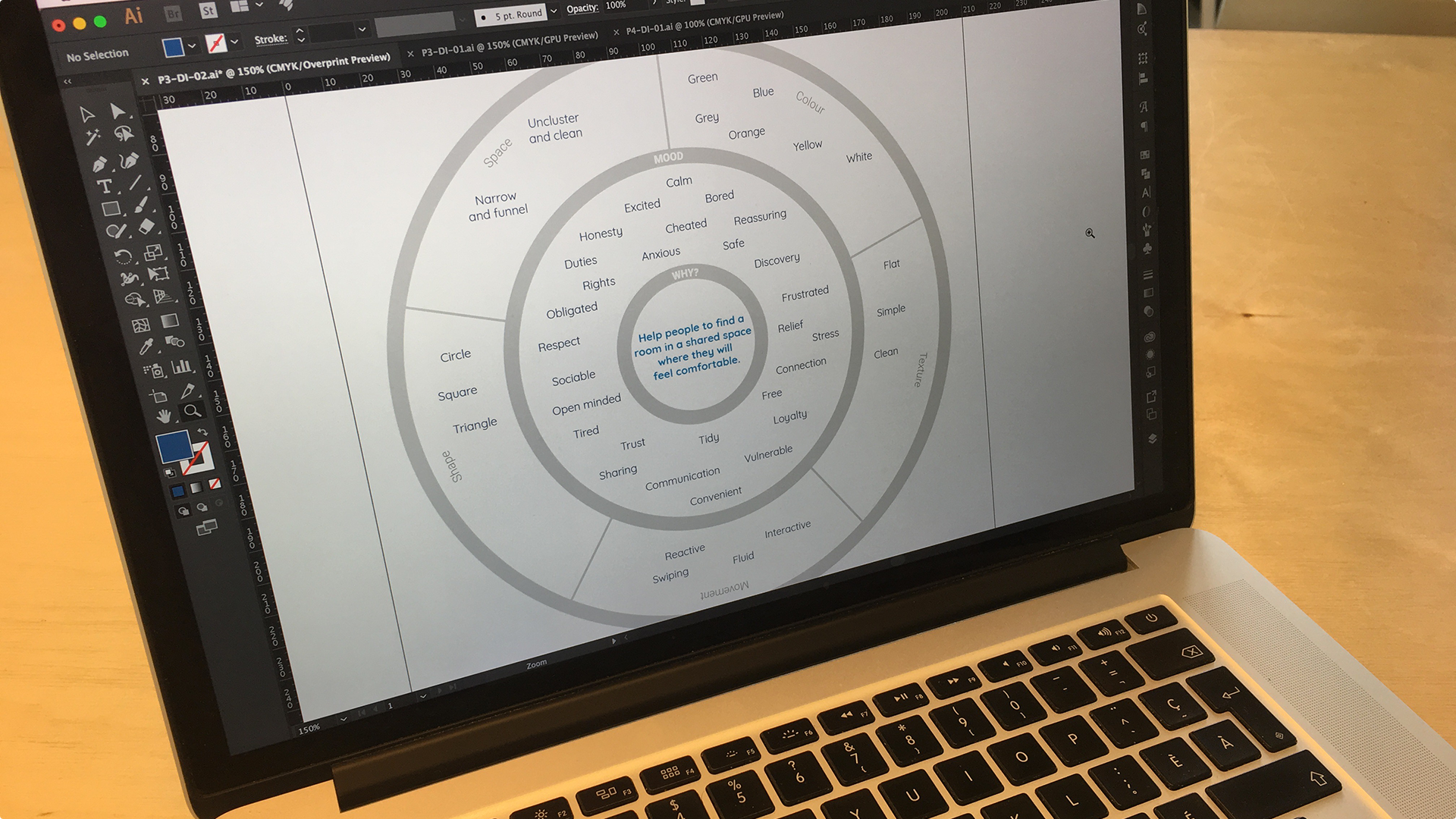
From there, we have synthesized these insights on a design inception worksheet. Built around the WHY question this document helped us to summarize with keywords the main purpose of the product as well as its visual environment.

Mood board

Gathering these insights brought forward mixed feelings. From excited, cheated, sociable, stress, safe, open-minded, trust, to frustrated or loyalty these keywords were the result of good and bad experiences in shared accommodation environments.
To turn these negative feelings into positive ones we have chosen to work with a blue color palette.

Indeed blue is associated with open spaces, freedom, trust, loyalty, sincerity. In many cultures, blue color has also significant spiritual meaning by bringing peace and keeping the bad spirits away. To reinforce this positive aspect and get a color that stands out among these shades of blue, we have also chosen a yellow. This color is associated with happiness, positivity, clarity, energy, and optimism which was in line with what we wanted to communicate.

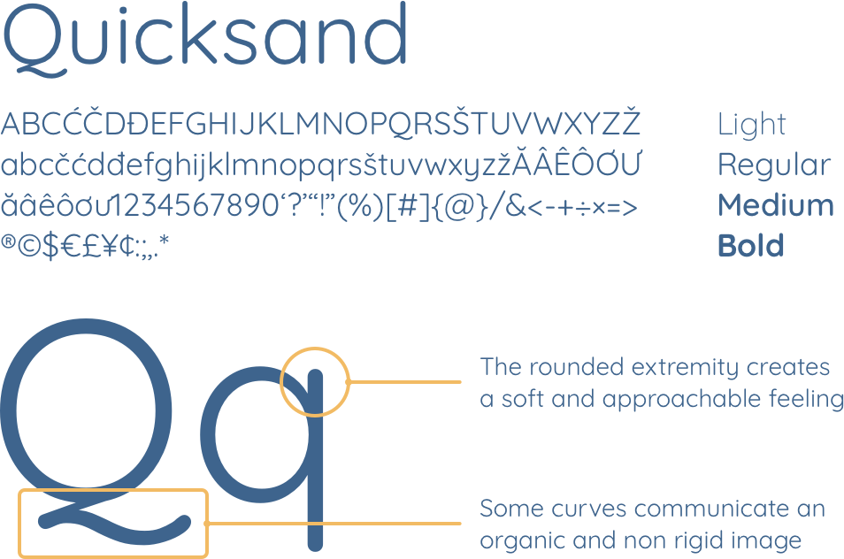
Because we wanted to create a platform to facilitate communication between room seekers and roommate seekers, we wanted to find a font expressing a friendly and human feeling. That’s why we have chosen Quicksand.

To complete our mood board realization, we have also chosen some imageries. Our selection is based on keywords we had captured on the design inception worksheet. Here are the keywords we have used to build our mood board: sociable, trust, free, sharing, connection, and calm.

Product naming

After defining the visual environment, we have then worked on our application name. To start things off, we have thought what were the common insights between room seekers and roommate seekers. We ended up with a list of few keywords:

  • Search
  • Security
  • Communication

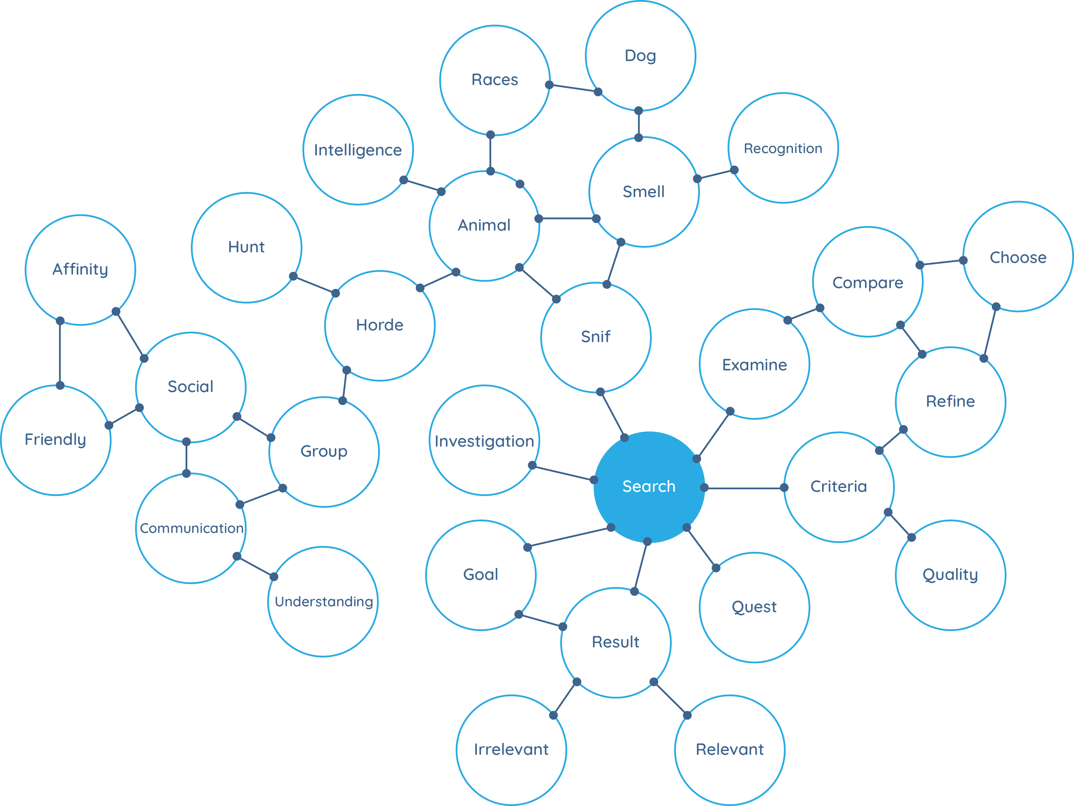
From there we have done a mind-mapping exercise to get some names ideas. We have started with the word “Search”.

After doing this exercise we did not end up with names but a promising connection between Search, Group, Smell, and Animal appeared.

As our product was about looking for a specific spot to live with other people, we thought there was an interesting parallel with the animal’s sense of smell. Some animals have a strong sense of smell which helps them to search for food or avoid predators. Moreover, like our targeted users who are looking to live with the right group of people, some animals live in packs or herds. This is the moment, we have started thinking an animal could become the logo of our product.

To go further, we have done searches focusing on animals with the most developed sense of smell and which live in packs or herds. We end up with a list of 5 animals:

  • Dolphins
  • Elephants
  • Wolves
  • Alligators
  • Monkeys

At this stage, we already had a strong preference for the Elephant. More than matching our research insights, the elephant was also a perfect fit with our idea to find the right room/roommates and “do not ignore the elephant in the room”.

The elephant in the room.

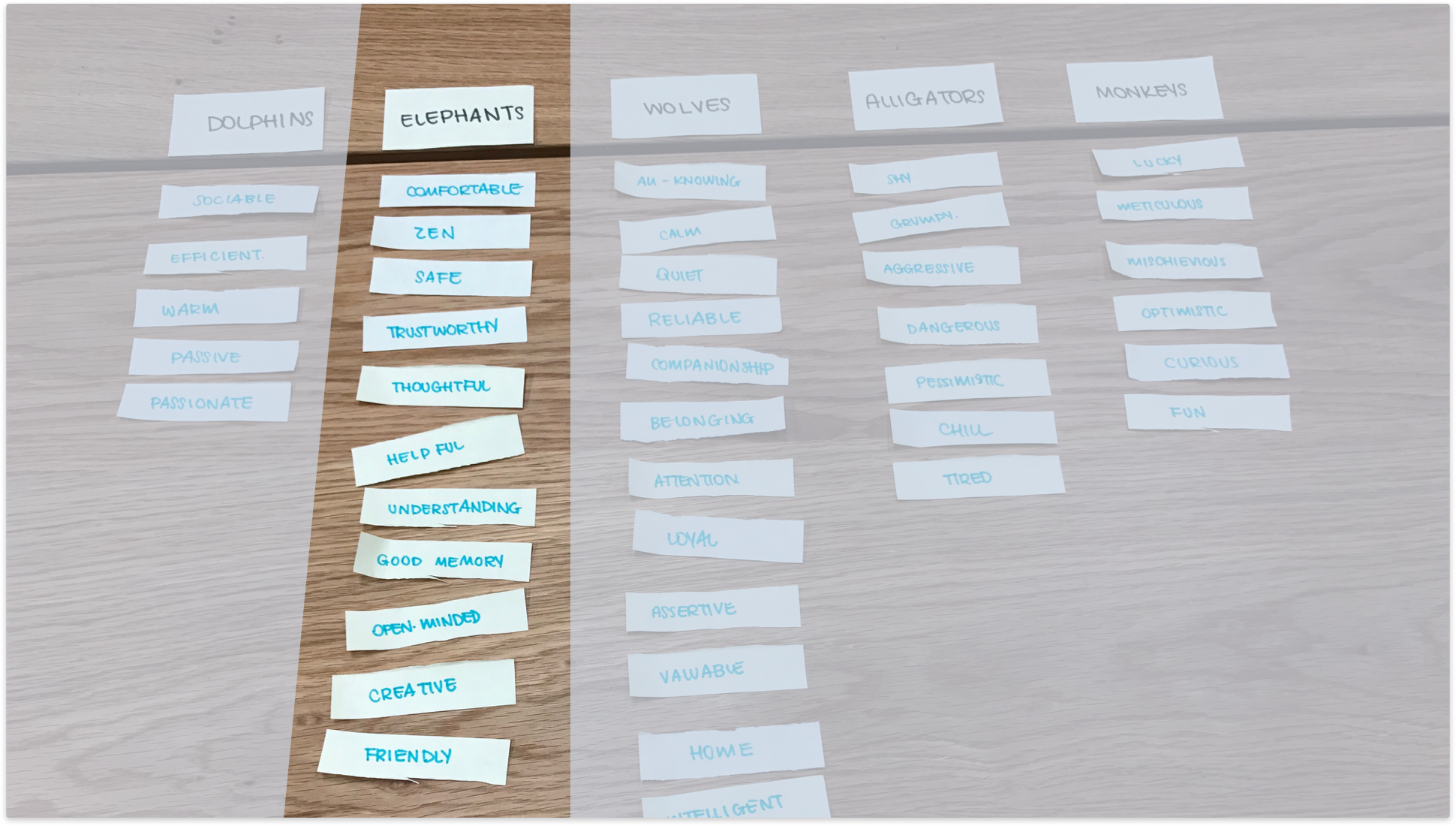
With our application, we wanted to make people feel comfortable to express their concerns and requirements to avoid incompatibility problems. Despite these strong rationales, we wanted to test our choice. To so, we have run a closed card sorting. We have listed the characteristics and qualities we wanted our product to have. Then we have asked potential users to sort these characteristics under the animals they associate with.

Our testings confirmed some of our assumptions. Many people associated elephants as being comfortable, trustworthy, safe, helpful, understanding, friendly, etc. These are the qualities we wanted our application to have.

This is after making these tests and reviewing our research phases, we came up with the idea to introduce an Artificial Intelligence (A.I.). More than a logo, our elephant could also become the user companion within the application. Because efficiency and efforts were two important frustrations of our users, the application had to facilitate as much as possible the room/roommate search experience. When encountering any kind of problems the user would be able to question any time the A.I. and be directed to the right screen. Introducing this virtual assistant was also a way to differentiate ourselves from competitors and create an engaging experience. The intention was also to have a friendly and conversational approach to make users feel more comfortable.


An elephant named…

It was now to find time to name for our A.I. mascot. We began to brainstorm with the goal to find a name that sounds friendly and easy to remember.

We eventually decided on “Elly”. Elly stemmed from the first two syllables — e-le — of the word elephant. The “ee” ending allows users to sense friendliness and approachability.

Logo

Initially focused on designing the face of “Elly”, we have quickly realized it could also make sense to use it as a logo as long as it was in line with our branding.

Prior to sketch our first iteration we have deliberately chosen to use simple shapes (circles, squares, triangles) to construct our logo. We thought the absence of complexity in shapes would help to highlight the amiability of Elly. We have explored different directions to represent our elephant. After sketching couple versions we are not really satisfied. The first iteration did not represent the friendliness we wanted to capture. We also had the feeling it was too complex because we were trying to represent the whole elephant. That’s how we have finally decided to only design the head of our elephant.

After a new round of iterations, we have finally found the right balance between something playful and serious. We did not want to be perceived as an application for children. Moving forward with the logo design process, we have then digitalized our last iteration to start refining it. To transcribe the friendliness and approachability of Elly, we have decided to round all the corners. It really helped us to diminish the rigidness and sharpness of the character.

Finally, we painted Elly’s face with 2 of our shades of blue. After trying different variations, we have found something which satisfied us. We have combined the sky blue shade with the darker version on purpose. The goal was to play with the contrasts to highlight some logo details. The focus on the eyes and the smile of the elephant was then more obvious. This is the kind of detail that contributes to reinforcing the friendliness and approachability of Elly. The combination of blues also helps to calm and ease the frustrations of our users. Finally, the blue not only relaxes but also aids our elephant to establish trustworthiness.

Thanks to this visual research, it was then way easier to create our product branding. This is how we finally defined it:

Brand core purpose
To make your life in a shared accommodation an enjoyable experience.

Brand personality
Friendly and resourceful

Who we are
Elly is a friendly and resourceful solution to find a room in a shared accommodation with people you will be comfortable to live with. Define your search criteria, then tell us about your hobbies and we will show you matching ads. More than finding a room you will like, find people you’ll love to live with. Because feeling comfortable and having a good time at home is all about finding the right mix of roommates’ personalities.

Unique selling proposition
Elly is a fast, simple, and fun way to find your room in shared accommodation you will enjoy.
With Elly, get notified whenever an interesting ad room is published and arrange a viewing with a just a swipe.

User stories

Getting back to our planning work, we have then focused our efforts on the room seeker user. To capture the user goals and benefits we have built the following user stories:

User story 1
As a busy individual, I want to spend as little time as possible to look for a room in a shared space, so I can focus on things I enjoy to do.

User story 2
As a sociable person, I want to live with people who have the same lifestyle, so I can feel comfortable as I get back home”.

User story 3
“As a woman, I want to live with people I can trust, so I can feel secured as I leave home”.


User flow

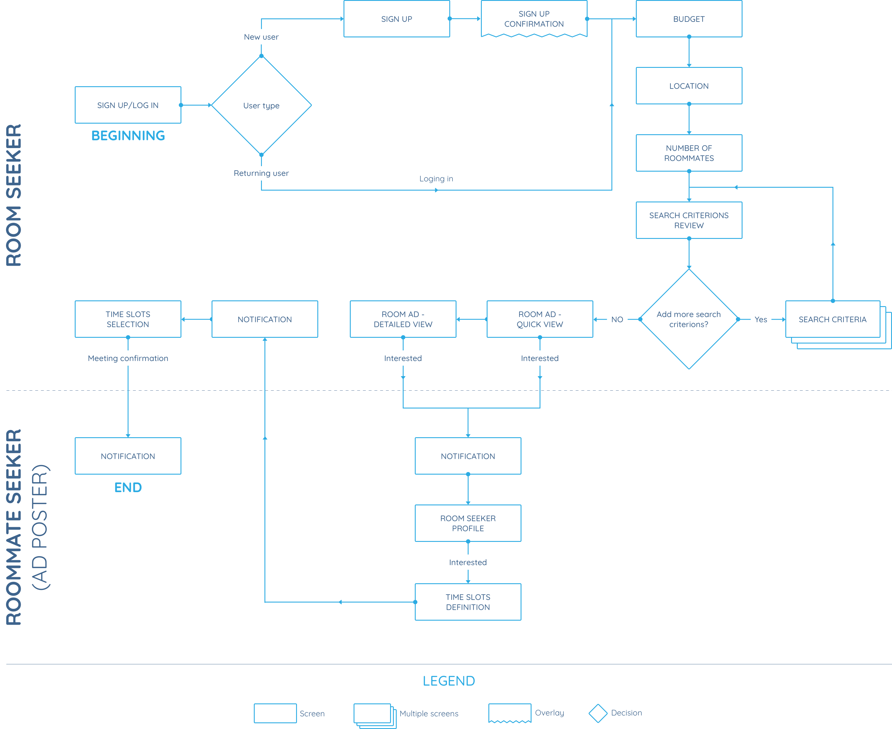
Inspired by these user stories and features list, we then had our guiding ideas to build the room seeker user flow:

  • Sign up process. Only ask information that matters to maximize chances to convert people into users.
  • Room search criterions. Set up once for all requirements, and then let users browse matching ads. Offer a progressive disclosure of the search criterions. Define budget, location, and the number of people to live and then see matching results or add others to be more specific (these criterions were the most mentioned during our research phase).
  • Room selection. Let users quickly scan important requirements by displaying key information at the first level. (room ad quick views vs room ad detailed view)
  • Recommendation system. Build a secure and trustworthy environment by allowing roommates to review each other.
  • Curation. Introducing a system allowing users to express their interest or nor for a room. If the user expresses its interest in a room, the ad poster receives a notification. From there the ad poster reviews the room seeker profile and decides or not arrange a viewing. On the contrary, if the user expresses its non-interest for a room, the room ad will never be displayed again.
  • Arrange a viewing. To arrange a viewing the ad poster has to accept the viewing request and send several time slots to the room seeker. Then, the room seeker receives a notification asking to select a time slot. From there the room seeker just has to select one to confirm the meeting.

To organize these ideas we have then designed the Room seeker flow.

Design studio

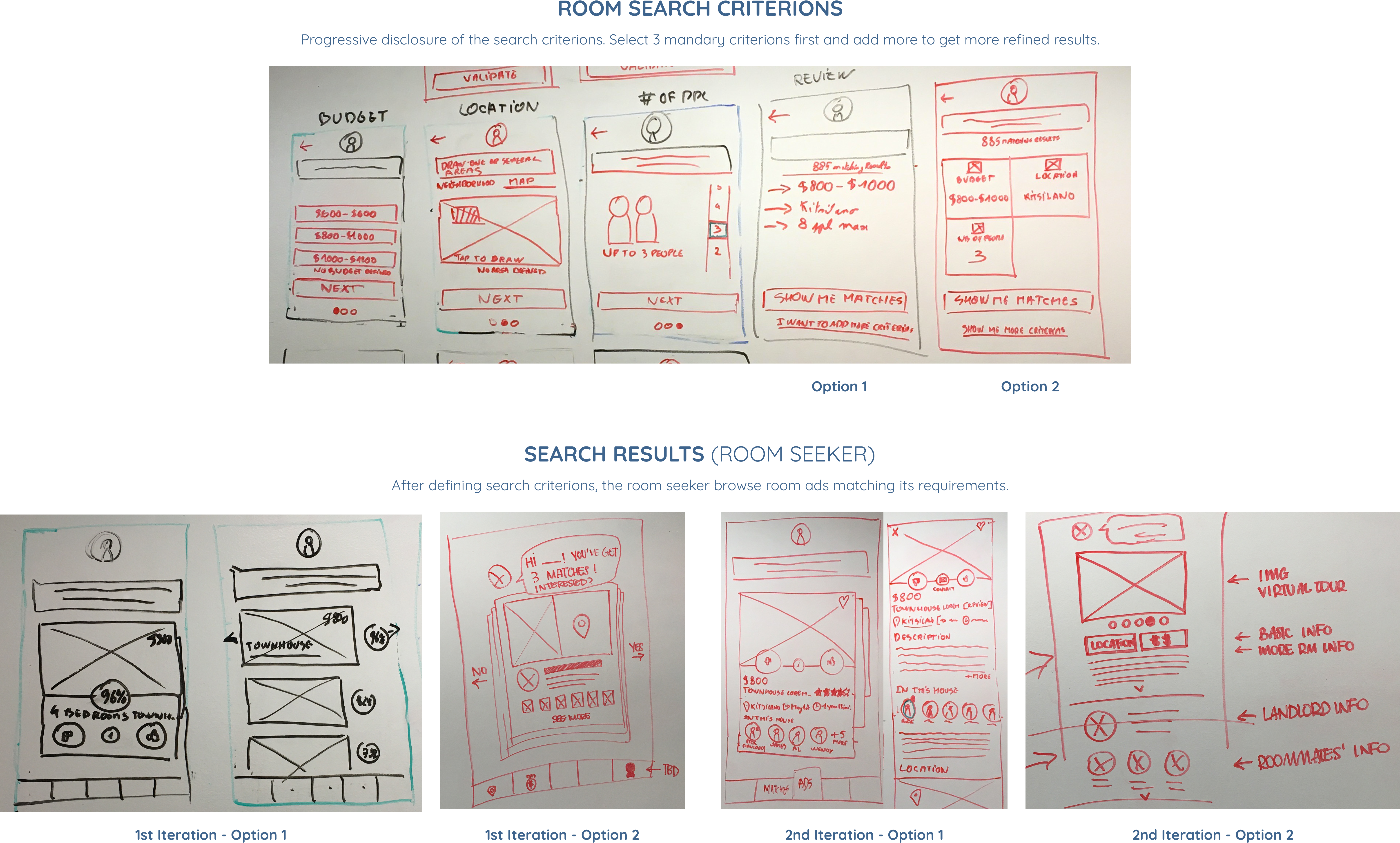
To help out to align our vision of the product, we have used the Design Studio method. Through 5-minute sessions, we have sketched screens we had previously listed in the room seeker flow. Here were some sketches from our initial vision.

Running these design sessions made us discover some gaps and things to adjust. After each sketch session, we reviewed our work and took some notes to come up with a more refined version. Here is what we have learnt:

  • we needed onboarding screens to present the benefits of the application
  • the Signup process could not be reduced to a single screen. There was actually more information to integrate than what we initially thought. The user profile type was one of them.
  • new feature ideas appeared as we were designing our screens. Some, such as a Save for later an ad have been integrated to the MVP, some not. For example, we did not keep the idea to have a matching score per ad based on user search criterions. Adding this figure to the card (ad) affected the readability and put less emphasis on more important information. See Search results — 1st iteration — option 1.
  • we both confirmed than displaying room ads as cards/tiles were a promising solution to quickly scan important information as well as dismisses “non-interesting” room ads. See Search results — 2nd iteration — option 1.


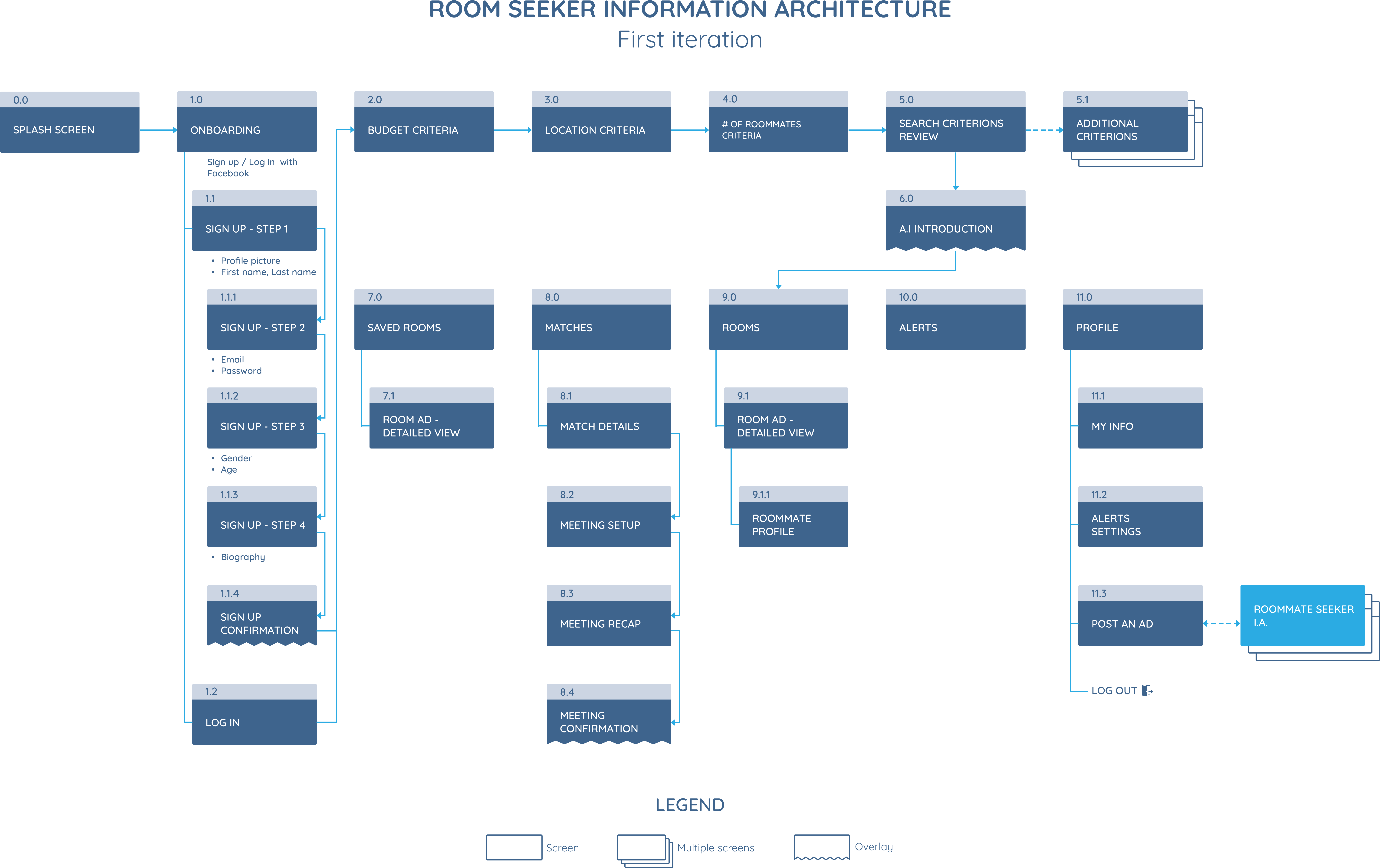
Information architecture

In addition to these discoveries, the Design Studio method also gave us a good idea of what the application I.A. could look like.

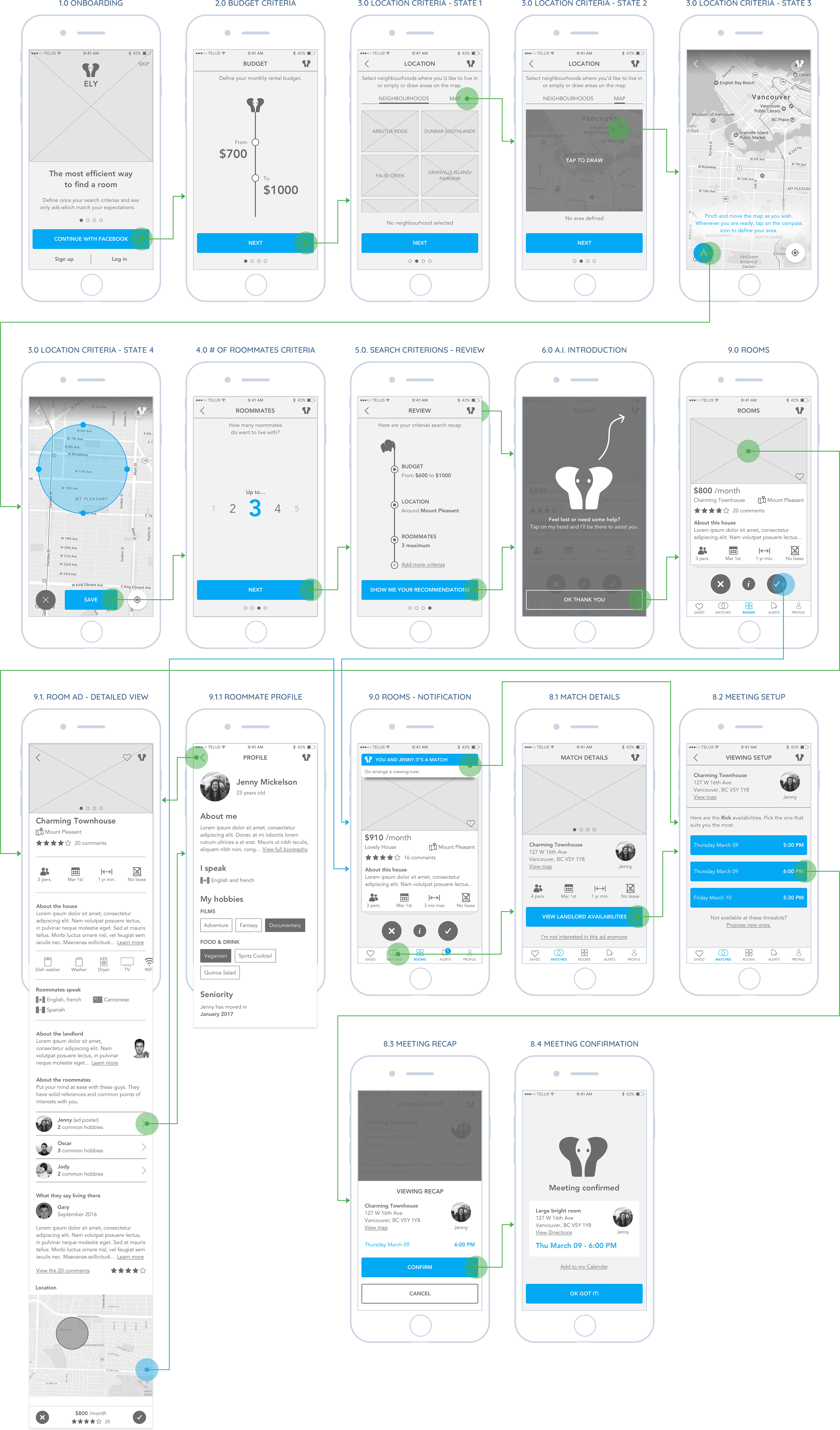
Wireframes

Thanks to our sketches and I.A., we have then designed digital wireframes. The objective was to build a prototype and start testing as soon as possible the Room seeker flow.

Here is the prototype we have built:

Tests


First iteration

To test our prototype we have tried to recruit 5 users as close as possible to Jane, our room seeker persona. Here was our user panel:

  • 4 women
  • 1 man
  • from 25 to 32 years old
  • had lived or currently live in a shared space

Before running the tests, we read to users a scenario to make sure they would understand the mindset of the room seeker persona. Here was the scenario:

Originally from Airdrie in Alberta, your are Jane a talent recruiter who moved in Vancouver last summer after accepting a new job. Conscious about the expensive price of the housing market, you have chosen to live in shared accommodation. Focused on the rent cost at that time, you did not take care to learn more about your roommates before moving in. Unfortunately, you quickly realized you have no affinity with them. Worst than that, some tensions have recently appeared. You have now reached a point where you are uncomfortable every time you get back home. Hopefully, you recently heard about a new app called Elly which helps people to find a shared accommodation with people they are in affinity with.
It’s Saturday afternoon, you are chilling, drinking a Latte in a coffee shop. You think it’s a good time to test this new app. You just downloaded it and are about to launch it…

To evaluate our design we have asked them to complete these tasks:

  • Find a room in a shared space with the following criterions:
    – a monthly rent between $700 and $1000,
    – located in a specific zone of the Mount Pleasant neighborhood (delimited by Cambie St and Main St on one side, and W 16h Ave and W 6th Ave on the other side)
    – live with 3 other roommates maximum
    – a 1 year stay minimum duration
    – reviewed with 4 stars minimum
  • Discover common points of interests with other roommates
  • Arrange a viewing on Thursday, March 9 after 5:45 pm

Prior to running the tests, we had some hypotheses:

  • We thought that users will find out how to define their monthly rent budget as well as the maximum number of roommates they want to live with.
  • We thought that users will understand the swiping gestures to express their interest or not for an ad.

We also had some fears regarding our design:

  • We were not sure if users would find out how to narrow their search to a specific zone of a neighborhood.
  • We were not sure if users would understand how the matching system between room and roommate seekers work.

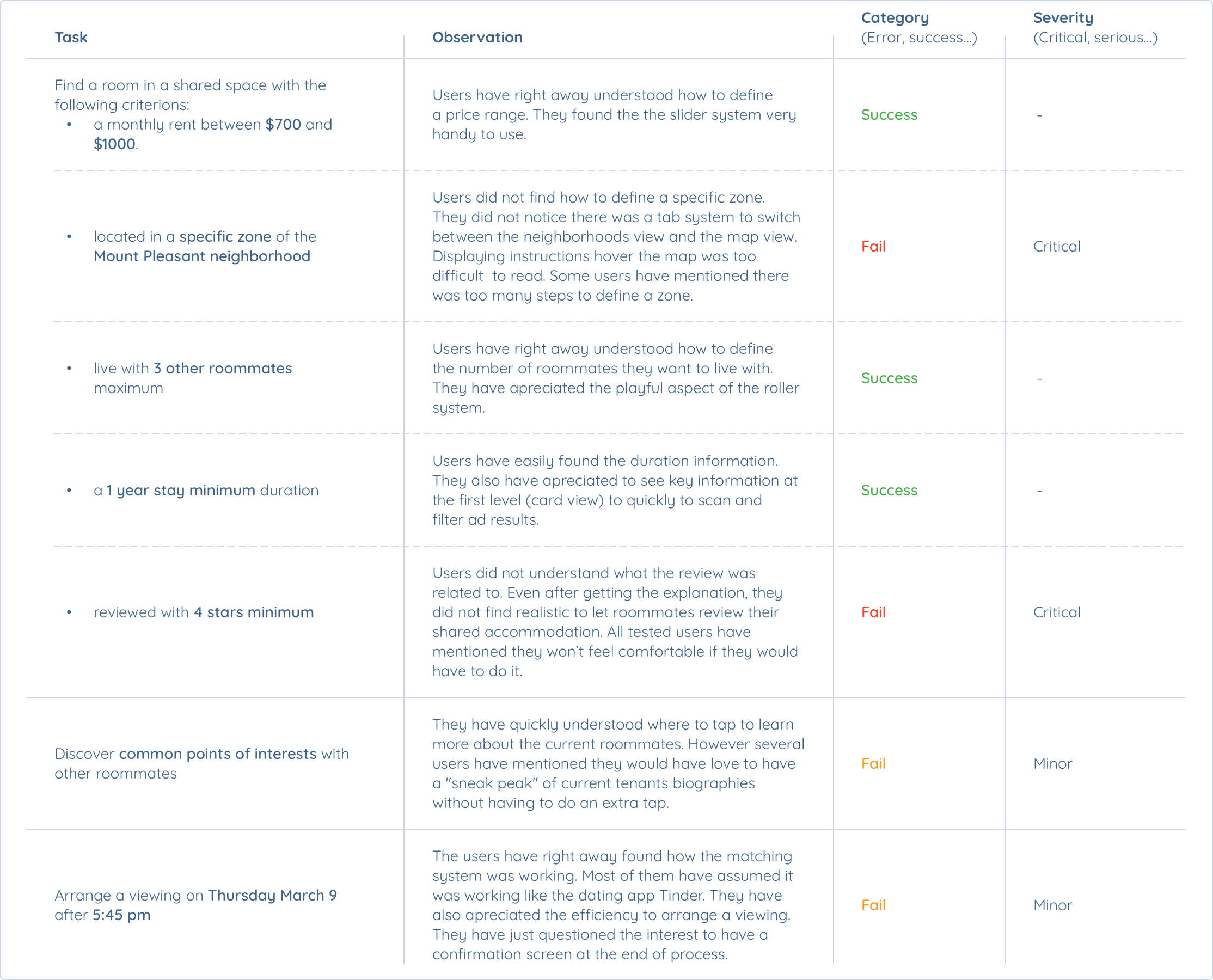
Here were the key takeaways of our testings sessions:

Second iteration

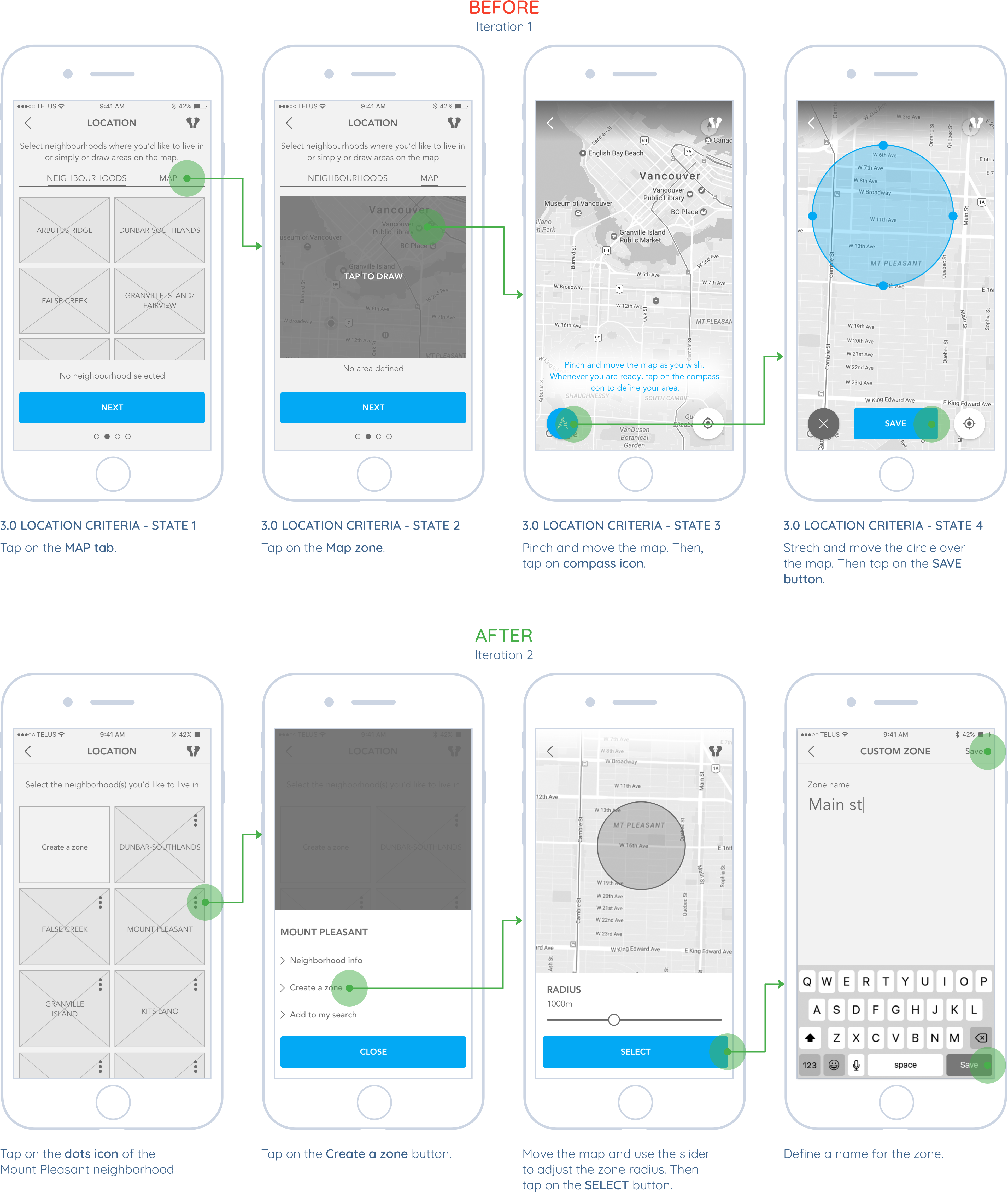
With our test results in mind, we got back to pen and paper to solve the issues mentioned by our users. Here is how we have tackled the issue related to defining a search zone from a specific neighborhood (Mount Pleasant).

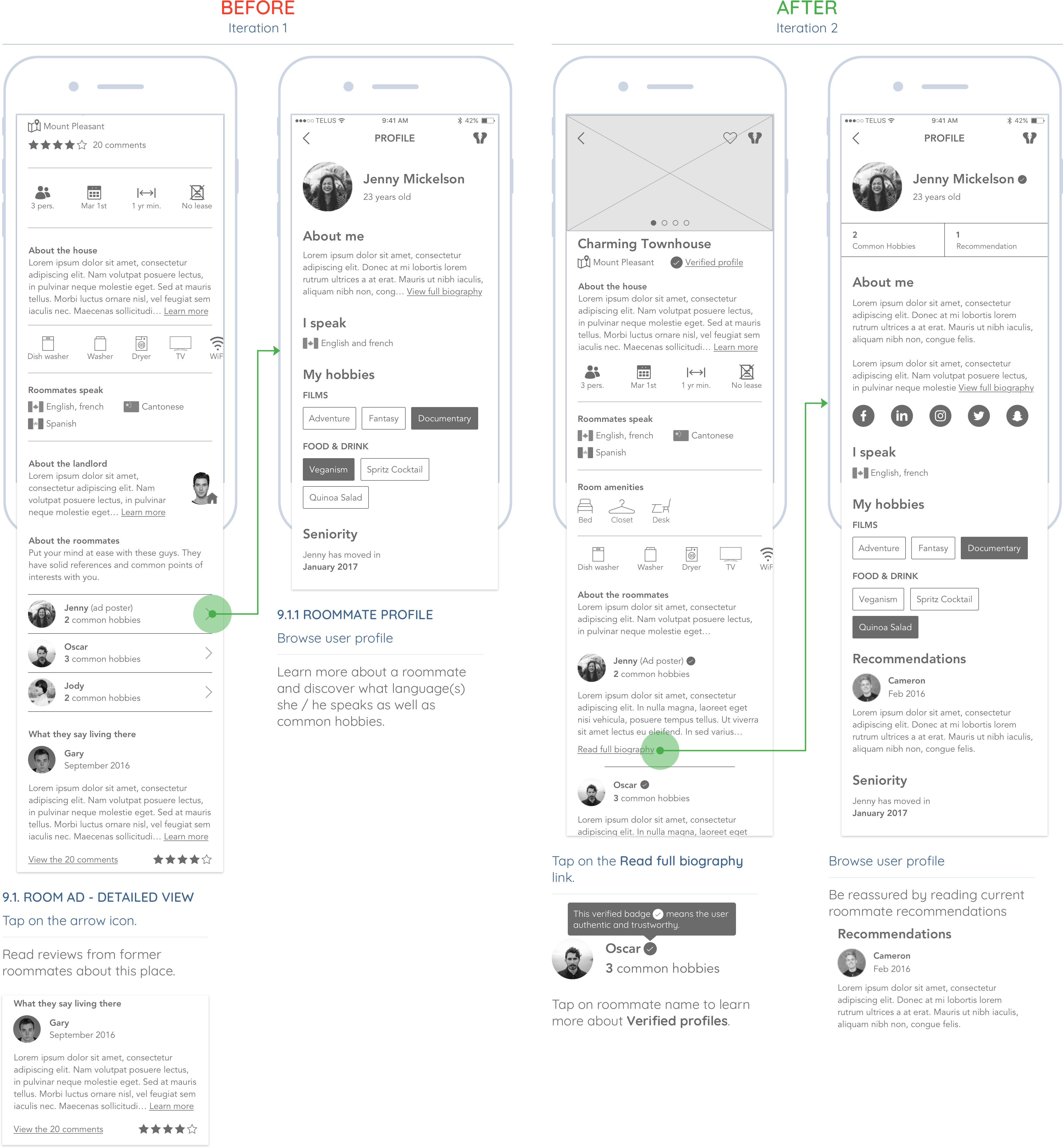
We have also tackled the issue related to the review system. From user feedback, it sounds the review system was unclear. They were also no comfortable to review their shared space. For these reasons, we got rid of the review system. However, we still wanted to address the security topic, which was one of the main concerns of our targeted users.

To do so, we have created a label named “Verified profile”. To get it, the ad poster (roommate seeker) has to write a small biography about himself, link to its profile at least one social media account (Facebook, Linkedin, Twitter, Instagram…) and get at least one recommendation from a previous landlord or professional contact. This is by having this transparent approach we wanted to build trust and security.

Here is how we have translated this idea into wireframes.

To test our second iteration we have recruited 5 new users. As before, we have given them the same scenario and have asked them to achieve the same tasks except one. Because we got rid of the review system, we have asked them this time to

Prior to running the tests, we still had some fear regarding our design and especially if users would understand this time how to narrow their search to a specific zone of a neighborhood. Our other concern was about the “Verified Profiles”. We were not sure if users would understand the purpose of the label.

Here were the key takeaways of this second round of tests:

Even if this second round of tests revealed new issues, we had to move forward and start producing mockups because of the tight deadlines we had. However, we have taken into account the user feedback and have integrated them into our hi-fi mockups.


The solution


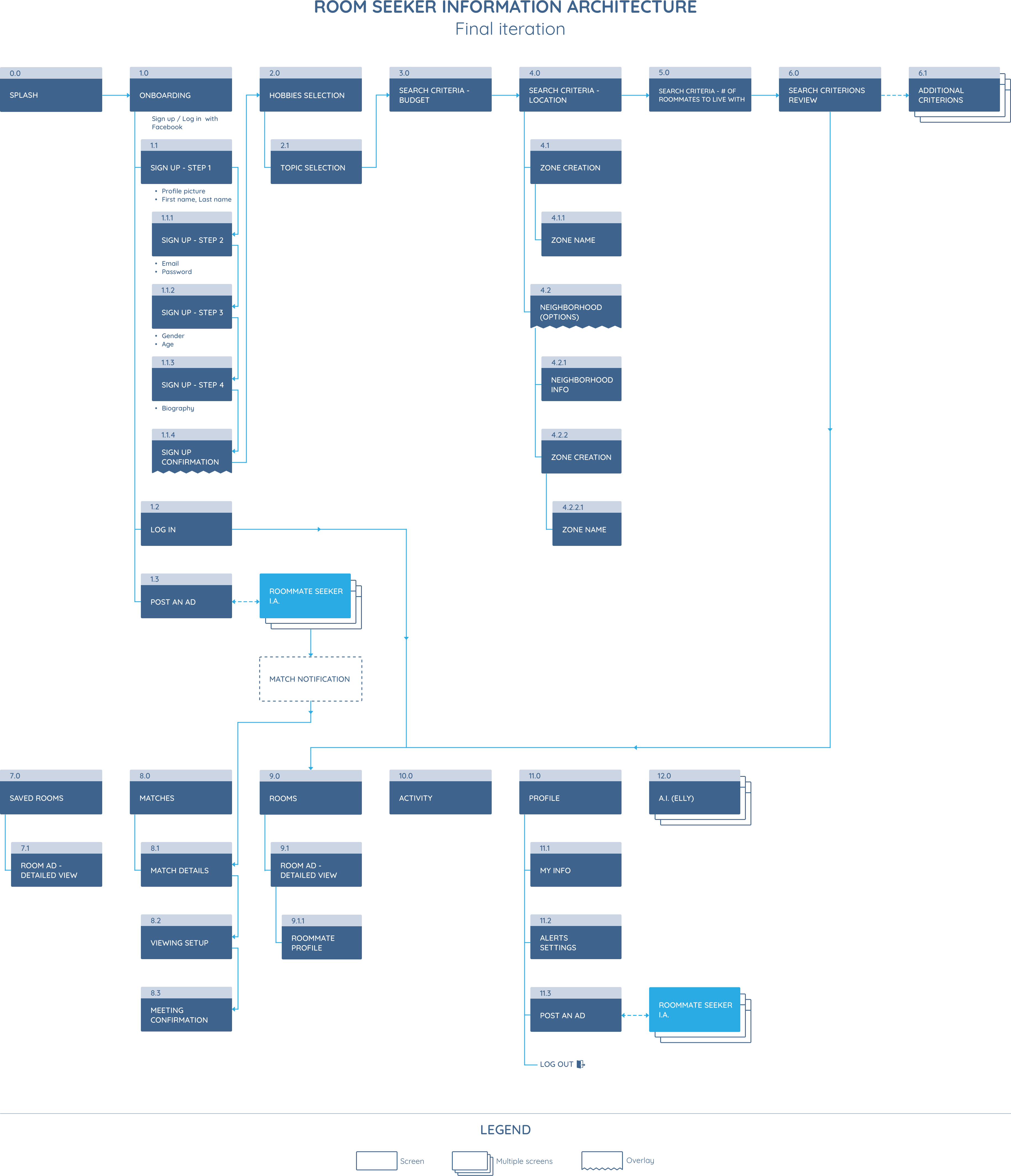
Final Information architecture

Prior to start working on the visual style of the application, we have adjusted our initial I.A. to reflect the discoveries we have made during the user testing sessions.

Style tiles

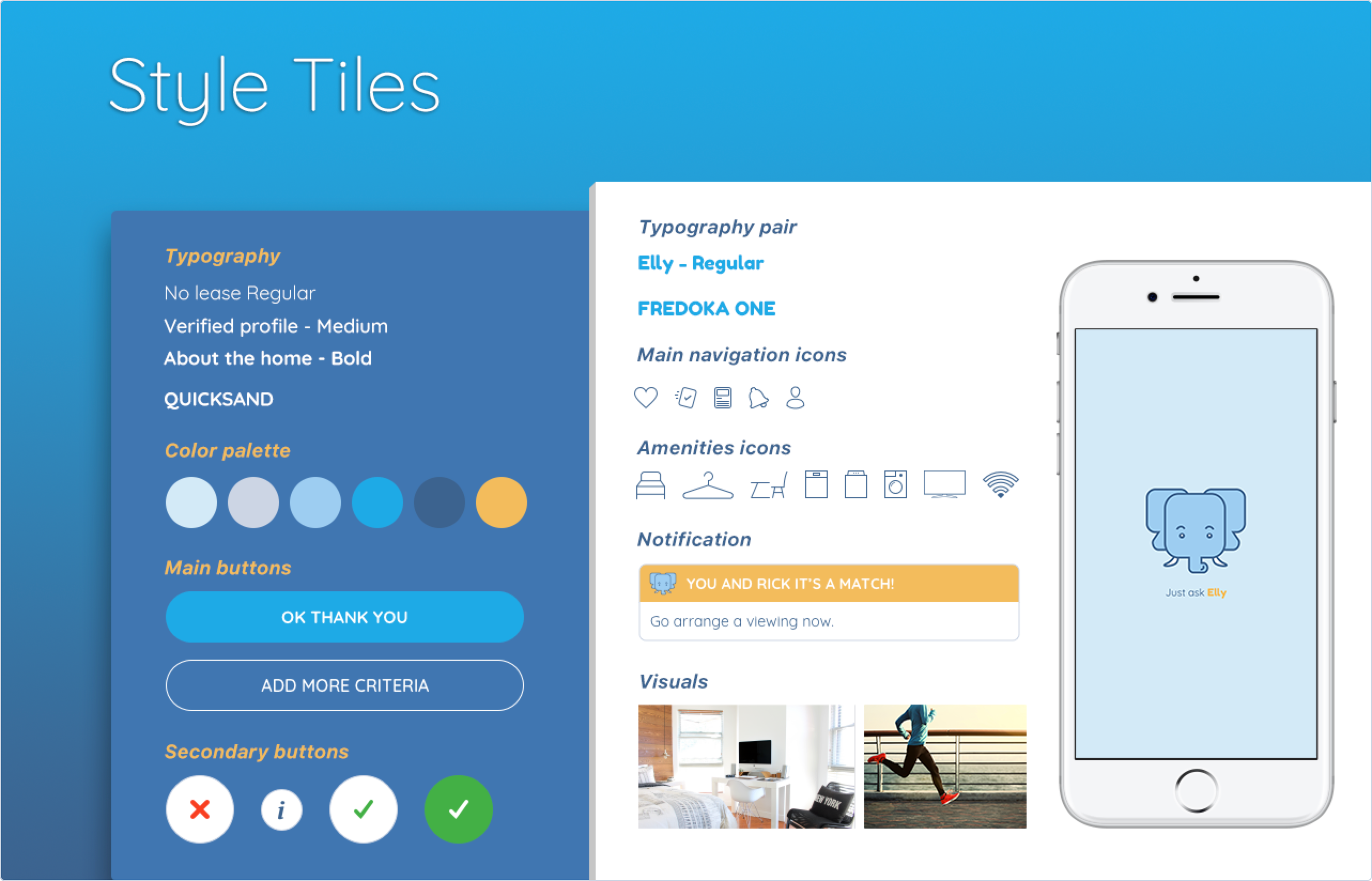
Based on our mood board and branding we have then built a Style Tiles. The goal of this exercise was to define the visual components we were going to use across the application.

Following the rounded style of the Quicksand typography, we have applied the same approach to design our main buttons. This idea was to reinforce the soft and approachable tone we had previously defined. For the secondary buttons, we have deliberately chosen to mimic the ones from the dating application Tinder. By using the same design pattern, the goal was to reduce as much as possible the learning curve on how the application is working.
In addition to Quicksand, we have also chosen another font to incarnate the personality of our A.I. assistant. With its bold and round shapes, we have found out that Fredoka One was a good fit to translate the friendliness and approachability of Elly.

In response to some negative emotions we have gathered during our UI research, we have also put a lot of attention to design icons with no fill as well as not having sharp shapes. The objective was to create a calm and simple environment to not overwhelm our users. To convey positive messages, we have also used the meaning of our accent color. This is why we have used the yellow to display Match notifications (see the unique selling proposition section for more information). Finally, we thought room visuals should also create user interest by conveying as much light as possible.

Hi-fi mockups

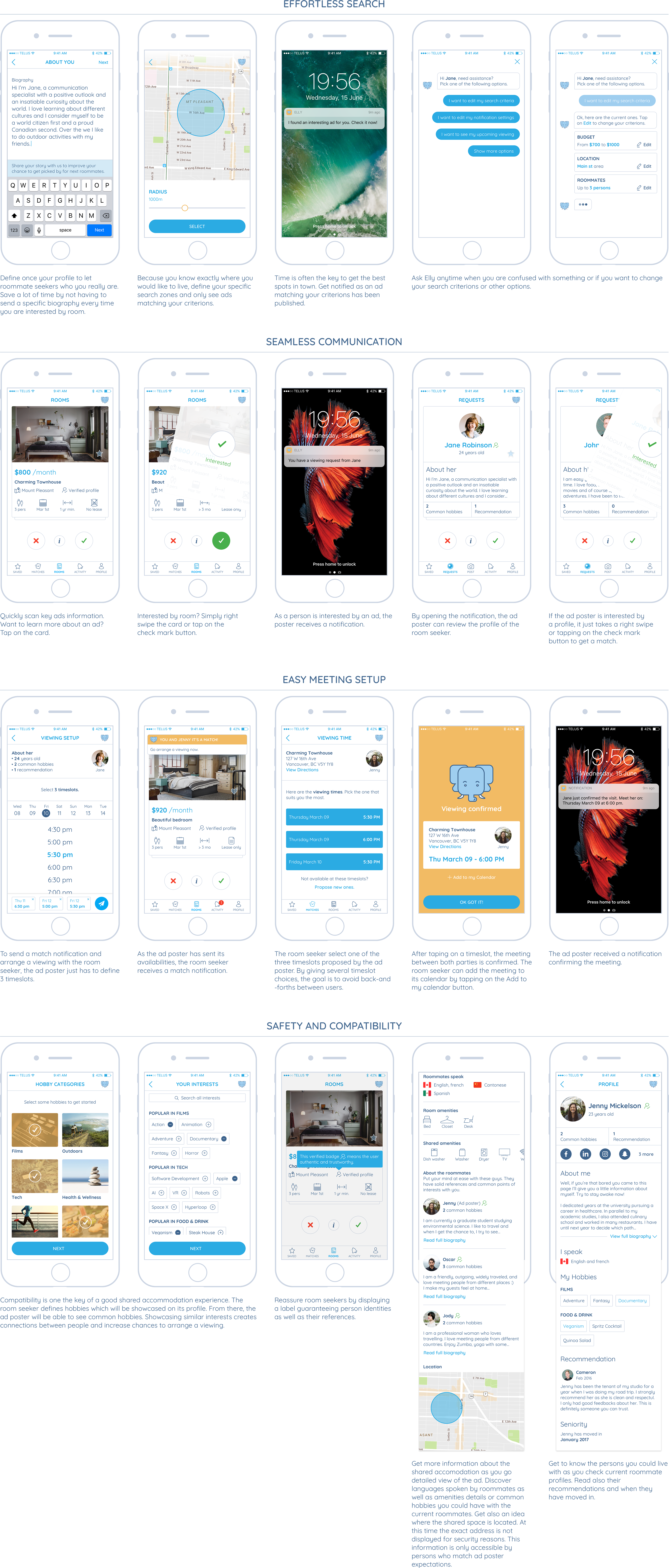
From the beginning of the project, we knew we would have to deal with tight planning. To make sure to meet the deadlines we have focused our thinking on the room seeker. We have more especially put our efforts on search criterions definition as well as the process to arrange a viewing. However, to have a more refined version of the MVP, I have designed additional screens. Please, note that these new screens have not been tested.

How we are different

We knew we were not the only ones to tackle the problem of the shared space. However, we thought there was room for improvement. Here is how our application is different from the current solutions.

Takeaways

It has been such an interesting journey to design this mobile application. Dealing with a short time constraint forced us to be extremely organized and efficient to meet our deadlines. In this context, our research phase has been essential to identify user expectations and frustrations. This is how we have discovered two important discoveries. Contrary to what we thought, landlords are rarely involved in finding new tenants for their property. We have also discovered how important communication, was in the room search process, or in roommates’ daily life. Security and character compatibility were also major concerns. In addition to these discoveries, designing the room seeker and roommate seekers flows helped us to identify pain points.

These insights have been very precious when we have started to sketch our solution. Using the design studio method gave us the freedom to explore different approaches as well as identifying missing screens in the room search flow. Then, digitalizing our ideas into wireframes and building a prototype allowed us to verify or not our assumptions. This is how we found out that offering a review system to evaluate shared accommodation was not the right approach to building security and trust.

Thanks again to our users, we have also been able to build our brand identity. Gathering their insights helped us to translate their mixed feelings into a design conveying calm and friendliness.

Even if we are quite satisfied with the end result, we would have liked to have more time to design and test more screens, especially on the roommate seeker side. Focused for now on the search process (room or roommate), we think the application could evolve and facilitate user’s life after finding their shared accommodation. Letting users pay their rent or organizing house cleaning chores, are some of the ideas we had to make the application evolving.
Thanks for reading!