Rakuten Rewards

CASE STUDY

Rakuten Rewards: Referral experience redesign


Project summary: Redesign the referral experience to support company OKRs

Methods: Surveys, competition analysis, mockups, prototyping, usability tests

Tools: SurveyMonkey, Sketch, Figma, Invision

Role: Lead Designer, from conducting research to delivering mockups

Platform: Web – mobile + destkop (Non responsive)

Team: Worked with product managers, marketing specialists, and developers

Context

Rakuten Rewards is a cash-back and shopping rewards company. Members of the site click through affiliate links before shopping at a retailer’s site. Once the member makes a purchase, Rakuten Rewards receives an affiliate commission from the retailer which is then shared with the member.


How the referral program works

    1. The referrer shares its unique referral link to a friend
    2. The referee (friend) joins Rakuten using this link
    3. Once the referee clicks on an affiliate link (from Rakuten Rewards) and spent $25+ on a partner store, the referrer gets $25, the referee $10.


Problem we are trying to solve

Teaming up with product managers, we looked at referral metrics and noticed a large portion of members who visited the referral landing page did not share their unique referral links.


Why is it a problem?

By not offering an optimal referral experience, we are missing a chance to increase our member database and ultimately generate more business.


Who are we designing for?

Authenticated Rakuten members


Design we wanted to improve

Constraints

1. Work with the Rakuten Design System
2. Provide a design solution allowing the marketing team to quickly update the bonus referral amount without creating new visuals.
3. Reuse the email referral component to reduce development efforts as much as possible
4. Reuse as much as possible existing referral email templates to reduce development implementation


What metrics will we use to measure the impact?

  1. Increase members sharing their referral link
  2. Increase “Refer a friend” landing page visits to share conversion

Research


Discovering rationales

Kicking off this project, I did not have any customer insights to help me out designing a solution matching members’ expectations. That’s why I designed a survey.


Method:

• 3 questions survey via SurveyMonkey

• Email open rate: 16.7%

• Survey ran for 4 days


 Participants:

• Sent out to 44k Rakuten Rewards authenticated users:

• Visited the Referral page at least once since 1/1/2019 on Desktop

• Did not send any referrals since 1/1/2019 on Desktop

• 654 responses, 141 open-ended responses


Goals:

• Understand members lack of motivation/interest around referrals on Rakuten Rewards

• Discover member aspirations about friend referral

Analyzing results here is what stood out and how I was envisioning to tackle those insights:

Competition Analysis

In addition to those user insights, I completed my research phase with a competition analysis. As most of our competitors did not offer innovative ideas regarding their referral experience, I enlarged my analysis to all types of businesses.

Design


Refining the project scope

At this point of the design journey, we had a clear idea of features/components we wanted to include in the redesign. Compiling user insights and relevant ideas from other referral programs, we prioritized features in 2 phases based on the effort vs impact model.


Phase 1 will include:
– a storytelling component explaining how the referral program works
– edit/add new referral methods (including a QR unique to each member)
– a dashboard indicating referees statuses in their referral journal
– a FAQ related to the referral program


Phase 2 will include:
– social proof/leaderboard (a gamification mechanic)


Mobile – Design iteration 1

Following a mobile-first approach, I designed a flow reflecting the action items I surfaced during my research. To land on the « Refer a friend » page the user has to tap on the « Refer & earn $25 » button from the header.

How I integrated my research insights:

Improve the way we explain the referral program

On the current design, the component explaining how the referral program work, was very low in the page information architecture. One of our assumptions was that not necessarily all users scrolled the page and read the content explaining how it works. This is why I surfaced above the fold, a call to action driving users to a page explaining the program in detail.

In this « How it works » page I decided to develop a storytelling around 2 fictional characters, Sarah and Gary. My goal was to clearly differentiate bonuses earned by both parts. Indeed the referrer earned $25 while the referee $10.


Limited link sharing methods

I introduced new ways to refer friends via QR code and Facebook messenger. Those new methods were on the top of existing ones: SMS and the referral link copy.

To identify which ones I would put more emphasis on, I teamed up with my product manager and looked at the most used referral methods on the current design. It appeared the 2 most used were the « SMS » and the copy feature (copying the referral link). To reflect this hierarchy in my design I made the SMS and copy link methods larger than the other ones. To reinforce the emphasis on the SMS method (the most popular one) I also used our pink accent color to make it more visible.


Answers questions users could have about the referral program

I introduced in the « Refer a friend » page, a FAQ section dedicated to the referral program.

In addition to answering questions related to this topic, the goal was also to avoid to see users leaving this page to find their answers. That’s why I used an accordion system to display answers. As a reminder one of the metrics I was trying to improve was to Increase members sharing their referral link.


Follow referees in their referral journey

As a reminder referees have to follow 3 steps to earn their referral bonus:
1. Click on the referral link they received
2. Sign up to Rakuten Rewards
3. Make a $25+ purchase from a Rakuten Rewards partner stores

To improve communication around where referrer friends are in their referral journey, I listed them as cards. Each card indicates in which of those 3 steps the referee is: « Invited », « Joined » and « Spend $25+ ». When a referee is at the « Invited » or « Joined » step, the card also includes a « Send reminder » link. Clicking on it sends an email reminder that encourages the referee to either join or complete a $25+ eligible purchase to earn a bonus.

Develop users engagement

To create excitement and encourage Rakuten members to get back to their referral section, I surfaced how much bonuses they could earn, if friends they invited, join Rakuten Rewards and make a $25+ eligible purchase. Those potential earnings live in the « Pending » tab of the « Referral activity » page.

This total is calculated by multiplying $25 (the bonus referral reward) by the number of invited friends who joined our platform but not made yet a $25+ eligible purchase.


Mobile – Design iteration 1.5

After sharing my first iteration in a design critic meeting I made some edits on the sections where I explain « How the referral program works ».

On the « Refer a friend » page I removed the photos of the fictional characters. From the feedback I got, adding photos made unclear who were those users. The unclarity also came from the fact I was also using a profile picture down below to surface the user profile picture (Mandy Jones).

Following this comment, I also removed the character photos associated with each step in the « How it works » page. I kept the step by step approach but made it more generic.

Mobile – Usability test 1

From the 1.5 version, I built a prototype and ran a usability test to evaluate my design solution.


Method:

Remote unmoderated via UserTesting


 Participants:

10 users

5 female – 5 male

25-55 y.o., $40k – $150k+

Rakuten users


Goals:

• Evaluate if users understand how the referral program works

• Evaluate if users understand how to refer friends

Evaluate if users understand the friend referrals tracking system


Here were the pain points revealed by the test:

Mobile – Design iteration 2

Following my action items, I edited my previous design and made those adjustments:

  • I removed the QR feature and the share button to give more room to the other referral methods.
  • I removed the profile picture and surfaced the « earned » and « pending » bonuses on the « Refer a friend » page. It avoids doing an extra tap to get that information. Users will have access to « earned » and « pending » bonuses breakdown by tapping on the « See details » and « See invited friends » links.
  • On the « Referral activity » page, I turned the top background-color in grey to create a higher contrast and make the « Pending » and « Earned » tabs more visible. The goal was to facilitate internal navigation and avoid having to get back the « Refer a friend » page to know how much bonuses are pending or earned.

Mobile – Usability test 2

Following the same setup as the previous one, I ran a second usability test to evaluate this new design iteration.

Here was the synthesis of this second test:

Desktop – Design iteration 1

For context, the mobile web and desktop web experiences were not totally symmetric features wise. While the mobile web version offered referral link sharing via SMS, the desktop version did not. The main difference between both versions was related to the email referral component. On the mobile web version, the approach was pretty basic as tapping on the email sharing icon opens the native email smartphone client. The desktop version allows users to send email invites directly from the friend referral page. It also lets the user import Gmail email addresses.

The product manager and I did not know the rationale explaining why the email component was different. To minimize development efforts, we decided to keep this difference as our goal was to launch the redesign as soon as possible.

Following the new mobile web design and the email component constraint, I designed the Desktop version. This is what my first iteration looked like:

Design and interaction notes:

Email referral component

While I did not change the core feature of the email sender component, I wanted to improve some elements of the experience.

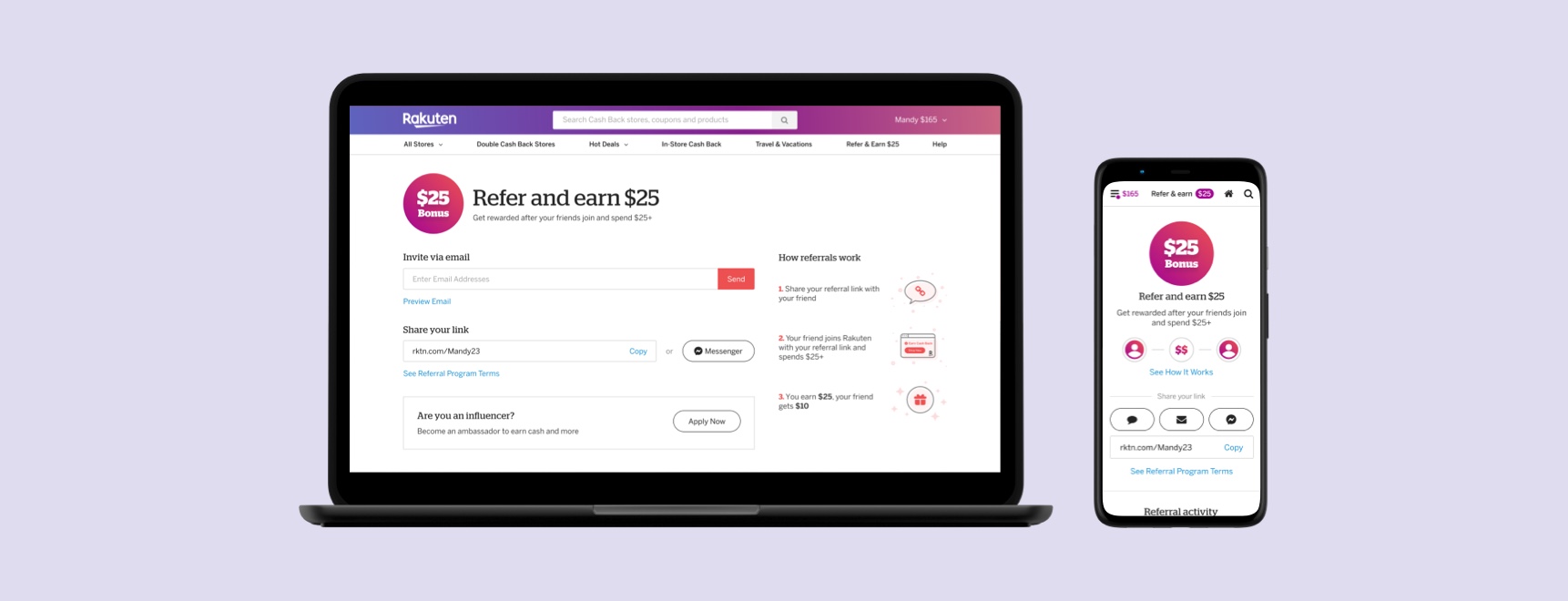
The first element I improved was the interaction around the button allowing users to send email invites. In the current design, the email component does not provide any visual feedback to indicate whenever the user can click on the « Send email » button to invite friends.

This is why I introduced states on this button. An inactive one to indicate the button is not clickable and active one to indicate it is clickable, meaning that the component is now ready to send invitation(s).

From my research, I also learned users care about not spaming their friends. That’s why I took care of not to overflooding users with too many emails as they already received a lot from other companies.

In the current design, once a friend received an email invite and did not sign up for Rakuten Rewards, another email will be automatically sent out 3 days later after the initial one. Similarly to other brands using an email referral component, I chose to give more control to the referrer. This is why after entering friend email(s) in the email field, the referrer will see a checkbox to automatically send or not an email reminder.


Desktop – Usability test 1

Following the same setup as my Mobile web ones, I usability tested to evaluate my design.

Here were the pain points revealed by the test:

Desktop – Design iteration 2

Following my action items, I edited my previous design and made those adjustments:

  • I moved the referral methods upper on the page to make sure they will be displayed above the fold. Because of that, some users did not see at all the referral methods during my first test.
  • I moved the « How referrals work » section on the right side of the page. My intention was to still keep it at the top of the page to maintain a logical information architecture. Indeed, as a new Rakuten Rewards member, I want to understand first how the referral program works before inviting friends.
  • I changed the visuals associated with each step of the « how referrals work » section. From a figurative style that created confusion on step 1, I switch to an abstract style to clearly indicates visuals are not clickable. For visual consistency, I have not only redesigned the visual associated with step 1 but all of them.
  • Regarding the checkbox allowing users to send an automatic reminder after 3 days,  the product manager and I finally decided to remove it to reduce development efforts.
  • As far as it concerns the inactive and active states of the « Send » invitations button, after sharing this idea with the Product Design team, it has been decided to not introduce this type of interaction. It would have broken the UX consistency with other buttons across the Rakuten Rewards experience.

Desktop – Usability test 2

Following the same setup as my Mobile web ones, I usability tested to evaluate my new design.

Here were the results after the second test:

Refining design screens

At this stage production, I was close to delivering the mobile and desktop screens to developers. However, I did some minor refinements to my design:

• On the mobile version, I replaced the initial visuals illustrating the « How referrals work » section by the abstract one I created for the Desktop version. The goal was to reinforce the UX consistency between both platforms.

As far as it concerns the Gmail email importer feature, after carefully looking at the metrics, we decided to remove it as it was barely used by users.

• Lastly, the product manager and I teamed up with a copyrighter to shorten a bit the copy as it was pretty heavy.


Adjusting emails

To complete the redesign of the Referral experience, the last piece I had to design was email referrals. As a reminder, those emails are the ones that referees will receive to either join Rakuten Rewards or complete a $25+ purchase to earn their bonus.

Here are the emails referees will receive during their referral journey:

For the most part, it was about adjusting the messaging of already existing emails. As for other areas of the experience, our goal was to save time and test our ideas in production as soon as possible. On top of that, I also had to be mindful of the communication pressure we are sending to referees. The last thing we want to do is to spam the referees. As described in the timeline, referees will receive emails that will be automatically or manually sent. To avoid « spamming » a referee, a referrer won’t be able to send an email reminder (« invitation » or « shop reminder ») within the next 7 days after the last one.

With this new tracking experience, I introduced an email reminder whenever a referee joined Rakuten Rewards but did not complete yet a $25+ purchase. The goal is to encourage referees to make this eligible purchase and earn their bonus. To create the « Shop » email reminder I took the « invitation » email template and created a variation of it. This is what email templates look like:

Final design

Here are what the final design looks like:

Results

I did not have the chance to measure myself the impact of this redesign as I left Rakuten Rewards a couple of days before the project launch. However, from the feedback I got a couple of days after the launch, it sounds the results were mixed. While the number of « members sharing their referral link » drops a bit on Desktop it increased on Mobile. Regarding the « Refer a friend landing page visits to share conversion », it drops a bit on both platforms.

Looking at the referral page a couple of weeks after the project launch, it sounds the redesign did not meet success as the « old referral page design » is displayed to users.

Takeaways

While I really enjoyed working on this project, I also feel very frustrated. Before getting this project split into 2 phases, the new approach was supposed to include a dedicated strategy to meet our OKRs. My idea was to introduce a gamification layer that would have encouraged users to refer more friends and develop their loyalty to the referral program. At that time the concept was not defined yet but I have been told it would have increase too drastically the project scope. This is why I had to revise the initial ambition and split the project into 2 parts. With this phase 1, the goal was to build new foundations and reinstate trust as it sounded to be a major pain point for users. With this approach, I was also expecting to have a positive impact the customer support. By offering a clear referees tracking system, I was hoping to improve communication and observe a decrease in customer support requests related to non paid referral bonuses.

From a design standpoint, I also feel I could have done a better job to simplify some components such as the activity. I guess I was too influenced by my usability tests. That’s one of the learnings of this project: find the right balance between user feedback and my design gut feeling. From a strategy perspective, I think the product manager could have done a better job of communicating about this redesign even if it was just an A/B test. For users, there was no way to know the referral section has been revamped. However, I don’t think it would make a difference metrics wise as this project phase 1 did not have this intent. The product manager and I should have made ourselves clearer about the new project phasing and mentioning that would not have a significant impact on the short term. Even if this project did not take the direction I expected I feel I learned a lot especially in terms of strategy and internal communication. It was definitely a good learning experience that helped me to improve the way I collaborate with various stakeholders.

Thanks for reading!