Liv

CASE STUDY

Liv: housing finder platform


Project summary: Design and redesign product features to enrich the user experience

Methods: Field study, mockups, prototyping

Tools: Sketch, Principle

Team: Worked with a product manager, developers, illustrators, and motion designer

Role: Lead designer, from designing screen flows and interactions to maintaining the design system

Platform: iPhone application

Context

Liv is a housing finder platform dedicated to the rental market. From looking at listings, booking viewings to signing a lease, and paying rent, it covers the entire user journey of the housing seeker.

The idea of launching a platform dedicated to the rental housing search came from the Machobear owner. He owns a real estate company and the studio developing the platform. When I joined the Machobear, « Liv » was not available to the public yet. It was just an iOS app that was close to being released on the App store. At that time the app was an advanced MVP. Users were only able to search for apartments to rent, chat, and arrange a viewing through the app.

As Machobear was a startup and did not make any money at that time, our financial resources were limited. I was the only UX/UI designer at that time. The company’s focus was to improve some UX weaknesses of the MVP as well as developing new features. Our time constraint was that intense that I never had the time and resources to usability test my design solutions. Features requirements and feedback on my designs came from the product manager and real estate agents.

When I joined Machobear, there was already a design system in place. However as I had to redesign some existing flows, a lot of components and atomic design elements became obsolete. Even if really enjoy enjoyed updating the design system, I ended up having some UX inconsistencies across the application. I wish I had enough time to maintain the design system and create/edit new design flows.

Research

It is unclear to me how they define their MVP but I know they worked closely with the estate company to define the platform specifications. Before joining Machobear I worked on my own on a similar project named Elly. The goal of this mobile application was to enhance the room/roommate search experience. I found the pain points I discovered during my research were also applicable to the housing seekers. Here the ones that probably nourished the creation of their MVP:

  • Lack of trust, there are a lot of scams on listing platforms such as Craiglist. On the landlord/agent side it is also about finding a solvent and respectful tenant.
  • Time-consuming, between scams, non updated ads (apartments not available anymore), drafting emails to contact landlords/agents, doing follow-ups, and schedule viewings, it takes a lot of time to find an apartment. On the landlord/agent side, it is the same. Searching and filtering potential tenants take also a lot of time.

Similarly to what I did, their mobile application has 2 entry points:

  • a « housing seeker» side, users looking for housing for rent
  • a « landlord/agent » side, users looking for a tenant

Design


Information architecture

Before sharing how we turned user pain points into design solutions, here was for context, what was the information architecture of the “MVP” when I joined Machobear:

Tenants:
Dashboard listing past, current, and upcoming tenants.

Listings:
Section dedicated to listings management: create, edit, and delete listings. This is also the place the landlord/agent sets its availabilities for the housing viewings.

Showings:
Section listing past and upcoming housing viewings.

Activity:
Section where the landlord/agent can chat with housing seekers/tenants. This chat also integrates all milestones the housing seeker will go through during its housing search: housing viewing time, application document, lease, and rent payments.

Profile:
Section including landlord/real estate agent information. Real estate agent managers also have access to admin features. They can create and delete real estate agent profiles. Managers can also attribute who is going to be in charge of listings.

Rentals:
Once a Liv user becomes a tenant, this is the section where all tenancy documents are displayed. From there, the tenant can also make rent payments.

Matches:
Section dedicated to housing search. The user can filter listings and get detailed information about those.

Activity:
Section where the housing seeker can chat with landlords/agents. This chat also integrates all milestones the house seeker will go through during its housing search: housing viewing time, application document, lease, and rent payments.

Profile:
Section including relevant user information related to housing search.

Product core features

I had the chance to design or redesign a large part of the application, including the 2 pillars of the MVP I am about to present. I won’t focus here on the rationales which led my design solutions, as my goal, for now, is to explain the core concept of the platform. However, I will explain in detail in the “Enriching product features” how I designed some other areas of the Liv experience. Getting back to the MVP presentation, here are the 2 pillars Machobear focused on to improve housing/tenant search:


Be effective

Similar to the Tinder dating application, housings for rent and housing seekers are presented as cards. This way, users can either have a preview of the essential information about the housing or the housing seeker information without doing an extra tap. From there users can also:

  • initiate a chat
  • add cards to favorites (to check those later)
  • dismiss cards to never see those again

This “dismiss” feature aims to offer a more efficient search. The next time, the user will open the app, only new listings / new housing seeker profiles will be displayed. To go further, housing seekers and landlords/agents can apply various filters to refine even more their search.

Build trust

Similar to resumes, housing seekers and landlords/agents have to create a profile. Those profiles aim to reassure about user identities and backgrounds. Housing seekers and landlords/agents can become “verified”. Displayed aside their name, the verified icon means they provided to Liv an ID guaranteeing their identity. To continue building trust, users (both sides) have to provide a short biography about themselves.

If this first “layer” of trust is common to housing seekers and landlords/agents some others are specifics

Real estate agents also have to provide extra details:

  • company information (name and address)
  • business license
  • job started date
  • number of housings managed


On the housing seeker side more information is required:

  • astrological sign
  • smoker or non-smoker
  • pets owner or not
  • current address
  • emergency contact information
  • Liv score (credit score + job information)
  • job-related documents
  • references (employment and landlord)
  • insurance information
  • roommate information (if applicable)

Housing seeker profiles are also a huge time saver as users don’t have to reintroduce themselves every time they start chatting with landlords/agents. They also save time when they apply for housing as most of the information required is already part of their profile. On the other end, landlords/agents can pre-filtering candidates by adding a minimum profile completion rule.  They can for example set a 50% minimum profile completion before allowing housing seekers to start chatting with them.

Enriching product features

Their MVP at that time was one illustration of how they wanted to enhance the housing search experience. However, Machobear knew they would need to create more added value to recruit users. This is why they already had in mind to develop new features to enrich the product. See what were the existing features and upcoming ones at that time:

In the following examples, I will focus on a few features I designed or redesigned. Those reflect my thinking and highlight the interactions between the housing seekers’ side and the landlord/agent side. Even if I did not have the chance to run a proper research phase, my design has been influenced by some rationales I had identified in my Elly project. Here were the users I was designing for:

Design problem 1


Problem I am trying to solve

As a landlord/real estate agent I want to be able to create a listing so housing seekers will be able to contact me about it.


Who are we design for?

Landlords/real estate agents


Design we wanted to improve

This is the previous listing creation flow I designed. At that time business requirements for listings creation were:

  • list apartment or house only
  • add/edit housing photos
  • housing details and features
  • housing location
  • lease terms
  • landlord/agent profile picture

What metric will we use to measure the impact?

Increase number of listings created


Design solution

Here are the new features I added:

  • townhouse listing creation
  • rent a part of a housing (e.g. 2nd house floor only)
  • security deposit
  • strata information (model of property ownership)
  • new housing rules (smoking, host guests)
  • extra terms (parking lot, storage, plus custom terms)

Design notes:

Balance the design

Before integrating new features, the listing creation process was already quite heavy. I did not want to overload the user with even more steps to create a listing. To avoid that, I started this redesign by mapping out the listing creation steps. Here were the steps users had to go through to create a listing:

This flow was one for landlords. Real estate managers had to go through an additional screen where they can select which real estate agent will manage a listing. This selection happened between steps 4 and 5. For context, real estate managers have admin rights on the platform. They can create agent profiles and listings. From there they can attribute listings to agents and promote other agents as admin.

On top of that, some steps can require extra efforts if the landlord/agent needs to add some rules. For example, in step 2, it is possible to set pets policy by defining how many cats, dogs are authorized. The user can also add custom rules for other pets.

When I thought about this redesign I had to think about those « worst-case scenarios » where a real estate manager needs to add a lot of details about a listing. Adding new features to this flow forced me to reconsider every step and information required. The main takeaway of my flow analysis was that step 4 (landlord/agent profile upload) had to be removed and reused for another purpose. While I was defining the new information architecture, I had to be mindful of the quantity of information I asked users within every step. I tried balancing the efforts between steps to avoid discouraging them to create a listing. This is what the new flow looks like after the redesign:

Facilitate navigation

As creating a listing requires filling out a lot of information, users won’t necessarily do it in one go. That’s why I introduce a « Save and exit » button. After filling some information, the user can save its progress and finish creating a listing later.

To make the navigation even more obvious, I also decided to create a sticky navigation bar at the bottom of the screen. This way, whatever the height of the screen, the button to move to the next step is always visible.

Facilitate data input

As the user already has a lot of data to enter during the listing creation, I wanted to reduce the input level effort whenever it was possible. That’s what I did with the housing address input. From the « Get started » screen, when the user taps on the « add address » it opens a search engine screen. As the user starts inputting the address, formatted addresses results appear. If the address matches a building which has already been inputted by another landlord/agent, a photo of it will also be displayed. Once the address found, tapping on it will close the search engine to bring back the user to the get started page. At this point, the housing address has been automatically broken down into the address different fields (street address, city, postal code…). If the address selected was a building, it will also automatically include the building name. The only information the user will eventually need to input is the suite name if there is one.

Provide feedback

To make the level effort more transparent it was also important to provide user feedback alongside its listing creation journey. This is why I introduced a progress bar at the top part of the screen. It helps the user evaluating how long the creation process will be.

To avoid handling multiple error messaging I also chose to create button states on each step of the process. This gives users a simple visual hint makers users understand that a least a piece of information is missing at this step.

On the photo uploader component, I also introduced contextual messaging to let users know what is the minimum of photos to upload to publish their listing. Similarly, during the photos selection, I included in checkboxes a number, indicating the position the photo will have in the carousel. As a reminder, those photos will be displayed at the top part of the listing.

Improve photos reorganization

1. The original design

When I worked on the original design, here were the requirements of this photos reorganize component:

  • add and delete photos
  • see full-size photos
  • reorganize photos

In my original design, I followed a horizontal approach. My thinking was to horizontally display photos as the user browses them by swiping left or right. The top part displays in full-size a photo. Right under, thumbnails represent all the photos uploaded by the user. Tapping on a thumbnail displays it full-size at the top of the screen. The user can also horizontally scrolls thumbnail to browse photos.

To reorganize photos, I introduced a drag and drop gesture. The user had to tap and hold a thumbnail to drag and drop it in the desired position. The thumbnail on the far left represents the cover photo. The cover photo is the default photo displayed by default on a listing. To make this clear a « cover » tag is displayed over the full-size visual. Another visual reference to the cover is displayed once the user drags the far left thumbnail or drop another thumbnail close to the far left one.

To delete a photo the user has to tap on first on the thumbnail representing the photo to remove. Then the user has to tap on the trash displayed on the bottom right of the full-size photo.

Finally to add photos the user has to tap on the « Add » button at the bottom right the screen. It will open a prompt allowing the user to either take a picture or import photos from the library.

2. The redesign

As I had to integrate new features in the listing creation flow, I also wanted to come up with a better design solution. Even if browsing photos horizontally made sense as it followed the carousel approach, I found it less convenient than scrolling vertically. I also thought the photo deletion process could be improved as the delete icon does not stand up much over the full-size photo.

With those elements in mind, I took the opposite direction trying to simplify the design and interactions. I chose to remove the full-size photo at the top and just have a single column of large photos. For each of them, I added on the left and right size icons. The trash bin icon is to delete the photo while the « 3 stack bars » one indicates a draggable interaction. Tapping and holding this icon lets the user moves a photo to put in another position. The top photo refers to the cover one. As in the original design, the user can add more photos by tapping on the « Add » button at the bottom right of the screen.

To me, this redesign feels more intuitive and use better the space of the screen. Users can now see bigger and more photos without having to scroll. Deleting a photo is also from my perspective more obvious than before as there is no contrast issue anymore. Unfortunately, as all my other designs, I did not have the chance to usability test this new solution.

Improve listing readability

1. Improve contrasts and interactions

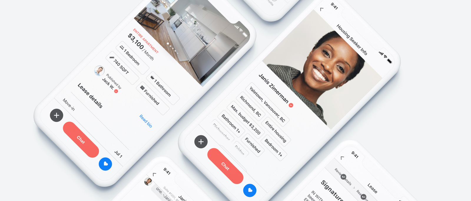
One thing that stood out when I looked at the existing listing template was the lack of visibility of the rent price. As the previous design direction was to display the price over the housing visual, the contrast was not really good. To make this information visible, the idea of the previous designer was to have a transparent dark overlay on the housing visual. By darkening the visual and displaying the rent price in white, the contrast was a bit better. When the previous designer created the listing template, the photo organizer tool did not exist. I had to find a spot on the template to access this feature without having to redesign this section. The only spot I found where it made sense to me, was the top middle part of the housing photo. I tried different variations: link text-only and short link text plus an icon. I chose the second option as it was the only one fitting the space I had, between the back button on the left end side, and the « Save and exit » link on the right end side. I finally labeled the call to action « Edit » and associated it with a camera icon to make the instruction clearer. It was not ideal but I already knew a listing template redesigning was coming.

Another element I was not satisfied with was the carousel. There was visually no hint indicating this area can be swiped. I actually discovered the interaction by playing with the application build. Similarly, I discovered the landlord/agent profile picture displayed over the housing visual was a call to action. Tapping on it drove the user to the landlord/agent profile.

When I started to work on the redesign the idea was to keep the housing visual as-is, as it created a simplistic and immersive feeling. As I thought using a dark overlay was not giving justice to visuals. To me, photos are on the key decision-maker for choosing your next housing. I removed the original dark overlay and simply used a subtle gradient from the top to the middle of the visual. The intent was still to keep good visibility of the « Save and exit » and back buttons. I also reinforced the contrast by adding a transparent overlay with dark blurry touches behind the call to action.

Regarding the call to action to access the photo reorganizer, I finally chose to move it right under the visual. Following the redesign of this component, the « edit » button became two calls to action: « Add photos » and « Reorder ». Adding a second once reduces the number of taps to add more photos. As a reminder with the previous approach, the user had to tap first on « edit and then tap on « Add » on another screen to add more photos (see the « Improve photos reorganization » section for details).

Lastly, I focused my attention on the photo component to make clear to users it is a carousel. Using a commonly used design pattern, I created over the photo, a pagination system represented by dots. Each dot represents a photo. To keep this pagination elegant, the number of dots is limited to 5. However, the housing seeker will be able to browse all photos. Thanks to a horizontal scroll animation, the user will understand there are still more photos to swipe.

2. Improve the information architecture

As I had to add way more details on the new listing template, I chose to reorganize the way information is broken down. I split the page into 2 parts. The first one is dedicated to the key information: rental type (entire housing, a part of the housing…), rental price, key features (# of bedrooms, bathrooms, housing size…), and landlord/agent profile. To make this content easy to read I create a visual hierarchy by playing with font size, colors, and background treatment. As this top part has a black and white color I made the rent price bigger to catch the attention. Close by the price, I used our pink accent color to surface the rental type. Right under the rent price, I display housing key features by creating a two by two grid of tags. Lastly, I surfaced the content dedicated to the listing creator (landlord/agent). In the previous design, the user did not have a visual clue indicating the profile picture of the landlord/agent was a call to action. To make that clear, I added the landlord/agent name as well as a « read bio » call to action. Tapping on this link drives the user to landlord/agent profiles.

The second part of the template is focused on details (lease, amenities, and housing rules). To structure this content, I created a « Lease details » section. It regroups the existing and new lease details I had to accommodate in this revamped version. To keep this section as condensed and consistent as possible I decided on purposed « hide » extra details behind « view details » call to action. Tapping on those links drives the user to detailed views. My intent was to find a balance allowing users to quickly scan high-level lease information without pushing amenities details to down below in the template. Regarding the amenities, I also chose to restructure this section to accommodate more details. That’s why I created subsections: features included, utilities included, utilities non included. The idea of clearly mentioning non included utilities came from real agent feedback. Some early testers complained about not knowing clearly if the rent included or not some utilities. Lastly, I regrouped the transit information close by the map indicating the listing address. My goal was to make the connection between the address and the transit time clearer. To do so, I created a timeline starting from the listing location to the various commuting options available.

Design problem 2


Problem I am trying to solve

As a housing seeker, I want to be able to apply to a listing using my “Liv profile” information so I won’t have to re-enter my information on another document/platform.


Who are we design for?

Housing seekers


Design we wanted to improve

As the application feature was suggested in some old designs the flow has not been created at that time. I started designing this feature from scratch.


Constraints

  • Follow and refine an existing design system
  • Reuse some existing navigation patterns


What metric will we use to measure the impact?

Increase user retention on the platform by adding a feature which is part of the housing seeker user journey


Design solution

Key requirements were:

  • use the housing seeker profile to fill out most of the application requirements
  • include an “offer more” feature allowing to offer more money for a listing. As some listings receive a lot of applicants, the goal was to help housing seekers to increase their chances to convince landlords/agents to rent them a listing.

Design notes:

Facilitate navigation

Listings and user profiles are quite rich in terms of data. To offer a pleasant experience and let users quickly scan content, I introduced expandable lists. In the following example, this system helps to get an idea of the housing seeker search criteria. With this approach, the user can access quicker the sections without having to go through a long list before.

To facilitate navigation I also reused a bottom sticky bar on listings screens. This bar includes the Chat, Add to favorites, and Dismiss buttons. This way, users won’t have to go back to the listing card view which offers the same call to actions. Also by keeping those buttons sticky to the bottom, users don’t have to scroll the entire listing to start interacting with it.

At the opposite, on the « Review details » screen I did not use a bottom sticky bar to embed the « Submit Application » button. At this point in the process, I wanted to make sure the user will scroll the page to review its application details.

Provide feedback

In addition to button states indicating whether or not they are active or not, I introduced a visual timeline a the top of the screen. Similarly to the progress bar, I mentioned in the listing creation flow, the goal was to let users know where they are in the application process. I visually treated this indicator differently compare to the listing creation one as the application process is way shorter. To me, using words versus a progress bar give is clearer feedback to users.

Build trust

As I mentioned in the « Product core features » section, building trust is one of the key pillars of the Liv experience. Developing trust around listings, housing seekers, and landlords/agents are essential to tackle one of the major pain points of this market. To do so, we developed our own trust label named « Liv score ». This score is calculated in points based on the user’s credit score and profession. Scores are broken down in 4 categories:

  • Poor
  • Average
  • Very good
  • Excellent

Displayed as a card, this score stands in the housing seeker profile. Each scoring category is associated with a specific color. Each score comes with a specific recommendation to provide guidance to landlords/agents and housing seekers. Contrary to housing seekers, landlords/agents have access to a detailed breakdown of the score. As it can be a key element in their decision process to chose or not a tenant, it was important to give them have many details as possible.

Design problem 3


Problem I am trying to solve

As a landlord/agent I want to be able to create and send a lease through the application so I could save some time by not having to re-enter housing seeker information on another lease document (paper or pdf) and then avoid to have to send it via email or mail.


Who are we design for?

Landlords / real estate agents


Design we wanted to improve

When I worked on this problem, the application did not offer a feature allowing landlords/agents to create and send the lease to housing seekers. I designed a solution pretty much from scratch. There were some existing screens but some pieces of the flow were missing.


Constraint

  • Follow and refine an existing design system
  • Create a system to ensure communication between landlords/agents and housing seekers whenever a lease is sent out.


What metric will we use to measure the impact?

Increase user retention on the platform by adding a feature which is part of the landlord/agent user journey


Design solution

Key requirements were:

  • reuse housing seeker application information and listing data to facilitate the lease creation
  • allow the addition of extra terms and addendums in the lease
  • add a “send lease” feature (sent to the housing seeker)

Design notes:

Facilitate navigation

As the lease creation regroups a lot of information I chose to break those through tabs. To make this navigation more visible and provide guidance to first times users I also created coach marks. Those explain at a high level what the user should review and add to the lease before previewing it.

Facilitate communication

As mentioned in my introduction, time is a crucial element when you are looking for housing. Getting notified whenever the landlord/agent or housing seeker sent you a message, lease or payment is crucial. It gives both parts more chances to not miss opportunities or deadlines. In this example, I highlighted one example of out of app notification. It’s of many I imagined communicating an important milestone to the landlord. The same approach applies to the housing seekers whenever landlords sent a message, lease, or payment request. This out of app notification system is not the only system I imagined to ensure good communication between both parts. I will describe others in design problem 4 or 5.

Design problem 4


Problem I am trying to solve

As a housing seeker, I want to be able to sign and send a lease through the application so I won’t have to search in my inbox, an email or mail before being able to do it


Who are we design for?

Housing seekers


Design we wanted to improve

When I worked on this problem, the application did not offer a feature allowing housing seekers to sign a lease. I designed a solution pretty much from scratch. There were some existing screens but some pieces of the flow were missing.


Constraint

  • Follow and refine an existing design system
  • Create a system to ensure communication between landlords/agents and housing seekers whenever the lease is signed and sent out.


What metric will we use to measure the impact?

Increase user retention on the platform by adding a feature which is part of the housing seeker user journey


Design solution

Key requirements were:

  • signing by typing or drawing
  • add a “send lease” feature (sent to the landlord/agent)

Design notes:

Facilitate navigation

To facilitate vertical scrolling and reach faster at the bottom of the screen, I chose to create expandable boxes. Those include data related to terms. Even if terms are all equally important, some are more crucial than others to review. That’s why some are expanded and some others not. I introduced this pattern at the step where landlords/agents or housing seekers are about to sign the lease and need to review all details. From the « Basic Terms » section, when the user taps on the « View All » button, all terms will be visible. Each of them is represented by an expandable box. As examples, « lease terms » or « rent details » boxes are expanded while « pet policy » or « parking information » are collapsed.

Provide communication

In addition to the « out of app notifications » I showcased in the design problem 3, I created « in-app notifications ». It aims the same objective to improve communication and ensure users won’t miss important messages or milestones. While they will be using the application, they could receive « in-app notifications » alerting them about a specific topic. In this « housing seeker – lease signature » process I chose to start my flow by an in-app notification. Taping on it drives the user to the signature flow. This one way to access it. The housing seeker could have also access it via an « out of app notification » or an activity card. I will describe activity cards in design problem 5.

Design problem 5


Problem I am trying to solve

As a landlord/agent I want to be able to sign and send a lease through the application so I won’t have to search in my inbox, an email, or mail before being able to do it.


Who are we design for?

Landlords / real estate agents.


Design we wanted to improve

When I worked on this problem, the application did not offer a feature allowing housing seekers to sign a lease. I designed a solution pretty much from scratch. There were some existing screens but some pieces of the flow were missing.


Constraint

  • Follow and refine an existing design system
  • Create a system to ensure communication between landlords/agents and housing seekers whenever the lease is signed and sent out.


What metric will we use to measure the impact?

Increase user retention on the platform by adding a feature which is part of the landlord/agent user journey


Design solution

Key requirements were:

  • signing by typing or drawing
  • add a “send lease” feature (sent to the housing seeker)

Design note:

Facilitate communication

When I joined Machobear the component I am about to describe was already there. Landlords/agents and housing seekers both have access to a section named « Activity ». As previously described, it acts as a chat section where you could also see the milestones related to the interactions you had with the landlords/agents or housing seekers. Those milestones are all actions (activities) you can run through the application: book a viewing, send an application, sign a lease, request/send a payment, request/end a tenancy… Those miles are represented as cards and let users view a document or start a process such as signing a lease. Having those milestones represented as cards help both parts to quickly identify and access important information. This is one way to retrieve documents such as a lease or rent payment receipts. Landlords/agents and housing seekers can also access documents generated by those milestones in dedicated dashboards.

Takeaways

It’s been a very interesting journey working on this project. First, because it was a natural continuity of my Elly project. It gave me the opportunity to convert in design solutions, the knowledge I gathered during this other project. Working on the Liv app also gave me the chance to work on a design system and develop it. I also really enjoyed teaming up with illustrators. Having beautiful illustrations and iconography helped a lot to break this « administrative feeling » and bring a human touch.

However, this experience has been a bit frustrating as I did not have the resources and time to come with a more solid solution. Having feedback from real estate agents was interesting but I won’t consider those as valuable as the one I could get from proper usability tests. Similarly, this lack of time did not let me developing and maintaining the visual consistency I would have loved to create. I realized that developing and maintaining a design system, in addition, to delivering new features was pretty much impossible. Those reasons among others explain some visual consistencies across the platform.

Overall this project was a great learning experience. I really loved working on complex processes on a two-sides application. It developed my capacity to see the big picture and anticipate interactions between landlords/agents and housing seekers. I wish I shared more work I did for this platform but it would have led to an even longer case study. Also, I chose to only present iOS design but I also worked on the Web version of the platform. At that time it was mostly a drive to the app experience but I was already translating for web some key flows of the experience.

Thanks for reading!