Fuud

CASE STUDY

Fuud: Meal kits delivery service


Project summary: This project has been completed in 2 phases. Project phase 1 was mainly about optimizing the meal kits subscription flow. Phase 2 was focused on adding new features to the meal kits subscription flow as well as adding a market section. From this section, users will be able to order market products from local partners (British Columbia farms and shops). Lastly, phase 2 was about developing new content dedicated to the Fuud people behind the scene.

Methods: Surveys, in-person interviews, data analysis, affinity diagram, customer journey maps, personas, field study, mockups, prototyping.

Tools: Google forms, pen and paper, Sketch, Invision, Principle.

Team: Worked with 2 other designers for project phase 1 while we were still design students. Phase 2 started after graduating from my design school. For this phase, I was on my own working directly with the company co-founder.

Role: Lead designer, from conducting research to designing screen flows and interactions

Platform: Mobile web

Context

Fuud is a subscription based delivering meal kits company based in British Columbia (Canada). Every week, customers choose recipes and receive boxes (meal kits). These contain all ingredients and instructions to cook the recipes.


Problems we are trying to solve

  1. The meal kits plan subscription flow lacks granularity and simplicity. It is for example impossible to order multiple times the same meal kits or review.
  2. There is not enough information about the people behind Fuud.
  3. It is impossible to share Fuud recipes with friends.


Why those are problems?

Those are problems because we are missing the opportunity to:

  1. Convert more prospects into customers by offering an optimized meal kits subscription flow.
  2. Differentiate Fuud from the competition with our local DNA and convince prospects to give us a try.
  3. Develop our brand awareness and attract more prospects to the platform.


Who are we designing for?

Prospects and existing Fuud customers. We refined the user profiles we were designing for after conducting a research phase.


Design we wanted to improve

Constraints

For both phases, time was the most challenging constraint. Project phase 1 has been realized while we were still at school. During phase 2 I was fully dedicated to the project but I had way more to cover as I was then working on my own. In addition to my design work, I have also handled project management, starting with defining the design schedule for delivering the new web platform (Mobile and Desktop views). I also had to handle user recruitment prior to running my usability tests. Finally, I also had to manage the client relationship as I was working directly with the 2 co-founders. It meant sharing design updates on a weekly basis, handling client features requirements, and design feedback.


What metrics will we use to measure the impact?

• Increase meal kits subscription conversion (visitors who subscribe to a meal kits plan/visitors).

• Social media sharing.

Research

To kick off this project we first educated ourselves to have a better understanding of the meal kits business as it involved a lot of steps prior to getting delivered to customers. We then used various research techniques to understand users’ pain points and aspirations.


UX audit

The first thing we did was to review the Fuud website (Fuud.ca). The goal was to have a first analysis level and identify areas of improvement. Focusing on the content covered, the navigation, the meal kits subscription flow this is what stood out:

• Engaging imagery / strong branding.

• The call to action to invite users to start subscribing was unclear. From the home page diet categories (“Omnivore”, “Vegetarian”, “Gluten-Free”) were the entry points (CTAs) to start the meal kits subscription process.

• Contrary to the links, the “How it works” link for the main navigation did not point a specific page. It drove the user to a section of the home page.

• The call to action to start subscribing to meal kits was only located on the home page. This forced users to do more clicks to achieve the most important action we want them to achieve.


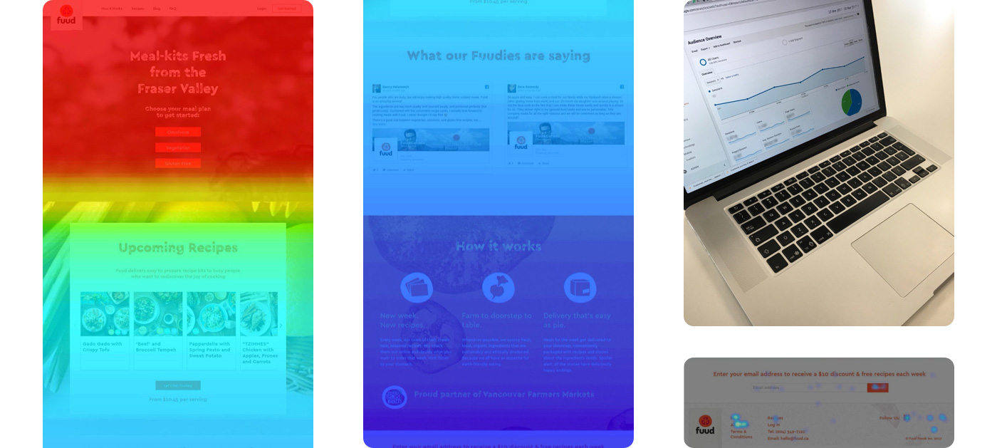
Analytics + Hotjar

To complete our UX audit, we also asked our client to give us access to their analytics tools. They used Google Analytics and Hotjar to track visitors’ and customers’ behaviors.

Here is what those tools surfaced:

  There was a lot of bounce back and forth between the meal plan page and the home page.

  Visitors don’t scroll much on the home page.

  Visitors who scrolled at the bottom of the page clicked on the “About US” or “FAQ” section.


Competition analysis

In addition to our UX audit, we ran a competition analysis including direct and indirect competitors. Our goal was to identify good UX practices with a specific focus on the meal kit subscription flows. We also looked at contents and features which could drive more meal kits subscriptions.

Here were our key findings:

• Similar main categories and CTAs as the Fuud platform:

   – “How it works” to explain how the service works.

   – “Get Started” to start the subscription process.

  Main categories we should consider adding or communicate better:

   – “Menu”: section highlighting upcoming and past meals kits (recipes) offered to customers

   – “Pricing”: section detailing plans prices and diet options available.

  Video contents surfacing people behind the scene, cooking techniques.

  Company values, a section highlighting produces sourcing and sustainability commitment.

  Newsletters and blog to showcase company news or free recipes or cooking tips.


Field study (experiencing recipes)

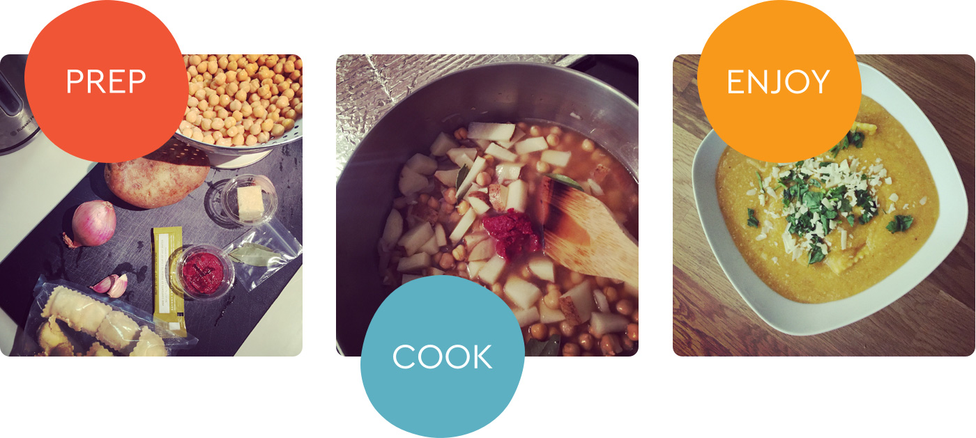
To complete our education about the meal kits business, we experienced ourselves the service, from unpacking our meal kits box to cooking the recipes.

We all loved the experience however here was what we noticed:

  It took longer to prepare than the recipe card said.

  It was not necessarily easy to follow recipe steps on a small card with a lot of content on it.

  I had to entirely read the recipe card to identify what kitchenwares I needed before getting started.


Qualitative and quantitative research

At this point in our research journey, we already had a good understanding of the meal kit industry. Analyzing data from Google Analytics and Hotjar also gave us some directions to improve the platform information architecture. However, we did not have any rationales on what prospects and customers expected or struggled with. This is why we ran a quantitative and qualitative research phase. To do so, we sent a survey to prospects and another one to Fuud customers. In both, we mixed qualitative and quantitative questions. We also ran in-person or phone interviews as much as can to capture people’s thoughts and emotions. Unfortunately, we did not have that much time to conduct this research phase as we were still at school when working on this project. This explains we did not have many respondents:

  30 survey participants (prospects and customers combined)

  12 interviews

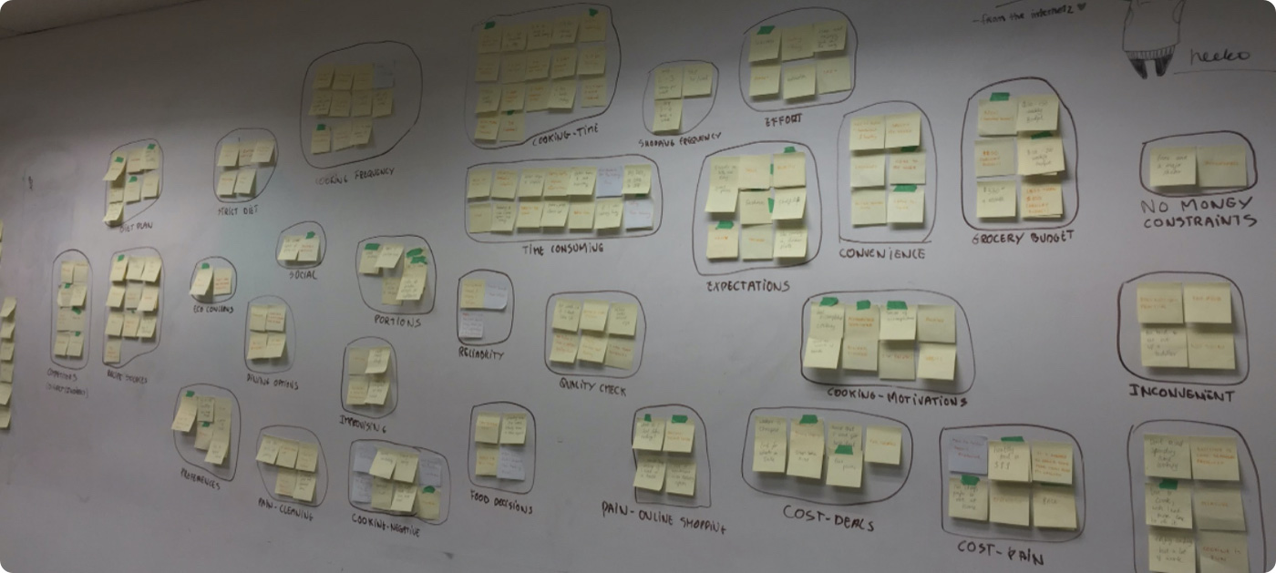
From there we synthesized those answers into an affinity diagram. It helped us to organize and surface recurrent topics and paint points mentioned by respondents.

Focusing on existing customers, here are the pain points that stood out:

  Navigation is not very intuitive.

•  Periodically forgetting to select recipes.

  Delivery time is not precise enough.

  Cooking time takes longer than indicated.


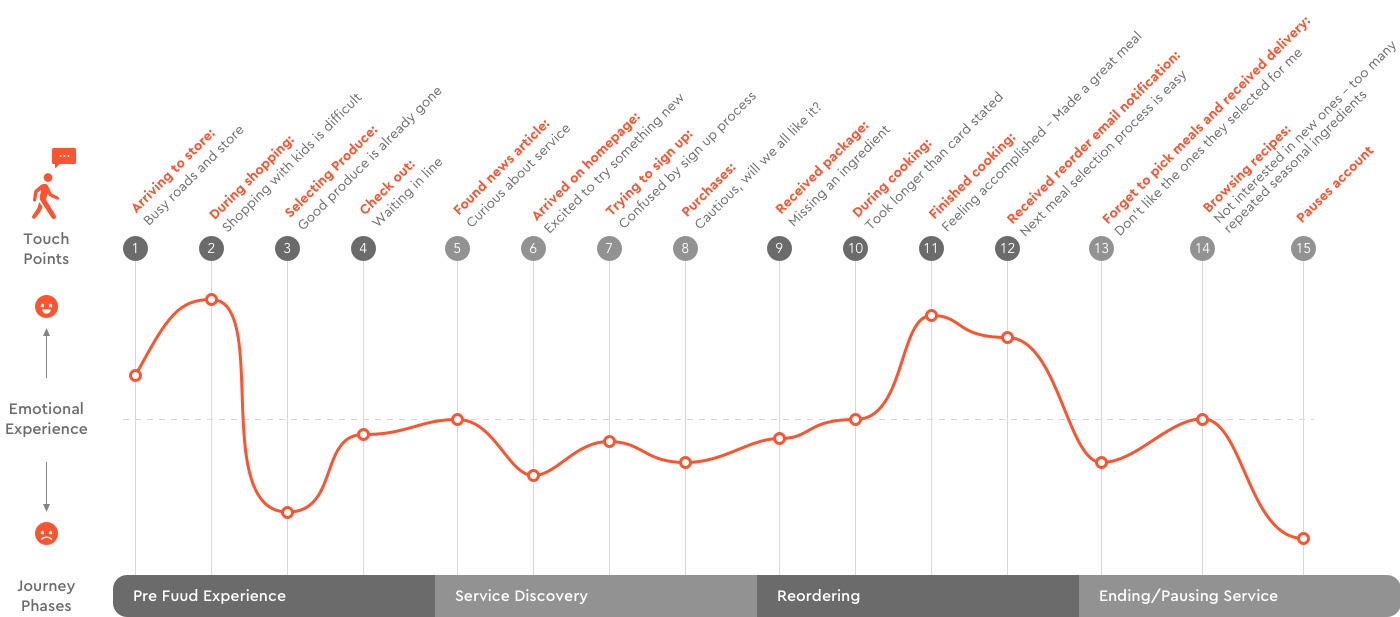
Journey map

Using the affinity diagram learnings, we also created journey maps to nourish our upcoming design work.

Persona

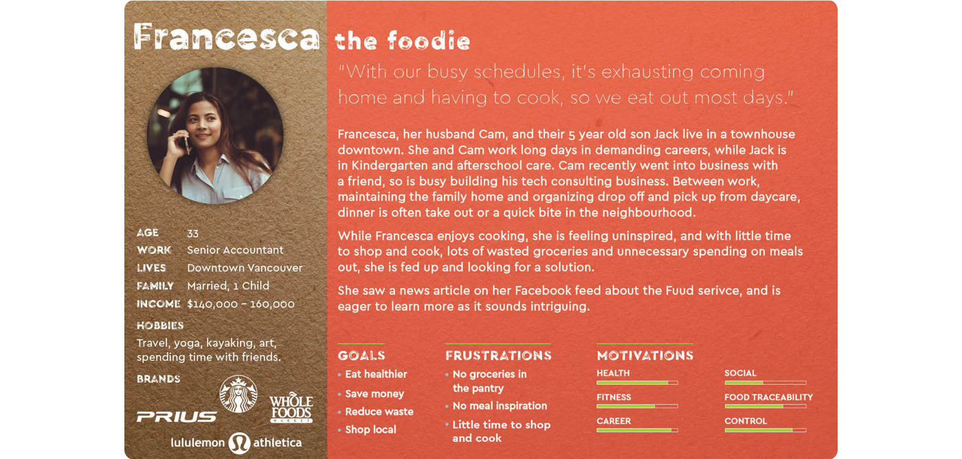
In addition to the journey map, we also created a persona ta make sure our design solution will match user expectations.

Planning

Information architecture

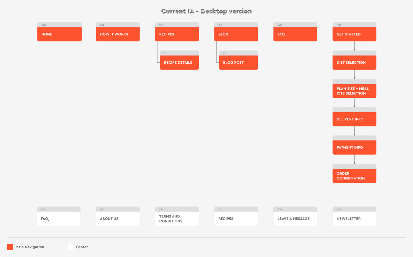
Nourished by the insights gathered during our research phase, we then focused on what the platform new information architecture could look like. Here was for reference the one we wanted to improve:

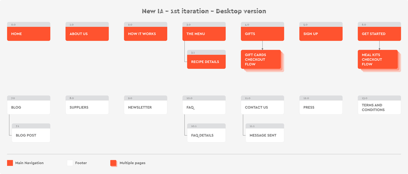
Here is the first iteration of the new one we proposed:

Notes:
• As prospects wanted to discover more about the people behind the scene, we introduced the “Suppliers” category. It was about presenting the company’ss local partners: farmers, fishermen, or artisans. Following the same rationale, we also wanted to surface better the “About Us” section. This category was focused on Fuud employees, from co-founders to the Chef.

• We also have included a “gifts” section as the company founders wanted to introduce a new business line by selling gift cards.

• Lastly, we thought it could be interesting, communication-wise, to allow users to create a Fund account without having to subscribe to a meal kits plan. This would have given us the opportunity to contact those prospects later on and convince them to subscribe to a meal kits plan.

To verify if our new IA was clearly understood by prospects, we usability tested it


IA Usability test 1

Method:

  In-person moderated tests.

  10 prospects (men and women).

  Printed the information architecture.

  Wrote down on paper 12 scenarios.


Running the test

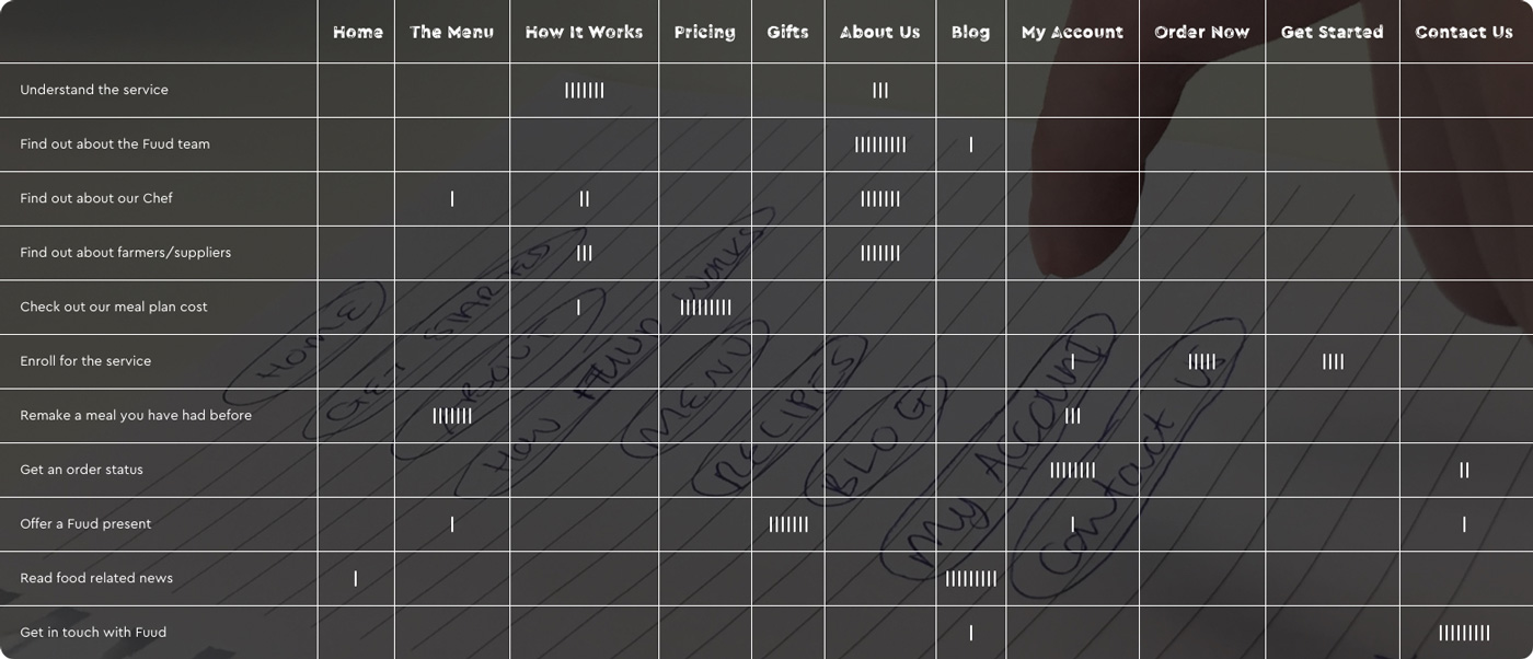
To conduct the test we shown them the IA and scenarios. Here are the scenarios we presented to users:

  Understand the service.

  Find out about the Fuud team.

  Find out about Chef.

  Find out about farmers/suppliers.

  Check out our meal plan cost.

  Enroll for the service.

  Remake a meal you have had before.

  Get an order status.

  Offer a Fuud present.

  Read food related news.

  Get in touch with FUUD.

Then, we asked them to tell us which categories they would go, to achieve each scenario.


IA Usability test 1 results

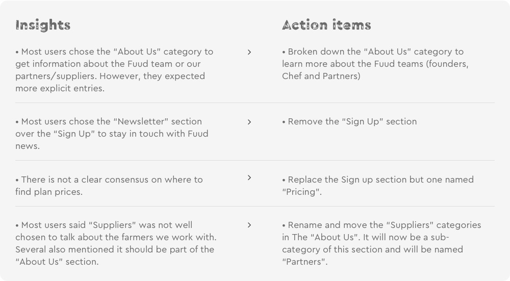
The test of the first IA iteration was pretty successful, however, there were some comments we wanted to address in a revised IA:

IA Usability test 2

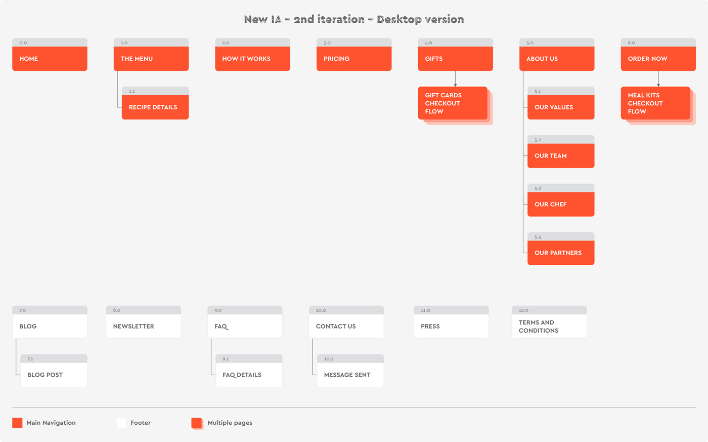
From those learnings, we came up with a second Information architecture iteration.

Test 2 results

This second test fixed the few pain points identified in the first one. Here was the broken down results of this second test:

Regarding the “Get Started” / “Order Now” categories, as we wanted to have a clearer consensus around one label we finally showed both. Showcasing both did not help to have a clear consensus but we finally decided to use “Order Now” as we needed just one of those.


Meal kits subscription flow

At the point of our planning journey, we were close to starting working on the design. However, the last thing we worked on was the meal kits purchase flow. We revised it based on our research learnings. Here was the old purchase flow:

Here is what we changed with the new flow:

  Clearer steps naming.

  Allow users to order the same meal kit several times.

  On the delivery info page, add a feature to let customers mention delivery instructions (e.g.: allow delivery to let my meal kits box at my doorstep or contact my neighbors).

  Add a pickup option in the delivery method and offer more granularity in the pickup/delivery time (morning or evening vs from 10 am to 5 pm as it was).

• Add a step to review order details.

• On the order confirmation page, add a feature to set recipe selection reminders for upcoming orders.

Design – Phase 1


Design studio

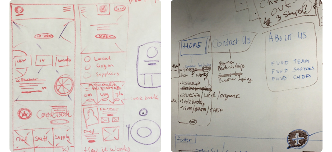
Nourished by our research and planning work, we then started to design the meal kits subscription flow. Considering the short timeframe we had to work on this project, we knew will only able to deliver this flow. We chose to run design studio sessions to define what the flow features list will look like. This method allowed us to join our forces and quickly come up with a more solid design solution.

Using the white writable walls we had a school, we sketched this flow in several 5 min sessions. After each, we look at sketches of each other’s sketches and critiqued our decision solutions. After a couple of sessions, we consolidated our sketches and came up with our first purchase flow iteration.

Design iteration 1

We then turned those sketches into digital wireframes and built an interactive prototype. Here was what our first iteration looked like:

Usability test

We then ran our first usability test to evaluate our design solution.


Method:

• In-person moderated.


Participants:

• 10 persons (male and female).

• 30-60 y.o., $100k – 160k+.

• Fuud prospects.


Goals:

• Evaluate if users understand how to select meal kits plan and recipes.

• Evaluate if users understand the checkout flow.


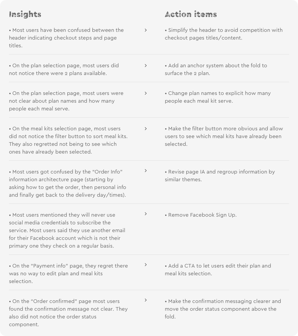
Here were the paint points revealed by the test:

Design iteration 2

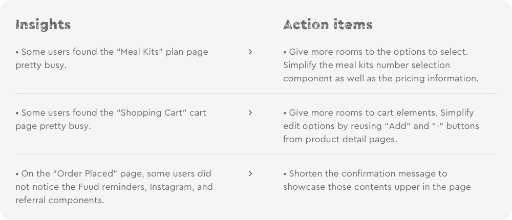
Following our action items we edited the first iteration and made those adjustments:

• Checkout steps name in the header has been removed.

• An anchor system has been added above the fold of the available plans.

• Plans names have been changed to be more explicit.

• The filter button is now more visible (located at the bottom of the page as a floating button).

• We added an expandable box that regroups the meal kits selected by the user.

• At the review order step, it is now possible to edit information filled out during the checkout process.

• The subscription confirmation is now more explicit

• The “Order status” component is now visible above the fold

Unfortunately, we did not have the chance to run a second usability test. As a reminder, we started this project at school while we were still students. This is where we handed off our research findings, wireframes, and prototypes to our client.

Design – Phase 2


Enriching the e-commerce platform

The client was pretty happy with the direction we took. After graduating from my design school, he got back to me, asking if I would be interested in resuming the project. I accepted and resume the project where we left it. From there I was working on my own, reporting directly to the client (one of two co-founders).

When we resumed our collaboration my client told me they wanted to enrich their e-commerce platform. In addition to their meal kits subscription service, the co-founders wanted to create a marketplace where they would sell food products from their local partners. They wanted to start with a limited range of products to evaluate the potential of this new business line. Regarding logistics, they did have enough resources to offer flexible delivery dates.

Those explain the following business requirements:

• Filter products by categories

• Delivery days and timeframes should be the same as the ones for meal kits.

• Delivery will be free for $65+ orders

In addition to this new business, the co-founder also wanted to offer more flexibility to customers. Here were their business requirements:

• Order now up to 6 meal kits per delivery (versus 4 only before)

• Add new delivery pace: every week, 2 weeks or month (versus every week only before)

• Allow users to order meal kits without subscribing to a plan

Finally, the client also wanted to let customers order in larger quantities, ingredients coming from their meal kits.


The challenge

With those new requirements in mind, the first thing I did was to run another quick competition analysis. Compared to the first one, I focused on specific competitors. I was looking for companies offering on the same platform, a “traditional” e-commerce experience (pay for you add in your shopping cart), and a subscription-based model.

At that time I only found one competitor offering this kind of experience: Blue Apron. I analyzed their purchase experience and noticed they treated their 2 business lines in separate checkout flows. For users, it meant it was impossible to subscribe to a meal kits plan and purchase products in the same order. I did not know why they did it this way but I assume it was to offer a clear user experience.

The challenge of offering a unified experience was double:

1. How to keep the checkout flow simple without creating funnels?

When you design a traditional e-commerce experience or subscription-based model, your goal as a designer is to create the simplest, sometimes shortest checkout flows to optimize your conversion (visitors placing orders). With a unified approach, you don’t want to influence users’ behaviors as you don’t know what are their intentions: subscribing to a plan, shop products, or both.

2. How to keep clear communication?

How to make clear that on one end they will receive recurring deliveries (meal kits plans) and the other a single delivery (product purchase). Also to me, users who order on other e-commerce platforms expect to be able to select a more or less fast delivery

This is with those elements in mind that I explained to my client she should have different purchase flows to keep the experience as simple and efficient as possible. Unfortunately, this is not the direction we took and I had to design a unified experience.


Design iteration 3

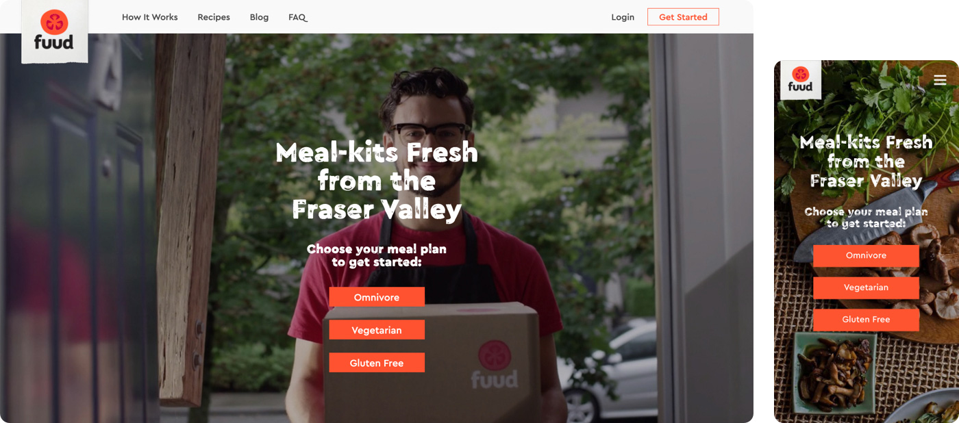
Designing iteration 3, I had to change a lot of things. Some changes were related to the new features I had to include. Some others were made because I found there was maybe a better way to solve the problem. Here is what changed compared to the previous iteration:

• Revamped the header.

• Added a Market products section (market products category page, product detail page).

• Allow users to order meal kits not only from the upcoming menu but also those which will be offered the following weeks.

• Revamped plan selection page.

• Revamped meal kits selection page.

• Revamped how the checkout process is broken down (from multiple checkout pages to one including all required information).

• Removed the status order. As meal kits and Market products deliveries occur the same days every week (Saturday or Sunday depending on user choice), I realized that keeping this component did not bring any added value for users.

Usability test

As for my previous iteration, I built a prototype and usability tested my third design iteration. Here was my usability test setup:


Method:

• In-person moderated.


Participants:

• 10 persons (male and female).

• 30-60 y.o., $100k – 160k+.

• Fuud prospects.


Goals:

• Evaluate if users understand how to purchase products from the Marketplace.

• Evaluate if users understand how to purchase products from the Marketplace and subscribe to a meal kits plan within the same order.


Surprisingly, this test did not reveal major pain points except for some details around the header.

Here was the feedback I received:

At this point of my design journey I already had a solution meeting user expectations. I made quick edits based those feedback and start to work on the other pages of the platform.

Results

Unfortunately, this project has been aborted after I completed the mobile design. That was very frustrating and surprising to stop halfway as my client seemed very satisfied with my work so far. I never knew why the project has been aborted but I saw the company, later on, had switched its distribution model. They now only sell their meal kits at local grocers.

Despite this disappointing end result, I thought it could be interesting to share what has been my design journey on this project. A few weeks after, I looked at my design with fresh eyes and had new ideas to refine some flows and improve UX consistency. What I am going to share reflects those ideas and highlight how I tried to:

• Reach my client’s objectives.

• Solve user pain points surfaced during the research phase.


As a reminder, here were the metrics the client wanted to grow:

• Meal kits subscription conversion (visitors who subscribe to a meal kits plan/visitors).

• Social media sharing.


Here were the pain points we were trying to solve:
  Navigation is not very intuitive.

  Forgetting to reorder periodically.

  Delivery time is not precise enough.

  Cooking time takes longer than indicated.

New customer – Service discovery

New customer – Market products + meal kits purchase flow

Returning customer – Selecting meal kits

Version 1

Returning customer – Selecting meal kits

Version 2

Design notes:

Improve meal kits subscription conversion

Our strategy to reach this objective was based on 2 pillars:

1. Content.

Users have access to richer content showcasing the people behind the company, companies’ values, F.A.Q. or customer support. Those help building trust which is to me foundational element to convince users adhering a service.

2. An optimized user experience

Offering a clear and efficient user experience should remove most blockers which could prevent users to subscribe to a meal kits plan. The detail of those optimizations is based on the pain points we identified during our research. How we tried to solve them is detailed down below.


Encourage social media sharing

User can easily share on social media Meal kits recipes or Market products thanks to a social media bar which sticks to bottom the screen. From our research, we learned users feelaccomplished” after cooking a delicious meal. Using the feeling we wanted to encourage them to share photos of their Fuud meals on Instagram with a dedicated hashtag. This social media approach would have helped Fuud to develop its brand and hopefully drove prospects to the platform.

Make the navigation intuitive

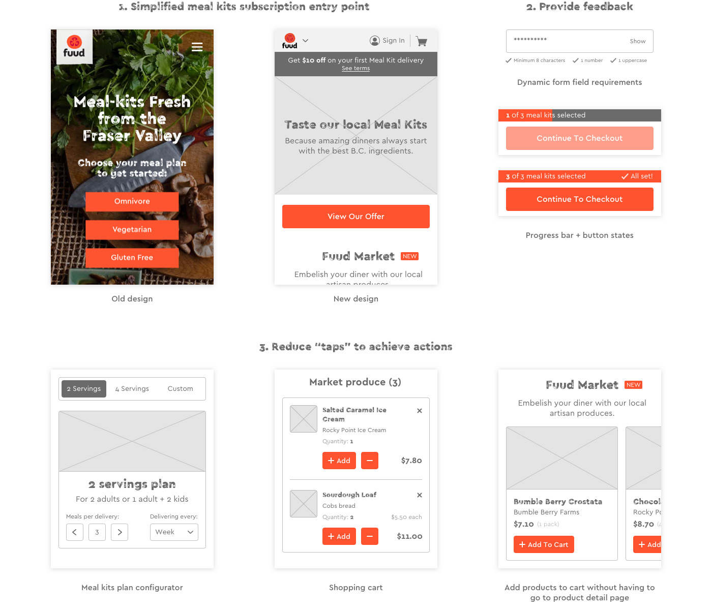
1. Simplify the meal kits subscription entry points from 3 cta to a single one.

2. Provide feedback. I added active and inactive button states to help users understand they need to perform some actions. Similarly, I also created a progress bar indicating to users where they are in their meal kits selection journey. Finally, to help users filling out their information correctly, I added a dynamic feedback system under some form fields. On the password field, as users enter their password characters, the system indicates if all security requirements have been matched.

3. Reduce “taps” to perform actions. On the meal kits plan selection page, I pre-selected options using a combination of radio buttons, tabs, and drop-downs menu. In the shopping cart, users can edit their meal kit plan or product quantities without going to another page. Similarly, users can add products to their shopping cart without going to a product detail page.

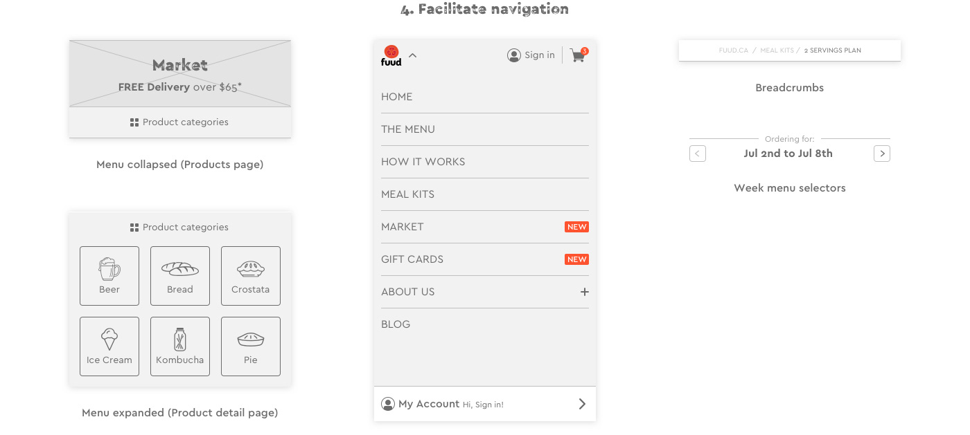
4. Facilitate navigation. To allow users to quickly jump from a page to another I used various navigation systems such as dropdowns, expandable lists, or breadcrumbs.

.

Help users not forgetting to make their recipes selection

Add an email and text message notification system to automatically send “recipe selection reminders” to users.

Improve precision on delivery time

As this element was related to the company logistics reality, we have not been able to offer more precise delivery time-slots. Even if does not help to solve this user pain point, I improved transparency mentioning deliveries occur between 10 am and 5 pm. Also, I added 2 components:

  a shipping instruction component. The user can note to the attention of the delivery man. This could be: “Let my order at my doorstep if I am not at home”

  a backup address component. The user can provide a close-by address to deliver the order in case of absence during the delivery

Improve recipes cooking time

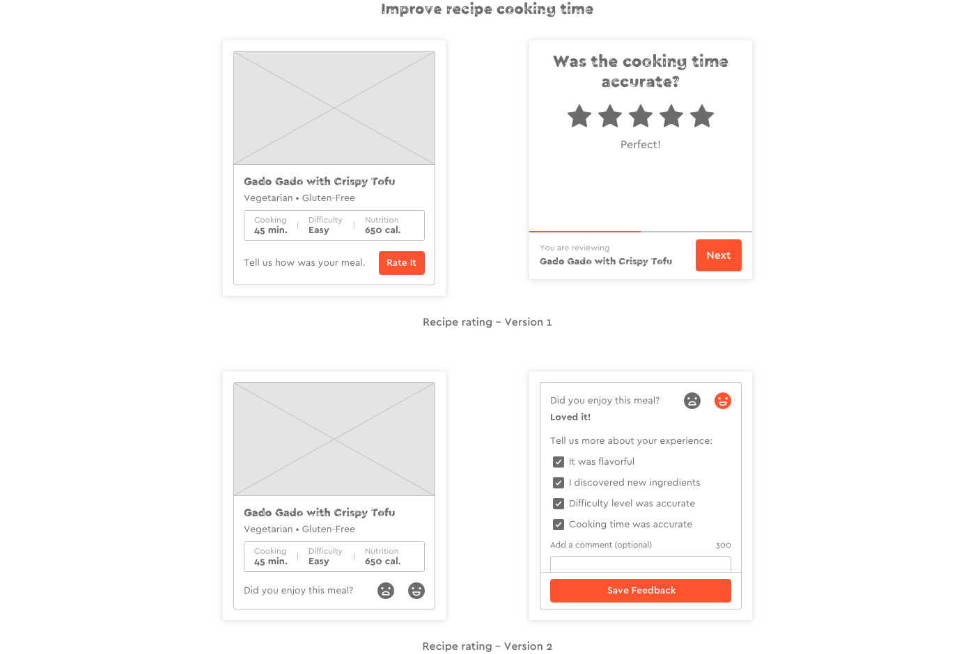
I invited our customers to evaluate each recipe they cooked. To help us improve recipes cooking time, one element they have to evaluate was the cooking time.

In addition, to evaluate the accuracy level of recipes cooking time, the objective of this tool was a way to track customer satisfaction. I initially thought it was a good idea to showcase recipes review to customers. This is why I came up with this first version: « Returning customer – Selecting meal kits + recipe rating – version 1″.

After reviewing my design I realized it could have a negative impact on our business if we had more bad reviews than good ones. Also, I realized the initial review flow required too much effort from users. That’s why I finally came up with a solution that only requires 2 taps to review an order (« Returning customer – Selecting meal kits + recipe rating – version 2″).

Takeaways

It’s been a really interesting journey to work on this project. Even if it has been very disappointing to see this project stopped after weeks of work, I am very grateful for all the things I learned. From my collaboration with other designers during project phase 1 to the one with the client, I gained experience in project management as I went through a lot of deliverables. Recruiting, preparing, and running in-person usability tests was also very insightful. It really allowed me to deliver a more refined design solution. Working on this project also made me realized how tough is it to achieve UX consistency, especially in the short time frame I got. This is probably why looking at this project a few weeks after its end, I decided for fun to improve the UX consistency as well as other details. As previously mentioned, it was not my decision to come up with a unified purchase flow mixing Market products and a meal kits subscription. Even if this approach allows users to do more in a single order, I still believe the checkout flow feels less intuitive when you combine both. Sometimes doing more effort in UX means more clarity and simplicity. I wish I had the time to create and usability test an alternative design solution showcasing 2 independent purchase flows.

Thanks for reading!